I’m a big fan of the graphic, so I’m
obviously biased, but I do see the concern what I start thinking about it too
much. It’s that pesky physics always intruding on our mental models! ;)
Anyway, if the notion is simply to make
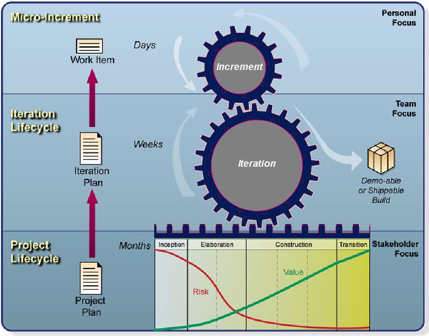
the gears more physically accurate, then I think they need teeth that are
spaced properly. The Work Items gear, for example, could have only one tooth,
so that each completed work item advances the iteration by one “increment”
toward completion of a shippable Build.
I DO like the “elongated tooth”
on the Iteration gear. Now if we could just get it to make sense. I think it’s
just a matter of visual spacing. There must be an engineer who can help us
poor software people out. J
Thanks,
Nate
Oster
From:
epf-dev-bounces@xxxxxxxxxxx [mailto:epf-dev-bounces@xxxxxxxxxxx] On Behalf Of Ben Williams
Sent: Wednesday, October 10, 2007
7:15 AM
To: Eclipse
Process Framework Project Developers List
Subject: [epf-dev] OpenUP Summary
Graphic
Hi
all
We have been speaking with various
customers about EPF and OpenUP.
We have received feedback that the main
OpenUP graphic (the cogs) is distracting because:
- it uses a mechanical metaphor to
illustrate an integrated process, yet the mechanics do not mesh
- there is no way that the two cogs could
actually mesh
- the elongated tooth on the iteration cog
is odd
- these issues distract from the
conceptual message being conveyed
I have attached a modified version - this
is just an example of how the deficiencies in the graphic could be addressed -
the graphic should be corrected properly by someone with better photoshop
skills :)
Thoughts?
Ben
Collaborate to Innovate!
Register today for Telelogic's annual User Group Conference November 19-21 in
South Wales
Learn more at www.telelogic.com/campaigns/2007/ugc/uk/index.cfm
--------------------------------------------------------------------------------
Telelogic Lifecycle
Solutions:
Helping You Define,
Design & Deliver Advanced Systems & Software
Learn More at www.telelogic.com
Ben Williams
Director of Product Management, Lifecycle Solutions
Telelogic UK Ltd
Northbrook House, Oxford Science Park
OX4 4GA, Oxford
United Kingdom
Phone: +44 020 7193 7067
Fax: +44 (1865) 784 286
Mobile phone:+44 (7710) 637 067
Ben.Williams@xxxxxxxxxxxxx
http://www.telelogic.com
Telelogic - Requirements-Driven Innovation!
-------------------------------------------------------------
The information contained in this e-mail,
including any attachment or enclosure, is intended only for the person or
entity to which it is addressed and may contain confidential material. Any
unauthorized use, review, retransmissions, dissemination, copying or other use
of this information by persons or entities other than the intended recipient is
prohibited.