Hello,
tracks how developers use their Eclipse IDE. If you ever wanted to find out how you use code completions
or what commands you use most often, Developer Statistics has the answer.
The goal of this project is to develop a rich visualization of the data collected,
to enable the developer to drill down and find out how to make more efficient use of the Eclipse IDE's features.
The already collected data could now be evaluated and displayed graphically in the form of diagrams.
What I have done this week:
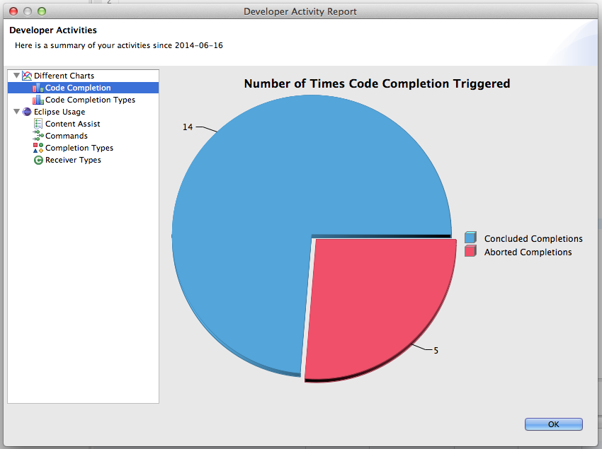
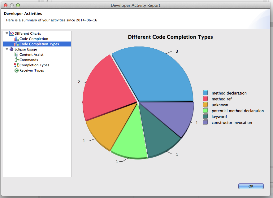
Last week I have added two pie charts in the „Developer Activity Report“ dialog.
One for the concluded / aborted code completions and another one for different code completion types, see task
437631.
This was our goal for the
mid term evaluation this week. The code you can see
here.
Tasks for the next week:
For the next week I have to do some code refactorings on change
28652 and create some unit tests for the pie charts above (see task
437954).
Feedback:
If you want to install Developer Statistics, look at the update site [1].
Feedback would be really great, please comment on bug
431842 or contact me on the mailing list.
Regards,
Akif