[
Date Prev][
Date Next][
Thread Prev][
Thread Next][
Date Index][
Thread Index]
[
List Home]
|
Re: [4diac-dev] Facelift for 4diac logo
|
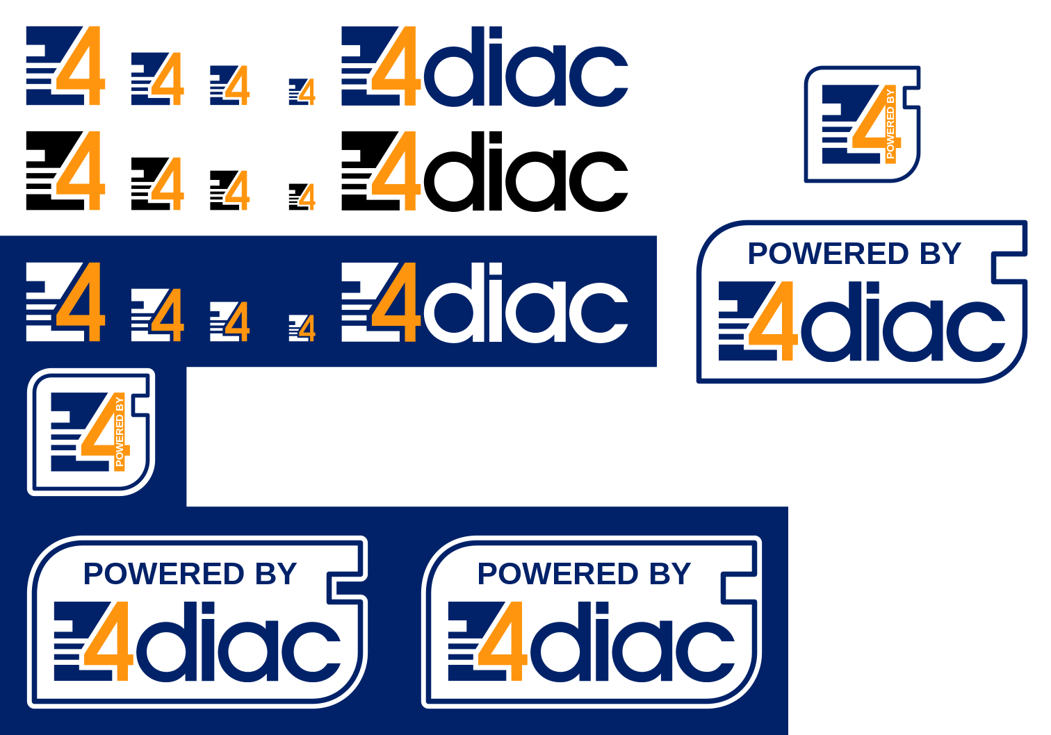
Thank you all for your nice feedback. Based on that I cleaned my design and created the SVG versions of the main logo and did a first take on the most used
icons and logos. See attached for an overview. I think this looks quite good.  I hope you too.

Cheers,
Alois

On Fri, 2019-03-22 at 12:13 +0000, Ben Schneider wrote:
> I like it too!
>
> Cheers,
> Ben
>
> -----Ursprüngliche Nachricht-----
> Von: 4diac-dev-bounces@xxxxxxxxxxx <4diac-dev-bounces@xxxxxxxxxxx> Im Auftrag von Martin Melik-Merkumians
> Gesendet: Freitag, 22. März 2019 12:43
> An: alois.zoitl@xxxxxx; 4diac developer discussions <4diac-dev@xxxxxxxxxxx>
> Betreff: Re: [4diac-dev] Facelift for 4diac logo
>
> Looks good to me.
>
> Best regards,
> Martin
>
> -----Ursprüngliche Nachricht-----
> Von: 4diac-dev-bounces@xxxxxxxxxxx <4diac-dev-bounces@xxxxxxxxxxx> Im Auftrag von Alois Zoitl
> Gesendet: Montag, 18. März 2019 23:15
> An: 4diac developer discussions <4diac-dev@xxxxxxxxxxx>
> Betreff: Re: [4diac-dev] Facelift for 4diac logo
>
> Hallo again,
>
> after letting the Eclipse 4diac logo/icon facelift sit for a while I came back to it and gave it more thoughts. I did more experiments I talked with many people. And based on the feedback I gave it a second try. Please find attached a new proposal for which I took the following points into account:
>
>   1. I tried to keep it as near as possible to the original one as the iconic shape is already in the brains of our users and we shouldn't change that again
>   2. Keep the 3 white lines as a reference to Eclipse logo
>   3. Have the white spaces bigger so that they scale better to smaller sizes
>   4. Get the overall logo a bit calmer.
>
> Based on that I tried again many different things. Many crazy things. The attached version is the current intermediate result. What do you think?
>
> Cheers,
> Alois
>
>
> On Sun, 2018-09-23 at 20:55 +0200, Alois Zoitl wrote:
> > Hi,
> >
> > for the upcoming 1.10 release I was looking on the splash screen and
> > for quite sme time I'm feeling that our logo would need a small face
> > lift. The main reason for this is that for me the logo is rather noisy.
> > This has especially drawbacks for smaller sizes (e.g. icons) or when
> > printing it or even more for stiching ont shirts.
> >
> > Therefore today I decided to experiment a bit with the logo to see if
> > I could come up with somthing that has better proportions and feels
> > calmer. What I wanted to keep was the iconic look of the Fb and the 4,
> > which I really like. As you can see in the attached PDF I did quite
> > some versions (more then 40).
> >
> > Currently I've a personal favorit. I atached you a PNG and also how it
> > would look in the full logo.
> >
> > What do you think? Is it an improvement? Any ideas on how to make it
> > even better?
> >
> > Cheers,
> > Alois
> > _______________________________________________
> > 4diac-dev mailing list
> > 4diac-dev@xxxxxxxxxxx
> > To change your delivery options, retrieve your password, or
> > unsubscribe from this list, visit
> > https://dev.eclipse.org/mailman/listinfo/4diac-dev
> _______________________________________________
> 4diac-dev mailing list
> 4diac-dev@xxxxxxxxxxx
> To change your delivery options, retrieve your password, or unsubscribe from this list, visit https://www.eclipse.org/mailman/listinfo/4diac-dev
Attachment:
4diacIcon_collection.png
Description: PNG image