[Date Prev][Date Next][Thread Prev][Thread Next][Date Index][Thread Index] [List Home]
Re: [gef-dev] New Palette Look and Feel


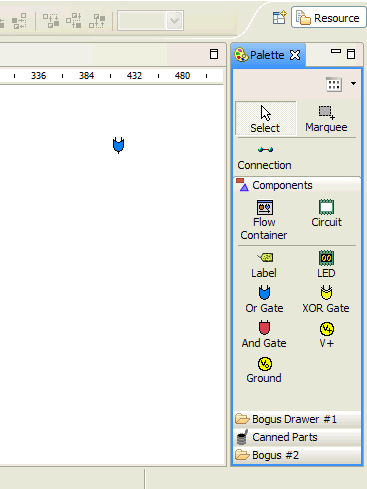
I think that the drawer titles do not stand out enough.  I also think that in list mode it would be hard to distinguish the titles from the items- especially a selected item.

When the toggle button down emphasis is too beveled looking.  What about something flatter like the emphasis on this "Google" button?  There is no border at all until the button is hovered over.  When hovered over it gets a border and the button lightens.  When pressed down, the button gets dark.


I also think a lighter background would look better.  Especially on Windows schemes (like the default) where the gray is darker.

Thanks.
George.


Randy Hudson/Raleigh/IBM@IBMUS
Sent by: gef-dev-admin@xxxxxxxxxxx

04/22/2004 03:43 PM

Please respond to
gef-dev

To
gef-dev@xxxxxxxxxxx
cc
Subject
[gef-dev] New Palette Look and Feel


We are working on a new palette look and feel for 3.0. Below is a prototype.  Please provide feedback and suggestions as soon as possible.  If you are skilled in photoshop, even better.


-Randy


Back to the top