April 15, 2024

Nuanced String Joining in Java
by Donald Raab at April 15, 2024 03:31 PM
Subtle differences sometimes make a big difference

Starting with an Integer array
I opened up my IntelliJ IDE and created an Integer array. I don’t usually like boxing primitives but wanted to see what interesting things I could discover about Eclipse Collections and Java Stream without immediately jumping into primitive types.
Integer[] numbers = {1, 2, 3, 4, 5};The first question I asked is “What can we do with this that is simple but interesting?“.” We can easily adapt this array in Java as a Stream.
Stream<Integer> stream = Stream.of(numbers);
We can also adapt it as an ArrayAdapter in Eclipse Collections.
ArrayAdapter<Integer> adapted = ArrayAdapter.adapt(numbers);
But what next? This is where our fun begins.
Let’s make a String
I wrote an article for 97 Things Every Java Programmer Should Know with the title “Learn to Kata and Kata to Learn.” In this article, I iterate through some example Java code using Collectors.joining() and String.join() to create a comma separated list of names. Then I turn the exercise into a code kata. I started with a List<String> and asserted some derived result of a joined String would equal the names in the List separated by commas.
This is a trivial example for both Collectors.joining and String.join. The example only involved a delimiter. It did not involve a prefix and a suffix. It also started off with String instances, which as we will see, is the perfect scenario for both Collectors.joining and String.join. Unfortunately, in the many classed world of object oriented programming, not everything starts out as a String.
Our problem today will start with the array of Integers values from 1 to 5 and converted them to a String starting with a “*”, separating elements with “*, *” and then finishing with a “*”.
For Loop
Joining an Integer array into a String with a for loop is a good exercise for us to start with.
@Test
public void loopArrayOfIntegerIntoAString()
{
    Integer[] numbers = {1, 2, 3, 4, 5};

    StringBuilder builder = new StringBuilder("*");
    for (int i = 0; i < numbers.length; i++)
    {
        if (i > 0)
        {
            builder.append("*, *");
        }
        builder.append(numbers[i]);
    }
    String string = builder.append("*").toString();

    Assertions.assertEquals("*1*, *2*, *3*, *4*, *5*", string);
}
We use StringBuilder here, but I started off with simple String concatenation. IntelliJ recommending applying an automated refactoring to convert the String concatentation to StringBuilder. So I did. The code is fairly simple here to understand. We iterate over the array using indexed access, so that we can check if we are not on the first (0th) element. Only the first element element will not have the “*, *” delimiter before it. A prefix of “*” and a suffix of “*” are added to the StringBuilder before and after iteration begins. The append method in StringBuilder is nice enough to call String.valueOf on each Integer value for us so we don’t have to. In the end, we assert we wind up with a String that matches this string “*1*, *2*, *3*, *4*, *5*”.
Stream.map, collect, and Collectors.joining
For the next implementation, we will use a Stream and Collectors.joining to create the String. Collectors.joining requires that elements are an instance of CharSequence (a parent interface of String). We will map each Integer to a String using String.valueOf before calling Collectors.joining.
@Test
public void streamAnArrayOfIntegerAndMapCollectorsJoining()
{
    Integer[] numbers = {1, 2, 3, 4, 5};

    // Collectors.joining requires elements to be CharSequence
    // delimiter is first, followed by prefix and then suffix
    Stream<Integer> stream = Stream.of(numbers);
    String streamedJoining = stream
            .map(String::valueOf)
            .collect(Collectors.joining("*, *", "*", "*"));

    Assertions.assertEquals("*1*, *2*, *3*, *4*, *5*", streamedJoining);
}
This code looks more concise than the for loop. However, it is rather annoying that StringBuilder append calls String.valueOf for us, and Collectors.joining does not. I also found it surprising that we see that joining takes the delimiter first, followed by the prefix and then the suffix. This does not mirror the output of the String.
String.join
For this implementation, we will used String.join. The String.join static method takes a CharSequence delimiter and either an array of CharSequence for the elements, or some kind of Iterable<CharSequence>. We can use the ArrayAdapter class from Eclipse Collections to convert the Integer array to an Iterable<CharSequence>.
@Test
public void adaptAnArrayOfIntegerAndStringJoin()
{
    Integer[] numbers = {1, 2, 3, 4, 5};

    Iterable<CharSequence> iterable = ArrayAdapter.adapt(numbers)
            .asLazy()
            .collect(String::valueOf);

    // String.join only supports delimiter. Prefix and suffix are concatenated
    // Requires elements to be a CharSequence[] or Iterable<CharSequence>
    String stringJoin = "*" + String.join("*, *", iterable) + "*";

    Assertions.assertEquals("*1*, *2*, *3*, *4*, *5*", stringJoin);
}
Here we use the ArrayAdapter, convert it to a LazyIterable (which is an Iterable) and collect String instances using String::valueOf. The most surprising thing I didn’t know about String.join is that there are no public overloads that take a prefix and suffix, like Collectors.joining has.
We can also use Stream to turn the Integer array into an Iterable<String>.
@Test
public void streamAnArrayOfIntegerAndStringJoin()
{
    Integer[] numbers = {1, 2, 3, 4, 5};

    Iterable<String> iterable =
            Stream.of(numbers).map(String::valueOf)::iterator;

    String stringJoin = "*" + String.join("*, *", iterable) + "*";

    Assertions.assertEquals("*1*, *2*, *3*, *4*, *5*", stringJoin);
}
We use a method reference here of ::iterator on the Stream to convert it to an Iterable. This is a neat trick since Iterable only requires one method to be implemented, which is iterator.
ArrayAdapter.makeString
In the 97 Things article, I did not include a refactoring to use Eclipse Collections makeString. We will see how to use makeString, which is available on all RichIterable subtypes, below.
@Test
public void adaptAnArrayOfIntegerAndMakeString()
{
    Integer[] numbers = {1, 2, 3, 4, 5};

    ArrayAdapter<Integer> adapted = ArrayAdapter.adapt(numbers);

    // makeString does not require elements to be CharSequence
    // prefix is first, then delimiter and then suffix
    String makeString = adapted.makeString("*", "*, *","*");

    Assertions.assertEquals("*1*, *2*, *3*, *4*, *5*", makeString);
}
Similar to StringBuilder append, makeString applies the call to String.valueOf for us. The order of String parameters here is prefix, delimiter, suffix, which more closely mirrors the expected output.
ArrayIterate.makeString
The simplest solution we will see is using ArrayIterate.makeString from Eclipse Collections. Eclipse Collections has utility classes with the suffix of Iterate. There are Iterate, MapIterate, StringIterate, and ArrayIterate utility classes, that work with Iterable, Map, String, and Object array types respectively.
@Test
public void iterateAnArrayOfIntegerAndMakeString()
{
    Integer[] numbers = {1, 2, 3, 4, 5};

    String makeString =
            ArrayIterate.makeString(numbers, "*", "*, *","*");

    Assertions.assertEquals("*1*, *2*, *3*, *4*, *5*", makeString);
}
The makeString method on the utility classes behaves the same as on RichIterable subtypes. The method does not require the elements in the array to be some type of String or CharSequence already. The prefix comes first after the array parameter, followed by delimiter and then by suffix.
Looking for more nuance? Let’s get primitive.
Instead of an array of Integer, let’s switch to an array of int, and see what options we have to convert to a delimited String.
MutableIntList.makeString
We can convert an int array to a MutableIntList and use makeString on a primitive List.
@Test
public void mutableIntListMakeString()
{
    int[] numbers = {1, 2, 3, 4, 5};

    MutableIntList adapted = IntLists.mutable.with(numbers);

    String makeString = adapted.makeString("*", "*, *", "*");

    Assertions.assertEquals("*1*, *2*, *3*, *4*, *5*", makeString);
}
IntStream.of, boxed and mapToObject
We can create an IntStream using the int array with the static of method, and then box it to Integer using the method boxed. There are no primitive Collectors for primitive Streams, so boxing is our only option.
@Test
public void intStreamBoxedCollectorsJoining()
{
    int[] numbers = {1, 2, 3, 4, 5};

    Stream<Integer> boxed = IntStream.of(numbers).boxed();
    String streamedJoining = boxed
            .map(String::valueOf)
            .collect(Collectors.joining("*, *", "*", "*"));

    Assertions.assertEquals("*1*, *2*, *3*, *4*, *5*", streamedJoining);
}
We can also get rid of the boxing to Integer, and box straight from int to String using mapToObj with String.valueOf.
@Test
public void intStreamMapToStringCollectorsJoining()
{
    int[] numbers = {1, 2, 3, 4, 5};

    String string = IntStream.of(numbers)
            .mapToObj(String::valueOf)
            .collect(Collectors.joining("*, *", "*", "*"));

    Assertions.assertEquals("*1*, *2*, *3*, *4*, *5*", string);
}
Summary
In this blog we saw how to use several approaches to convert the elements of an Integer array to a delimited String with a prefix and a suffix. The following are the methods we explored.
✅ for loop
✅ Stream.map, collect, and Collectors.joining
✅ String.join
✅ ArrayAdapter.makeString
✅ ArrayIterate.makeString
We then explored converting the Integer array to an int array, and looked at how we can convert that to a delimited String.
✅ MutableIntList.makeString
✅ IntStream.of, boxed and mapToObj
There are nuances to each of these methods. The ArrayIterate approach wound up being the most concise for this particular use case.
Thank you for reading this blog and I hope you find the solutions I shared to this problem informative.
Enjoy!
I am the creator of and committer for the Eclipse Collections OSS project, which is managed at the Eclipse Foundation. Eclipse Collections is open for contributions.
Nuanced String Joining in Java was originally published in Javarevisited on Medium, where people are continuing the conversation by highlighting and responding to this story.
April 12, 2024

Enhancing Modeling Tools with AI: A Leap Towards Smarter Diagrams with Eclipse GLSP
by Jonas, Maximilian & Philip at April 12, 2024 12:00 AM
The integration of Artificial Intelligence (AI) with IDEs, as exemplified by tools like Github Copilot, Codeium, Tabine, ChatGPT and more, has opened new horizons in software development. It is...
The post Enhancing Modeling Tools with AI: A Leap Towards Smarter Diagrams with Eclipse GLSP appeared first on EclipseSource.
April 11, 2024

OCX 2024: Celebrating Community, Code and Collaboration
by Clark Roundy at April 11, 2024 06:25 PM
TL;DR - Don't miss the opportunity to participate in Open Community Experience 2024, a new conference for our vibrant community of communities.
At the Eclipse Foundation, our ethos is anchored in three pivotal Cs: Community, Code, and Collaboration. These principles are so integral to our mission that when we re-envisioned our flagship event for 2024, we aimed to include these themes. As a code-first community, we initially introduced our revamped event as the Open Code Experience (OCX). However, after careful reflection and, in full disclosure, due to some potential concerns related to trademark considerations, we embraced a name that truly resonates with our core mission: the Open Community Experience.
Communities are at the core of the Eclipse Foundation. OCX 2024 will showcase a diverse range of excellent content across multiple tracks from the Eclipse ecosystem. In addition to the main conference tracks, OCX will also host three multi-day, collocated events, each dedicated to specific communities: Open Community for Automotive, Open Community for Java, and EclipseCon.
Our program committees are currently hard at work building an outstanding program, but here's a glimpse of what to expect:
- Main OCX Tracks: Content covering embedded systems, IoT and edge computing, programming languages and runtimes, security, trusted data sharing, and open source best practices.
- Open Community for Automotive: Focused on innovations in automotive software, software-defined vehicles, and mobility domains.
- Open Community for Java: A deep dive into the open source enterprise Java ecosystem, featuring content related to Jakarta EE, Adoptium, MicroProfile, and much more.
- EclipseCon: Reinvented as the nexus for all talks related to the Eclipse IDE platform and the evolving landscape of development tools.
In addition to the collocated multi-day events, the program will feature specialised sessions and one day gatherings like the Eclipse Security, Artificial Intelligence, Architecture, and Modelling Conference (eSAAM), which will spotlight innovative software and solutions for data spaces.
OCX is made possible with the generous support of our sponsors, and we extend our sincere gratitude to each of them. A special acknowledgement goes to Huawei, our first Diamond-level sponsor, whose support sets a high standard for excellence. We also appreciate the early sponsorship commitments from EclipseSource, Lunatech, Obeo, Scanoss, and Typefox. Your contributions make OCX a reality and greatly enhance the experience for all attendees.
We encourage all companies in the Eclipse ecosystem, particularly our Strategic members, to consider sponsoring our flagship conference. This is a unique opportunity to build your brand and directly engage a highly qualified developer audience focused explicitly on the open source technologies that drive your business. Sponsor packages include multiple event passes, making it easy for your developers to join the many conversations to be had at this unique confluence of forward-thinking technologists. Explore sponsorship opportunities by reaching out to sponsors@OCXconf.org.
OCX isn't just an event — it's a celebration of community-driven collaboration and open source innovation. We invite you to join us on this exciting journey. For more details on OCX and how you can sponsor and participate, visit the OCX website. And, be sure to mark your calendars for the Call for Proposals opening on April 15.
Stay tuned for more exciting news and announcements in the coming weeks!
April 09, 2024
Eclipse Theia 1.48 Release: News and Noteworthy
by Jonas, Maximilian & Philip at April 09, 2024 12:00 AM
We are happy to announce the Eclipse Theia 1.48 release! The release contains 53 merged pull requests and we welcome two new contributors. In this article we will highlight some selected improvements...
The post Eclipse Theia 1.48 Release: News and Noteworthy appeared first on EclipseSource.
April 06, 2024
Looking at a Java Class and its Methods Through a Kaleidoscope
by Donald Raab at April 06, 2024 06:44 PM
Exploring the Java Stream methods from multiple perspectives

Six Views of a Java Class
I have been exploring different ways of understanding the methods of large Java classes. I don’t mean large in terms of lines of code, but large in terms of number of methods. Feature-rich interfaces, sometimes referred to as humane interfaces, are not incredibly humane when you need to find a method, if you don’t know the name, or discover patterns and look for symmetry between types. Thankfully, we have computers to help us process large amounts of data very quickly. Class and Method declarations are an easily accessible treasure trove of information about libraries and applications that Java developers have at their fingertips. Unfortunately, beyond good old Javadoc we don’t have many ways to make them talk.
I’ve created some basic documentation tools for increasing my own understanding of the feature-rich API of Eclipse Collections. Of course, I use Eclipse Collections to help me understand Eclipse Collections. The tools I am creating allow me to understand any Java Class and its Method instances, not just Eclipse Collections classes. One might consider the tools I have been experimenting with as a kind of Javadoc++. I am writing this blog in the hopes it might confirm or deny the usefulness of some of these class/method views.
I’m also hoping this blog will bring more attention and interest to a user-defined method grouping feature that is missing in Java, that I learned from Smalltalk, and is known as Method Categories. Imagine being able to optionally tag each Method in a Java Class with something like methodCategory=”filtering” or methodCategory=”transforming” and then having JavaDoc, IDEs, and developers able to query this information through the Method interface. I digress. Back to the views and groupings that I was able to create without any new Java features.
I have created five AsciiDoc generated views of a class and its methods to help me understand how the methods on the class are organized and if any interesting patterns exist. These views can help me understand class scope, naming patterns and any symmetry/asymmetry that might exist.
The six views of a Java class we will see in this blog are as follows:
- Javadoc
- Methods by First Letter
- Methods by Prefix
- Methods by Suffix
- Methods by Return Type
- Methods by Functional Interface Parameter Types
For views two through six, I used Eclipse Collections to group and count methods by different attributes based on the Class and Method types in Java.
There is no user-defined grouping mechanism for Java methods today, which would be the equivalent of method categories in Smalltalk. I used the available metadata about a Method to build groupings of methods to create these additional views of methods using generated AsciiDoc. I hosted the generated AsciiDoc for the Java Stream class in gists. I linked to the gists below and used GitHub’s ability to render AsciiDoc to have decent looking tables displayed inline.
Enjoy the following views of the Java Stream class and its methods!
Six Views of Java Stream
We will explore the six views of a Java class using Java Stream as an example.
1. Javadoc
The first view of Stream we can find online is the Javadoc for the class.
The Javadoc view shows us all the documentation about the class, and organizes a method summary with all methods listed in alphabetical order. While this may be suitable for some purposes, it does not help us find patterns in the methods, because there is only a flat view without any particular grouping. We can filter methods by static methods, instance methods, abstract methods, and default methods.
We can use the useful search widget in the top right corner to find things. There is also an interesting “Use” tab that can show us the places in the JDK where Java Stream is used.
Uses of Interface java.util.stream.Stream (Java SE 21 & JDK 21)
2. Stream Methods by First Letter
This is the simplest view of methods on a class. I use Eclipse Collections to group all of the methods of the Stream class by their first letter, and sort them by the most frequent first letter to the least frequent.
In each letter, the methods are sorted alphabetically. The benefit of this view is the method compression. In the Javadoc view for Stream, you have to scroll to see all of the methods. With this view, there is no scrolling on either my 27 inch monitor or laptop screen.
https://medium.com/media/49b7a53df8af7eb8c79e3bd6df9420da/href3. Stream Methods by Prefix
This view is slightly more interesting than grouping by first letter. Here we group the methods by any prefix they might have like “map” or “for”. The prefix is determined by the split between the initial lowercase letters in the method and the first uppercase letter. Methods with no prefix, or having all lowercase letters, show up in a category of “No Prefix”. This category shows up first because the table is sorted by the most frequent prefix to the least frequent prefix. Prefix does grouping/screen space compression and also serves as a rough approximation of categories for a majority of methods.
https://medium.com/media/7d4b7898ae0bfafd1acff19efa0199ec/href4. Stream Methods by Suffix
This view is an interesting variation on the grouping by prefix. Here we group the methods by any suffix they might have like “int” or “match”. The suffix is determined by the split between the last uppercase letter and the remaining lowercase letters in the method. Methods with no suffix, or having all lowercase letters, show up in a category of “No Suffix”. This category shows up first because the table is sorted by the most frequent suffix to the least frequent suffix.
https://medium.com/media/47cbdbd4061946f918b7585c32da8c80/href5. Stream Methods by Return Type
In this view, which has methods grouped by their return types, we get to see a bit more information about each method. We can see the methods with their parameter types. This necessarily takes up a bit more screen real estate, but the extra information is potentially useful. The table is sorted by most frequent return type to least frequent return type. As we can see, Stream is the most frequent return type from Stream, which means there are a decent number of lazy methods on the Stream interface. There are also four BaseStream methods and nine primitive stream (IntStream, LongStream, DoubleStream) methods which are also lazy.
https://medium.com/media/61700f8d2181d268db2a848bc067e5b1/href6. Stream Methods by Functional Interface Parameter Types
This was the most complicated of the views to produce. In this view, we can see the methods, with their number of parameters as an emoji, grouped by each of the parameter types the methods take. The methods are filtered to only include parameter types that are Functional Interfaces (e.g. Predicate, Function, Consumer). This view tells us which methods are lambda ready, and which Functional Interface has the most methods with it as a parameter type. The parameter number was included here, because as we can see on the BinaryOperator row in the table, there are three overloaded versions of reduce.
This view can quickly answer questions like “Where can I use a Predicate with a Stream?” or “Where can I use a Function with a Stream?”
https://medium.com/media/1b5873c26da2b9dc28168c48a44f861c/hrefComparing Stream and RichIterable Lambda Enabled Methods
The sixth view of the Stream interface methods allowed me to compare how lambda ready Stream is compared to the RichIterable interface from Eclipse Collections, based on the number of methods that accept the four most well known Functional Interfaces as parameters.
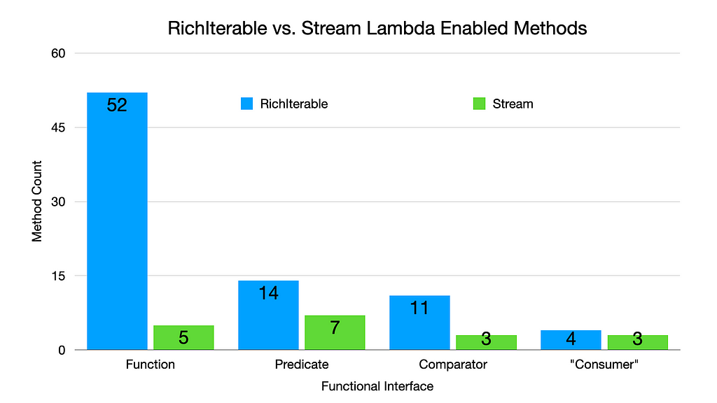
Consumer is quoted in the above chart as the equivalent type in Eclipse Collections is named Procedure.
If you feel like there are some useful methods missing in Stream, you might be able to find them in RichIterable. The detailed view of RichIterable Methods by Functional Interface Parameter Types can be seen below.
https://medium.com/media/2d7fa8c9d57e26186324a3f382e60fd8/hrefFinal Thoughts
Sometimes it’s helpful to build tools to help us augment our understanding of the Java classes and methods we use. Java gives us the capability to query Classes and Methods for a lot of useful information in code. Looking for everything in files can necessitate a lot of scrolling and testing of our memory. Information chunking is extremely helpful for humans. Grouping and Filtering are great options for aiding information chunking.
This is the first time I have used AsciiDoc in a gist included in a Medium blog. I was pleasantly surprised by the automatic rendering of the AsciiDoc tables by GitHub. Now that I know this is possible, I may use AsciiDoc tables in gists instead of screen captures for tables in the future.
I hope you found this blog and the five AsciiDoc generated Class/Method views of the Stream class in Java useful. Please share this blog with others who you think may benefit from learning more about the method naming and organization on the Java Stream class!
Enjoy!
I am the creator of and committer for the Eclipse Collections OSS project, which is managed at the Eclipse Foundation. Eclipse Collections is open for contributions.
Looking at a Java Class and its Methods Through a Kaleidoscope was originally published in Javarevisited on Medium, where people are continuing the conversation by highlighting and responding to this story.
April 04, 2024
The Eclipse Foundation to Highlight Open Innovation at embedded world 2024
by Jacob Harris at April 04, 2024 11:00 AM
BRUSSELS – 4 April 2024 – The Eclipse Foundation, one of the world’s largest open source foundations, is set to unveil its latest open source innovations at this year’s embedded world Exhibition & Conference, taking place in Nuremberg from 9-11 April 2024. The foundation will be presenting talks on multiple embedded topics, while also highlighting new open source technologies, including a safety-certified real-time operating system (RTOS), industrial grade RISC-V CPU IP, and Software-Defined Vehicle (SDV) innovations.
“Embedded computing, the bedrock of today’s digital economy, thrives on open source technologies,” said Mike Milinkovich, executive director of the Eclipse Foundation. “The Eclipse Foundation is experiencing remarkable growth across various aspects of embedded innovation, spanning IoT, edge computing, and our Software Defined Vehicle initiatives. We’re particularly excited to showcase the first release of Eclipse ThreadX at this year’s Embedded World.”
The First Release of Eclipse ThreadX
Eclipse ThreadX, formerly Azure RTOS, is the world's first open source, safety-certified real-time operating system (RTOS). ThreadX is a new addition to the world of open source, having recently become a project at the Eclipse Foundation after its transition from Microsoft. embedded world 2024 serves as the launchpad for the debut release of ThreadX under the stewardship of the Eclipse Foundation. Eclipse ThreadX v6.4.1 is available under the permissive MIT licence. You can download it and its subcomponents from GitHub.
Innovation for Software-Defined Vehicles
The Eclipse SDV team will showcase groundbreaking business use cases with SDV Blueprints, spotlighting advancements in insurance, fleet management, and software orchestration. These initiatives represent a collaborative effort across more than 20 automotive open source projects, highlighting a collective effort to push the boundaries of software-defined vehicles.
Industrial-Grade, Open Source RISC-V CPU Technology
The OpenHW Group will be demonstrating its latest cores based on RISC-V open source technology. The CVA6, CVE4, and CVE2 cores exemplify the pinnacle of open source innovation and adoption in the embedded industry.
Cutting-Edge Research and New Open Source Projects
The Eclipse Research team will unveil four new projects that are advancing the future of technology:
- CODECO, a cognitive, cross-layer, and highly adaptive Edge-Cloud management framework
- TRISTAN, an industrialisation of the European RISC-V ecosystem that is capable of competing with existing commercial alternatives
- TRANSACT, a universal, distributed solution architecture for the transformation of security-critical cyber-physical systems
- NEPHELE, a reliable and secure end-to-end orchestration of hyper-distributed applications on a programmable infrastructure.
Advancing European Technology Leadership with Eclipse Aidge
With the backing of CEA List, the Eclipse Aidge project stands out as a testament to European and French technological leadership. It embodies the successful transition from academic research to real-world applications, showcasing the symbiotic relationship between academia and embedded industry. Connect with the CEA List team to learn more about Eclipse Aidge.
Get to Know Our Community
Discover the diverse Eclipse Foundation ecosystem catering to the IoT, edge, and embedded industries. Representatives from key Eclipse communities such as Eclipse IoT, Sparkplug, and Oniro will all be available to engage with you.
Must-Attend Technical Talks
Eclipse Foundation experts will have a strong presence at this year’s embedded world, including two specific presentations that anyone interested in open source technologies will not want to miss:
- Frédéric Desbiens: Open Source Software and Lifecycle Standards – Yes: It Can Be Done (Tuesday, April 9, 11:30 AM - 12:00 PM, NCC Ost, Session 6.1)
- Frédéric Desbiens: The State of Open Source Real-Time Operating Systems (Wednesday, April 10, 11:00 AM - 11:30 AM, NCC Ost, Session 3.4)
Join Us at Booth 4-554, Hall 4:
Discover the transformative power of open source innovation by visiting the Eclipse Foundation at booth 4-554, Hall 4. Engage with our vibrant communities, explore industry-leading projects, and discover how open source initiatives are reshaping technology. We look forward to seeing you there!
About the Eclipse Foundation
The Eclipse Foundation provides our global community of individuals and organisations with a business-friendly environment for open source software collaboration and innovation. We host the Eclipse IDE, Adoptium, Software Defined Vehicle, Jakarta EE, and over 415 open source projects, including runtimes, tools, specifications, and frameworks for cloud and edge applications, IoT, AI, automotive, systems engineering, open processor designs, and many others. Headquartered in Brussels, Belgium, the Eclipse Foundation is an international non-profit association supported by over 360 members. Visit us at this year’s Open Code Experience (OCX) conference on 22-24 October 2024 in Mainz, Germany. To learn more, follow us on social media @EclipseFdn, LinkedIn, or visit eclipse.org.
Third-party trademarks mentioned are the property of their respective owners.
###
Media contacts:
Schwartz Public Relations for the Eclipse Foundation, AISBL (Germany)
Gloria Huppert/Julia Rauch
Sendlinger Straße 42A
80331 Munich
EclipseFoundation@schwartzpr.de
+49 (89) 211 871 -70/-43
Nichols Communications for the Eclipse Foundation, AISBL
Jay Nichols
+1 408-772-1551
514 Media Ltd for the Eclipse Foundation, AISBL (France, Italy, Spain)
Benoit Simoneau
M: +44 (0) 7891 920 370
Eclipse Foundation Security Advisory: HTTP CONTINUATION frames issue
by Marta Rybczynska at April 04, 2024 04:24 AM
The Eclipse Foundation Security Team has been made aware of the vulnerability VU#421644 affecting multiple HTTP/2 implementations, that could cause an out-of-memory crash.
April 03, 2024
Showcasing Open Innovation at embedded world 2024: An Eclipse Foundation Preview
by Clark Roundy at April 03, 2024 11:33 PM
With embedded world 2024 just around the corner, we're thrilled to offer a sneak peek into the groundbreaking projects and innovations that are shaping the future, all thanks to the collaborative efforts of the Eclipse Foundation and our vibrant community.
Join us in Nuremberg April 9th to 11th at booth 4-554, Hall 4, as we unveil a diverse spectrum of open source projects and technologies spanning the entire embedded ecosystem. At the Eclipse Foundation booth, you'll have the opportunity to explore the world of open source collaboration and witness firsthand its transformative power.
Here are a few things to expect and explore when you visit our booth:
Software Defined Vehicle Innovation
The Eclipse SDV team will showcase groundbreaking business use cases with SDV Blueprints, spotlighting advancements in insurance, fleet management, and software orchestration. These initiatives represent a collaborative effort across more than 20 automotive open source projects, highlighting a collective effort to push the boundaries of software-defined vehicles.
The World’s First Open Source, Safety-Certified RTOS
Eclipse ThreadX, formerly Azure RTOS, is the world's first open source, safety-certified embedded real-time operating system. ThreadX is a new addition to the world of open source, having recently become a project at the Eclipse Foundation after its transition from Microsoft. Embedded world 2024 serves as the launchpad for the debut release of ThreadX under the stewardship of the Eclipse Foundation. Eclipse ThreadX v6.4.1 is now available under the permissive MIT licence. You can download it and its subcomponents from GitHub. Stop by our booth to engage with one of our experts and learn more about how you can harness the potential of open source in your next safety-critical real-time project.
Industrial-Grade, Open Source RISC-V CPU Technology
With a mission to deliver industrial-grade, fully open source RISC-V CPU IP Cores to the tech community, the OpenHW Group's CVA6, CVE4, and CVE2 cores exemplify the pinnacle of open source innovation and adoption in the industry. Chat with the OpenHW team to learn more about their projects.
Advancing European Technology Leadership with Eclipse Aidge
With the backing of CEA List, the Eclipse Aidge project stands out as a testament to European and French technological leadership. It embodies the successful transition from academic research to real-world applications, showcasing the symbiotic relationship between academia and embedded industry. Connect with the CEA List team to learn more about Eclipse Aidge.
Cutting-Edge Research and New Open Source Projects
The Eclipse Research team will present 4 new projects that are advancing the future of technology: CODECO, a cognitive, cross-layer and highly adaptive Edge-Cloud management framework; TRISTAN, an industrialisation of the European RISC-V ecosystem that is capable of competing with existing commercial alternatives; TRANSACT, a universal, distributed solution architecture for the transformation of security-critical cyber-physical systems; and NEPHELE, a reliable and secure end-to-end orchestration of hyper-distributed applications on a programmable infrastructure.
Get to Know Our Community
Discover the diverse Eclipse Foundation ecosystem catering to the IoT, edge and embedded industries. Representatives from key Eclipse communities such as Eclipse IoT, Sparkplug, and Oniro will all be available to engage with you.
Must-Attend Technical Talks
Embedded world features talks covering myriad topics, but here are some sessions you definitely won’t want to miss:
- Frédéric Desbiens: Open Source Software and Lifecycle Standards – Yes: It Can Be Done (Tuesday, April 9, 11:30 AM - 12:00 PM, NCC Ost, Session 6.1)
- Frédéric Desbiens: The State of Open Source Real-Time Operating Systems (Wednesday, April 10, 11:00 AM - 11:30 AM, NCC Ost, Session 3.4)
Join Us at embedded world 2024
Embedded world 2024 offers a glimpse into the future of embedded systems. Visit the Eclipse Foundation at booth 4-554, Hall 4 To connect with our passionate communities, explore industry-leading projects and discover how open source is reshaping technology. We look forward to seeing you there!
Date: 9 - 11 April 2024
Location: Nuremberg, Germany
Visit Us: Booth 4-554, Hall 4

Eclipse Theia IDE: A Look at Leaps in Performance
by John Kellerman at April 03, 2024 02:53 PM
Developers hate waiting. In the ever-evolving landscape of Integrated Development Environments (IDEs), the quest for swifter, more efficient tools remains a constant pursuit. Enter Eclipse Theia IDE. This is more than a rebrand of Theia Blueprint. It is a statement that this IDE is ready for prime time and to provide a great user experience. It is a statement that the feature set, stability and performance have all improved to the point where the product provides a compelling user experience. We will explore a bit of the performance improvements with Theia IDE startup time and compare it historically. This should lead to a more streamlined development journey.
Objectively speaking, Eclipse Theia IDE delivers a noticeable boost in performance over the “Theia Blueprints” releases 3 months ago, 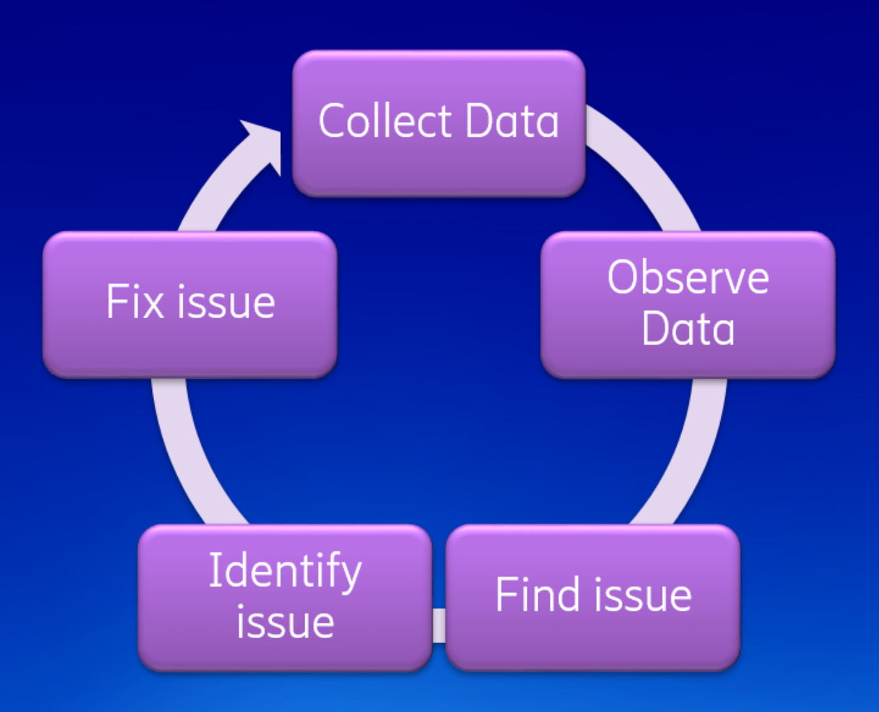 particularly evident during the startup phase. To get to this point, smart engineering was used. The Theia developers started by measuring execution time in a repeatable way. This phase is called instrumentation. After that, they observed the results and improved the performance dominators. This showed them where to look and where to optimize. After that, they identify an issue, fix it and repeat the process to continually make things faster.
The Theia developers set up a site to observe performance changes. The tests were run on github runners, which are quite fast, but more importantly, are quite stable in practical terms. Two runs on the infrastructure yielded reproducible changes.
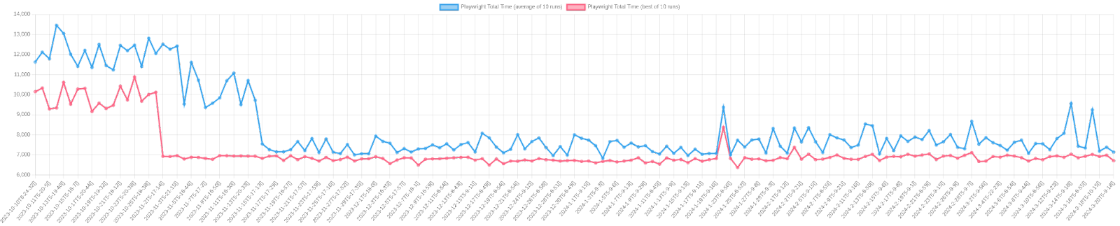
The following chart shows the total “Startup time.” It does not show a complete picture though as it does not show when users can begin to interact with the UI. You can see there were significant speedups in November, where the performance has more than doubled. The time from initialization to a responsive UI has improved by about the same factor too! There were a few observed speedups on Jan 21st. This is due to the “implement headless plug-ins” patch which defers plug-in loading. These were done by Tobias Ortmayr, Philip Langer, Jonas Helming, Stefan Dirix, Thomas Maeder and more.
The Theia developers used Eclipse Trace Compass to compare the execution times. If you’d like, you can reproduce the findings yourself. In the theia-e2e-test-suite GitHub repo, run the get_trace.py script to reproduce the experiment.
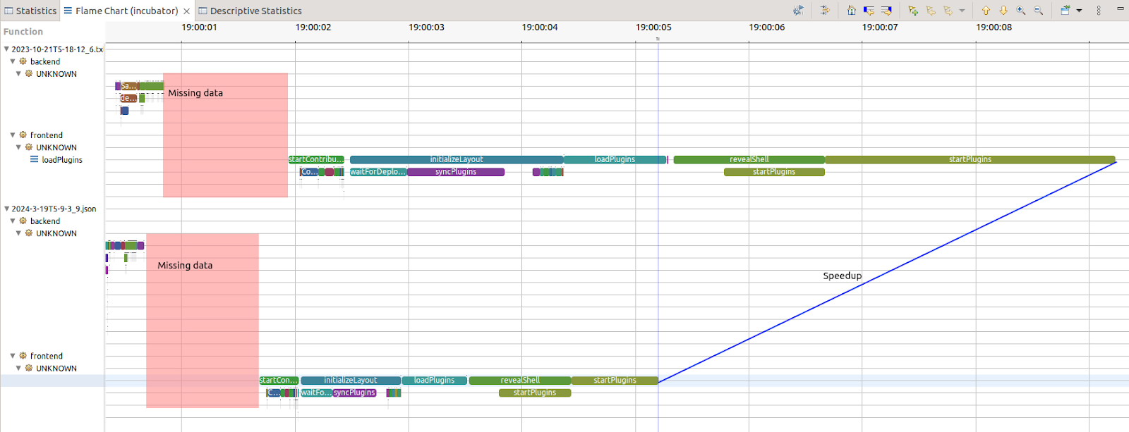
The view above is the flame chart. It shows the call stack over time. Trace Compass has the ability to synchronize two runs and compare them. With this data layout, it becomes clear that startplugins was a major dominator before, and was reduced. However, every item on the UI thread (front end) seems to have accelerated aggressively. This is great news as the UI thread is resource limited, it could require a UI thread whereas the back-end can eventually multi-threaded more easily.
We must however acknowledge the unknown. The response to first click is measured here with 20% unknown (see above the pink boxes). The unknown is probably due to the Theia plug-in being downloaded to the browser. However, it needs to be confirmed and a trace point on that transaction would need to be added
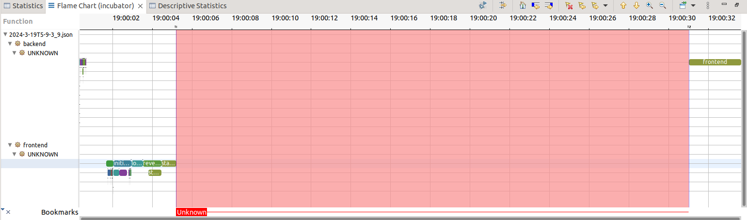
If the full transaction, i.e. the full initialization and not just interactivity, is considered, almost 80% of the time is unknown. With the data we have, it is not clear what is happening. One possibility is this is when plug-ins are lazy-loaded. It is bounded by the backend operation, and so this could be seen as a "known unknown." While this may initially seem daunting, it presents an opportunity for further exploration and refinement. For example, by instrumenting the plug-in API, the initialization time of plug-ins would be known and a misbehaving plug-in on the critical path of start-up could be identified.
Having a proper, more complete test bench and suite is an opportunity for more visibility in the long run. The partially instrumented code is a good first step, meaning that we need to instrument more, to fill in the gaps. When the code instrumentation is complete for a given test execution flow, more test flows can be then added. This then presents additional opportunities to update the instrumentation.
Will Rogers is attributed to saying “You never get a second chance to make a first impression.” The startup time is the first thing anyone sees when opening a new product, and the Theia community has optimized it, showing their concern with the user experience. This shows the general attitude and the work towards justifying the rebrand from Blueprint to IDE. Its strides in startup performance are the first step on a journey of ongoing enhancement and refinement. As the team continues down this path, the community is optimistic and anticipating what lies ahead. (spoiler alerts: backendless, remote and multi-player!)
With Eclipse Theia IDE arriving on the scene, developers have another viable contender that offers rich features, a vibrant community and a tight experience.
Matthew Khouzam,
Director, Eclipse Foundation
Product Owner/Developer, Ericsson AB
John Kellerman
Program Manager Cloud DevTools and Open VSX
Eclipse Foundation
April 02, 2024
The Open Source Community is Building Cybersecurity Processes for CRA Compliance
by Jacob Harris at April 02, 2024 02:40 PM
Apache Software Foundation, Blender Foundation, OpenSSL Software Foundation, PHP Foundation, Python Software Foundation, Rust Foundation, and Eclipse Foundation are jointly announcing our intention to collaborate on the establishment of common specifications for secure software development based on existing open source best practices.

The Open Source Community is Building Cybersecurity Processes for CRA Compliance
by Mike Milinkovich at April 02, 2024 07:00 AM
tl;dr – Apache Software Foundation, Blender Foundation, OpenSSL Software Foundation, PHP Foundation, Python Software Foundation, Rust Foundation, and Eclipse Foundation are jointly announcing our intention to collaborate on the establishment of common specifications for secure software development based on existing open source best practices.
In an effort to meet the real challenges of cybersecurity in the open source ecosystem, and to demonstrate full cooperation with, and to support the implementation of, the European Union’s Cyber Resilience Act (CRA), Apache Software Foundation, Blender Foundation, OpenSSL Software Foundation, PHP Foundation, Python Software Foundation, Rust Foundation, and Eclipse Foundation are announcing an initiative to establish common specifications for secure software development based on open source best practices.
This collaborative effort will be hosted at the Brussels-based Eclipse Foundation AISBL under the auspices of the Eclipse Foundation Specification Process and a new working group. As Europe’s largest open source foundation, which also supports a robust open specification process, the Eclipse Foundation is a natural home for this effort. Other code-hosting open source foundations, SMEs, industry players, and researchers are invited to join in as well. The starting point for this highly technical standardisation effort will be today’s existing security policies and procedures of the respective open source foundations, and similar documents describing best practices. The governance of the working group will follow the Eclipse Foundation’s usual member-led model but will be augmented by explicit representation from the open source community to ensure diversity and balance in decision-making. The deliverables will consist of one or more process specifications made available under a liberal specification copyright licence and a royalty-free patent licence.
The reasons for this collaboration extend beyond compliance. In an era where software, particularly open source software, plays an increasingly vital role in modern society, the need for reliability, safety, and security has steadily increased. New regulations, exemplified by the impending CRA, underscore the urgency for secure by design and robust supply chain security standards well before the new regulation comes into force in 2027.
While open source communities and foundations generally adhere to and have historically established industry best practices around security, their approaches often lack alignment and comprehensive documentation. The open source community and the broader software industry now share a common challenge: legislation has introduced an urgent need for cybersecurity process standards.
The CRA will lead to numerous standards requests from the Commission to the European Standards Organisations. And these are only the European requirements – additional demands from the US and other regions can be anticipated.
The CRA also creates a new type of economic actor – the “Open Source Software Steward”. It is in this context that we, as open source foundations, want to respond to the challenge of establishing common specifications for secure software development.
This challenge is compounded by the following:
- Today’s global software infrastructure is over 80% open source. The software stack that underpins any product with digital elements is typically built using open source software. As a result, it is fair to say that when we discuss the “software supply chain,” we are primarily, but not exclusively, referring to open source.
- Traditional standards organisations have had limited interactions with open source communities and the broader software/IT industry. To make matters more complicated, their governance models currently do not provide opportunities for open source communities to engage.
- Open source communities have a limited history of dealing with traditional standards organisations. To make matters more complicated, their resource constraints make it difficult for them to engage.
- Standards setting is typically a long process, and time is of the essence.
So while these new cybersecurity standards must be developed with the requirements of open source development processes and communities in mind, there is no clear path on how to do so in the time available. It is also important to note that it is similarly necessary that these standards be developed in a manner that also includes the requirements of proprietary software development, large enterprises, vertical industries, and small and medium enterprises.
Despite these challenges, a foundation for progress exists. The leading open source communities and foundations have for years developed and practised secure software development processes. These are processes that have often defined or set industry best practices around things such as coordinated disclosure, peer review, and release processes. These processes have been documented by each of these communities, albeit sometimes using different terminology and approaches. We hypothesise that the cybersecurity process technical documentation that already exists amongst the open source communities can provide a useful starting point for developing the cybersecurity processes required for regulatory compliance.
We hope that our specifications could inform the formal standardisation processes of at least one of the European Standards Organisations. Given the tight time horizon for implementation of the CRA, we believe that this immediate start will provide a constructive environment to host the technical discussions necessary for the stewards, contributors, and adopters of open source to meet the requirements set forth in these new regulations.
We invite you to join our collaborative effort to create specifications for secure open source development: Contribute your ideas and participate in the magic that unfolds when open source foundations, SMEs, industry leaders, and researchers combine forces to tackle big challenges. To stay updated on this initiative, sign up for our mailing list.
March 19, 2024
Visualizing Eclipse Collections after Twenty Years of Development
by Donald Raab at March 19, 2024 07:37 PM
It’s hard to see the forest when you keep walking among the trees.
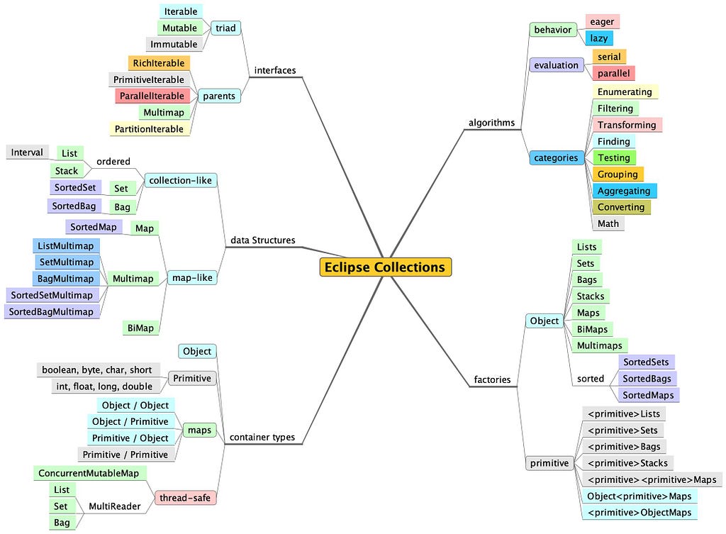
This year is the 20th year that I have been working on Eclipse Collections. To kick off the official 20th anniversary celebration in a technical blog, I wanted to create a fresh visualization of Eclipse Collections features to get new developers acquainted with this amazing library.
In a code base with many packages, many types, and over one million lines of code (including test code), it can be easy to get lost browsing while looking through files. There is an organized package structure to Eclipse Collections, but if you are new to the library, it may not be obvious where to get started. I’m leaving this mind map here, with some useful links to help folks find the things they might be looking for.
This blog may be the “Just getting started” guide some folks are looking for as they begin their journey of discovery. Eclipse Collections contains everything I ever wanted in a collections library for Java. I hope Eclipse Collections will be the same for many of you. My intention in writing this blog is for it to be a good reference for using the library in your development adventures. I plan to refer to it myself on my own continuing adventures over the next 5… 10… 15… maybe 20 years.
Good luck and enjoy your journey!
Interfaces
If you want to find the interfaces, you need to look at the eclipse-collections-api module. In this module you will find most of the parent interfaces, like RichIterable, PrimitiveIterable, and ParallelIterable. Multimap and PartitionIterable are located in two different packages. Eclipse Collections had a design goal of cleanly separating interface from implementation. We want developers to refer only to interfaces whenever possible. This module contains primarily interfaces. The one exception to this are collection factory classes, which are loaded with implementations dynamically.
In order to understand the symmetry of the triad of interfaces, which include an Iterable, Mutable, and Immutable version for each type (e.g. ListIterable, MutableList, ImmutableList), I recommend reading the following blog.
Rich, Lazy, Mutable, and Immutable Interfaces in Eclipse Collections
There is only one LazyIterable interface. LazyIterable is not a parent interface, as it extends RichIterable. LazyIterable substitutes co-variant overrides for any methods that should be lazy and return a LazyIterable. Any collection type, whether iterable, mutable or immutable can create a lazy view of itself by calling asLazy(), which will return a LazyIterable.
Data Structures
The data structures for Eclipse Collections are split between interfaces and implementation. The interfaces are located at the module and links I shared above. The implementations are located in the eclipse-collections module. The types you are probably most interested are the implementations of List, Set, Map, and Bag. The Mutable implementations of these types in Eclipse Collections are named FastList, UnifiedSet, UnifiedMap and HashBag. Most of the time you will never see these names in code, assuming you are using the interfaces MutableList, MutableSet, MutableMap, and MutableBag and create the collections using the Lists, Sets, Maps, and Bags factories.
Container Types
There are Object and primitive containers in Eclipse Collections. For Map types, there are Object/Object, primitive/primitive, Object/primitive, and primitive/Object combinations. There are also some thread-safe container types in Eclipse Collections including both concurrent and MultiReader containers.
The best way to learn about the specialized Data Structures and Container Types in Eclipse Collections is to check out the following blog series.
Blog Series: The missing Java data structures no one ever told you about
Algorithms
Eclipse Collections supports eager and lazy behaviors, as well as serial and parallel evaluation. The best way to understand the difference between eager and lazy behaviors is to read the following blog. You can also learn how the library evolved support from eager, to fused, to lazy over time.
The above blog only covers serial examples. If you would like to read more about the parallel capabilities in Eclipse Collections, the following blog is a great place to start.
The unparalleled design of Eclipse Collections
Java is missing a feature that I remember fondly from my days as a Smalltalk developer. The missing feature is a code organization tool known as Method Categories. Method categories allow you to group methods together in a class. The following are the categories I would use in Eclipse Collections types if a method categorization feature was available in Java.
✅ Enumerating
✅ Filtering
✅ Transforming
✅ Finding
✅ Testing
✅ Grouping
✅ Aggregating
✅ Converting
✅ Math
The following blog covers some of the features in the categories above. There are over 100 methods on the RichIterable parent interface, and even more in subtypes. Most of the methods fit in one of these categories.
Getting Started with Eclipse Collections — Part 4
Factories
Eclipse Collections includes factories for Mutable, Immutable, MultiReader and other more specialized types. The factory classes in Eclipse Collections are named by taking a type name (e.g., List) and pluralizing it (e.g. Lists). The following blogs will teach you everything you ever wanted to know about the collection factories in Eclipse Collections.
- As a matter of Factory — Part 1 (Mutable)
- As a matter of Factory — Part 2 (Immutable)
- As a matter of Factory — Part 3 (Method Chaining)
Twenty Years! Woo hoo!
In 2004, I didn’t think I would ever contribute anything to open source. I certainly didn’t think I would create something that would be open sourced from Goldman Sachs and used and contributed to by so many developers and projects. Here I am in 2024, celebrating 20 years of using and working on this amazing library. Crazy!
I think all that is left is to tell you how to download the library in your own projects. Of course, there is a blog for that.
Getting Started with Eclipse Collections — Part 1
Thank you for reading this blog, and for spending your valuable time learning some things about Eclipse Collections. I hope the library will be as useful and inspiring to you as it has been to me. If you find it useful and would like to contribute, we always welcome new contributors. If you don’t have a code contribution, but would like to advocate for and help others discover cool features in the library, then write a blog or an article. I keep a running list of articles about Eclipse Collections updated on the GitHub wiki linked below.
Enjoy!
I am the creator of and committer for the Eclipse Collections OSS project, which is managed at the Eclipse Foundation. Eclipse Collections is open for contributions.
Jakarta EE Developer Survey 2024
by Jacob Harris at March 19, 2024 01:25 PM
The 2024 Jakarta EE Developer Survey is now open! Through this annual survey, we want to gather valuable insights into the needs, priorities, and requirements of the enterprise Java developer community.
March 13, 2024
WTP 3.33 Released!
March 13, 2024 02:00 PM
March 12, 2024
Reminder: Eclipse Theia Community Call March 14th, 2024
by John Kellerman at March 12, 2024 03:52 PM
The Eclipse Theia community is a dynamic and expanding ecosystem, reflecting the dedicated efforts and enthusiasm of its members. The Theia Community Call is an open forum intended to provide updates on Theia, foster discussion within the ecosystem, and engage the community of Theia adopters, contributors, and users. This call presents an valuable opportunity to stay informed about the latest in Theia, contribute to its ecosystem, and partake in discussions with fellow community members.
Why Attend?
The Theia Community Call serves as an important venue for:
- Gaining comprehensive updates on Theia and its surrounding ecosystem.
- Participating in discussions about the project's progress, challenges, and opportunities.
- Offering suggestions and agenda items, thereby contributing to Theia's future direction.
Your involvement and feedback play a vital role in Theia's ongoing development. Whether you are deeply involved in the project or have a budding interest, your participation is greatly welcomed and appreciated.
Meeting Details
- Date: March 14th, 2024
- Time: 4pm Central European Time (CET)
- Location: Zoom Meeting
- Meeting ID: 820 4658 7932
- Passcode: 117021
Agenda Highlights
- Community Update by Jonas: An in-depth update on the most recent developments and releases within the Theia community.
How to Contribute
We encourage the community to actively contribute to the agenda. If you have topics, questions, or discussions in mind that you believe would benefit the community, please propose your ideas by initiating a [discussion](https://github.com/eclipse-theia/theia/discussions) and tagging @JonasHelming. Your insights and contributions are essential for a diverse and enriching conversation.
Navigating the IoT & Edge Landscape: Insights from the 2023 Commercial Adoption Survey Report
by Clark Roundy at March 12, 2024 01:42 PM
We are excited to introduce the much-anticipated fifth edition of the Eclipse Foundation’s annual IoT & Edge Commercial Adoption Survey Report. The latest findings shed light on some of the shifts within the industry that unfolded over the past year, and how certain trends have persisted. Let’s take a look at a few of the key takeaways and explore what they mean for the future of IoT and edge computing:
A Noteworthy Rise in IoT Adoption
The numbers speak for themselves – in 2023 there was a remarkable 11% increase in IoT adoption, with 64% of respondents now deploying IoT solutions. This surge signals a growing recognition of the value and potential that IoT technologies offer across various industries. Moreover, an additional 23% are gearing up to embrace IoT, with plans to deploy within the next 12-24 months.
Steady Adoption, Anticipated Acceleration in Edge Computing
While IoT adoption demonstrated healthy growth, the adoption rate of edge computing remained steady year-over-year at 33%. Nevertheless, it would seem that an adoption surge is on the horizon, with 30% planning deployments within the next 24 months. Meanwhile, an additional 27%, are evaluating the potential use of edge computing platforms, while only 10% remain on the sidelines. This all points to organisations taking a cautious but optimistic approach, with an anticipated acceleration of edge technology adoption for enhanced data processing and analysis closer to the source. Machine learning at the edge is a possible driver here.
A Trend Towards Larger Financial Commitments
Confidence in IoT and edge technologies is on the rise, reflected in a notable shift towards higher investments. In 2023, 17% reported spending between $1-10 million, more than doubling the percentage from 2022, and projections show this growing to 23% in 2024. Furthermore, 5% anticipate spending over $10 million, indicating a trend towards substantial financial commitments in these domains.
Deployments are Scaling Up
The scale of IoT and edge deployments is also evolving, with 10% of deployments now consisting of 50,000 or more devices. This shift towards larger deployments is accompanied by an almost equal mix between greenfield and brownfield implementations, indicating diverse approaches to integrating new and existing technologies.
Organisations Recognize the Strategic Value of IoT & Edge Tech
A notable development in 2023 is the increased influence of C-suite executives in driving decisions related to IoT and edge investments. Nearly half of participating organisations report that their investment choices are predominantly driven by top-level executives, a substantial rise from 38% in 2022. This trend underscores the strategic importance of IoT and edge technologies in shaping business directions and outcomes.
The Rising Tide of Open Source
Open source technologies have taken centre stage in the deployment of IoT and edge solutions, with a whopping 75% of organisations actively incorporating open source into their plans. This overwhelming embrace reflects the critical role open source plays in fostering innovation, flexibility, and collaboration in the development of IoT and edge solutions.
As organisations increasingly recognise the value of these technologies, the trends toward larger deployments, higher investments, and the strategic involvement of the C-suite are likely to continue. Moreover, the embrace of open source technologies signifies continual viability of open, collaborative, and innovative approaches to technology deployment. To learn more about open source in IoT and edge computing, explore our industry collaborations like Eclipse IoT, Sparkplug, and the Edge Native special interest group (SIG).
While these are some of the high level takeaways from this year’s survey, I encourage you to dive into the report yourself. These insights aren't just reflections of our past, but serve as a guide for the future of IoT and edge computing. Let’s keep the conversation going, collaborate often, and collectively continue to shape the path forward.
The Eclipse Foundation Unveils 2023 IoT and Edge Commercial Adoption Survey Insights
by Jacob Harris at March 12, 2024 10:45 AM
BRUSSELS – 12 March 2024 – The Eclipse Foundation, one of the world’s largest open source foundations, today announced the availability of its 2023 IoT and Edge Commercial Adoption Survey Report, a comprehensive analysis derived from responses of over 1067 professionals in the IoT and edge computing domain. Conducted online from 4 April to 5 July 2023, the survey offers valuable insights into the evolving IoT and edge computing ecosystems by identifying the requirements, priorities, and challenges faced by organisations that deploy and use commercial solutions, including those based on open source technologies.
“Consistent with our previous surveys, the continuous growth and adoption of IoT and edge computing remains evident. The data reflects a notable increase in the number of managed devices and larger investments, indicative of a scale-up in deployments,” said Mike Milinkovich, executive director of the Eclipse Foundation. “Particularly notable is that the C-suite significantly influences decision-making for IoT and edge investments. This underscores the strategic value that businesses place on solutions based on open technologies in real-world deployments. Open source components are recognised as vital enablers of success.”
Survey participants represent a broad range of industries and job functions. Six of the key takeaways from the survey data include:
- IoT Adoption Surged in 2023: 64% of respondents are now deploying IoT solutions, up from 53% in 2022. An additional 23% plan to deploy within 12-24 months. Less than 5% have no IoT deployment plan.
- Edge Computing Adoption Holds Steady, Acceleration Anticipated: Adoption of edge computing solutions remains at 33% (same as 2022), with an additional 30% indicating plans to deploy within the next 24 months. 27% are still evaluating edge platforms, while only 10% have no plans to deploy edge solutions.
- Rising Investments Signal Scale-Up in Production Deployments: 17% of respondents spent between $1-10M in 2023 (more than double that of 2022), growing to 23% in 2024. 5% anticipate spending over $10M. This trend indicates a transition from proof-of-concept to ROI-focused deployments.
- Growing Number of IoT & Edge Assets per Deployment: Deployments of fewer than 1K managed assets will remain steady or decline, while larger deployments are on the rise, with an impressive 10% of deployments consisting of 50K or more devices. Regarding asset implementation, the mix between greenfield and brownfield is almost equal.
- IoT is Increasingly Strategic with the C-Suite Driving Investment Decisions: 49% of organisations reveal that the C-suite predominantly drives decisions. This marks a significant increase from the 38% reported in 2022, indicating a growing influence of top-level executives in shaping investment choices within the realm of IoT and edge technologies.
- 75% of Organisations Surveyed Embrace Open Source in IoT and Edge: 75% of organisations are actively incorporating open source into their deployment plans. The widespread use of IoT and edge solutions based on open source technologies highlights how open source has become key in shaping today's technology landscape.
The report also delves into industry-specific insights on IoT and edge adoption, highlights the primary concerns and challenges encountered by commercial adopters, and provides actionable recommendations for navigating the evolving landscape. To find out more, download the 2023 IoT & Edge Commercial Adoption Survey Report.
The IoT and Edge Commercial Adoption Survey is sponsored by the Eclipse IoT and Sparkplug Working Groups. It serves as a valuable complement to the annual IoT Developer Survey, a vital source of strategic insights from the development front lines. The Eclipse IoT community represents one of the largest IoT-focused open source collaborations in the world, with 45 members and over 50 projects. Eclipse IoT projects have been broadly adopted by leading organisations across a variety of verticals to deliver commercial IoT and edge-based solutions and services.
To learn more about how to get involved with the Eclipse IoT, Sparkplug, or other Eclipse Foundation industry collaborations, visit the Eclipse Foundation membership page. Members benefit from a broad range of services, including exclusive access to detailed industry research findings, marketing assistance, and expert open source governance.
For further IoT & edge related information, please reach us at:
Moreover, mark your calendars for the inaugural Open Code Experience (OCX) by the Eclipse Foundation, dedicated to open source software development. Join us 22-24 October 2024 in Mainz, Germany.
About the Eclipse Foundation
The Eclipse Foundation provides our global community of individuals and organisations with a business-friendly environment for open source software collaboration and innovation. We host the Eclipse IDE, Adoptium, Software Defined Vehicle, Jakarta EE, and over 415 open source projects, including runtimes, tools, specifications, and frameworks for cloud and edge applications, IoT, AI, automotive, systems engineering, open processor designs, and many others. Headquartered in Brussels, Belgium, the Eclipse Foundation is an international non-profit association supported by over 360 members. Visit us at this year’s Open Code Experience (OCX) conference on 22-24 October 2024 in Mainz, Germany. To learn more, follow us on social media @EclipseFdn, LinkedIn, or visit eclipse.org.
Third-party trademarks mentioned are the property of their respective owners.
###
Media contacts:
Schwartz Public Relations for the Eclipse Foundation, AISBL (Germany)
Stephanie Brüls / Susanne Pawlik
Sendlinger Straße 42A
80331 Munich
EclipseFoundation@schwartzpr.de
+49 (89) 211 871 – 64 / -35
Nichols Communications for the Eclipse Foundation, AISBL
Jay Nichols
+1 408-772-1551
514 Media Ltd for the Eclipse Foundation, AISBL (France, Italy, Spain)
Benoit Simoneau
M: +44 (0) 7891 920 370
March 07, 2024
Eclipse Theia 1.47 Release: News and Noteworthy
by Jonas, Maximilian & Philip at March 07, 2024 12:00 AM
We are happy to announce the Eclipse Theia 1.47 release! The release contains 64 merged pull requests and we welcome four new contributors. In this article we will highlight some selected improvements...
The post Eclipse Theia 1.47 Release: News and Noteworthy appeared first on EclipseSource.
March 06, 2024
2024 Eclipse Foundation Board Election Results
by Gesine Freund at March 06, 2024 02:00 PM
2024 Eclipse Foundation Board Election Results
The Eclipse Foundation would like to thank everyone who participated in this year’s election process and is pleased to announce the results of the 2024 Eclipse Foundation Contributing Member and Committer Member elections for representatives to the foundation’s board. These positions are a vitally important part of the Eclipse Foundation's governance.
Hendrik Ebbers, Johannes Matheis are returning, and Angelo Corsaro will be joining as the Contributing Member representatives. Ed Merks, Matthew Khouzam, and Shelley Lambert will all be returning as the Committer representatives. Congratulations! We're looking forward to working with them on the Board, effective April 1, 2024.
We thank George Adams, Torkild Ulvøy Resheim, Thomas Mäder, and Carlo Piana for running in this year’s election.
We also thank Gunnar Wagenknecht for his many years of service to the Eclipse Foundation Board.
March 05, 2024
Eclipse Cloud DevTools Digest - January and February, 2024
by John Kellerman at March 05, 2024 05:50 PM
Eclipse Cloud DevTools Contributor Award for 2023 goes to EclipseSource and TypeFox
The Eclipse Cloud DevTools Contributor Award for the year 2023 was to two remarkable companies, EclipseSource and TypeFox, in acknowledgment of their enormous, continuous, strategic, and sustainable contributions to the Eclipse Cloud DevTools ecosystem.
Adopter Story: Code RealTime
In an earlier article, I wrote about Code RealTime, an innovative tool for creating stateful, event-driven real time applications in C++, created by HCL and IBM and using the strengths of the Eclipse Cloud DevTools open source ecosystem, including Eclipse Theia and Eclipse GLSP.
Languim

Markus Rudolph of TypeFox provided a nice, instructive article on atting a React webview using Langium to a VS Code extension, resplendent with code examples.
Unveiling the Power of Open VSX
In this article we discuss the success we've seen in the extensions hosted at Open VSX, an open source registry for VS Code extensions, providing a decentralized and community-driven alternative to the Visual Studio Code Marketplace.
Cloud DevTools Articles from EclipseSource
Jonas, Maximilian, and Philip of EclipseSource were busy in January and February with a series of informative articles about building and running cloud based IDEs. The article on AI integration for tools and IDEs is an especially worthy read.
- Why Every Tool and IDE Project Should Care About AI Integration
- The Eclipse Theia Project Update 2023
- Real-time Collaboration on Diagrams with Eclipse GLSP
- Building Custom C/C++ Tools: CDT Cloud and Eclipse Theia in Action
- Accessibility in Diagram Editors with Eclipse GLSP
- Running Eclipse Theia without a backend
- Hosting IDEs and tools online - lessons learned
- CDT Cloud Blueprint: Tracing with TraceCompass Cloud
- The Choice of an IDE and Tool Platform: Eclipse Theia vs. Code OSS
GLSP 2.0!
Jonas, Maximilian & Philip announced GLSP 2.0, a major release. GLSP (Graphical Language Server Platform) is a framework for web-based diagram editors. Enhancements in 2.0 include improved JSON model support, helper lines for better element alignment, reconnectable server connections, ghost element rendering, front-end only support, among many other things
JKube 1.16 is Available
The JKube team announced the availability of 1.16. Enhancements included, among other things, a Helm Lint feature, support for Kube Recommended labels and updated base images.
The Eclipse Theia Community Release 2024-02
Jonas, Maximilian & Philip also, in this article, tell us about their latest Theia Community Release. 2024-02 includes a beta release of Theia IDE, portable mode support, and number of other enhancements.
Other Recent Releases
Cloud Tool Time Webinars
We are now scheduling Cloud Tool Time webinars for 2023. Be sure to Sign up now to get on the calendar and let us help tell your story. You can see past sessions on our Youtube channel.
Eclipse Cloud DevTools Projects

Explore the Eclipse Cloud DevTools ecosystem! Check out our projects page to find out more about open source innovation for cloud IDEs, extension marketplaces, frameworks and more.
Getting Listed on the Cloud DevTools Blog
If you are working with, or on, anything in the Cloud DevTools space, learn how to get your writings posted in our blog section.
Eclipse Cloud DevTools Contributor Award: Marc Dumais for Simplifying License Management
by John Kellerman at March 05, 2024 05:48 PM
The Eclipse Cloud Developer Tools (ECDT) community is happy to announce Marc Dumais as the recipient of the Contributor Award for the first quarter of 2024. This is in recognition of Marc's outstanding contributions that have significantly simplified third-party license checks across ECDT projects, contributing to enhanced project integrity and compliance.
Marc significantly simplified the approach to third-party license (3PP) checks. Traditionally, these checks have been a cumbersome and manual necessity, often slowing down project development. Marc created a modular, more configurable wrapper to dash-licenses, now available as the npm package @eclipse-dash/nodejs-wrapper. This tool, developed under the Eclipse Foundation's technology.dash project, makes license compliance checks more accessible and streamlined for projects within and beyond the ECDT ecosystem. For those interested in the technical intricacies of this contribution, the integration details and its application can be explored in depth here.
This contribution by Marc transcends the code; it exemplifies the spirit of collaboration and innovation that the ECDT community holds dear. By not only addressing a need within a project he was directly involved in, but also championing the solution for wider adoption, Marc has significantly eased the burden of license compliance for numerous projects within our community.
Marc Dumais is no stranger to the ECDT ecosystem. His long-standing commitment and versatile contributions across several projects, including Eclipse Theia, TraceCompass Cloud and CDT Cloud, have been instrumental in the shaping and evolution of the ecosystem.
We extend our warmest congratulations to Marc Dumais for this well-deserved recognition!
This Eclipse Cloud DevTools contributor award is sponsored by EclipseSource, providing consulting and implementation services for web-based tools, Eclipse GLSP, Eclipse Theia, and VS Code.

Langium 3.0 is Released!
March 05, 2024 12:00 AM
March 04, 2024
Join Us: Reminder for the Eclipse Theia Community Call! March 14th
by Jonas, Maximilian & Philip at March 04, 2024 12:00 AM
As the date approaches, we want to extend another warm invitation to the Eclipse Theia Community Call scheduled for March 14th, 2024, 4pm CET. It’s a great opportunity to dive deep into the...
The post Join Us: Reminder for the Eclipse Theia Community Call! March 14th appeared first on EclipseSource.
March 02, 2024
Visualizing My Java Champion Journey
by Donald Raab at March 02, 2024 04:34 AM
Mind mapping memories and metrics from the before and after times.
The Journey Continues
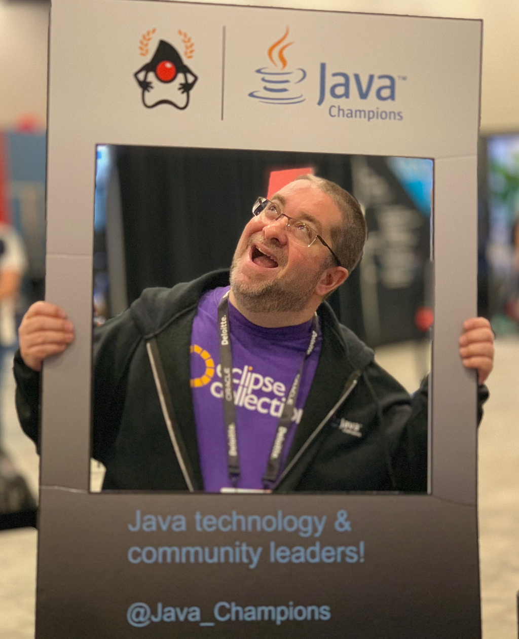
Last year I captured a blog with a mind map including the things I believe had contributed to me being selected as a Java Champion in 2018. This week I captured a mind map of everything I have done in similar categories since 2018. There was some missing time in the conference talks due to the pandemic, but I made up some lost ground last year with four conference talks. I spoke at Devnexus 2023, QCon New York 2023, Devoxx Greece 2023, Devoxx Belgium 2023. I’m not going to write too much text in this blog. I will just leave the before and after Java Champion mind maps for comparison, along with a photo from my first talk as a Java Champion from Oracle CodeOne 2018.
Before Java Champion
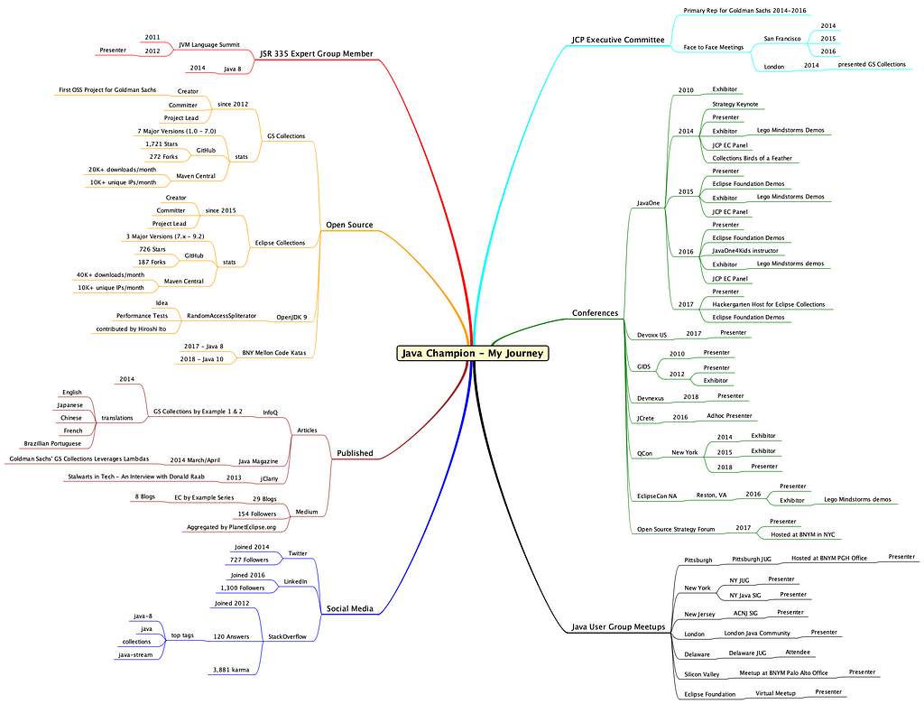
After Java Champion

Mapping the Memories
One benefit I have seen out of this activity is quantifying the resulting impact on the communities and initiatives I have been involved with over time. I will try to capture an update every few years so I can have snapshots of how my journey is evolving.
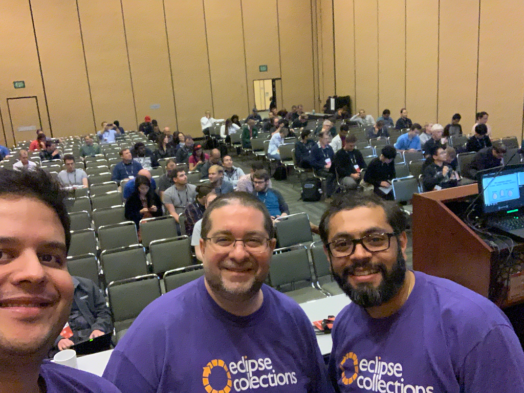
It was very nostalgic for me, going back through old photos and recalling things that can be easily forgotten. I am including a photo below from Oracle CodeOne 2018, which was the first conference I spoke at where I was able to add Java Champion to my speaker bio. Some of the benefits of speaking at and attending technical conferences are the amazing people you get to meet, and the global network you can grow if you invest some time and energy in building connections. It helps to find good places to meet for coffee before, during and after a conference.
Thank you for reading, and best of luck on your journeys!
I am the creator of and committer for the Eclipse Collections OSS project, which is managed at the Eclipse Foundation. Eclipse Collections is open for contributions.
February 27, 2024
2023 in Review: Eclipse Software Defined Vehicle (SDV) Accelerates Automotive Tech Innovation through Open Source Collaboration
by Jacob Harris at February 27, 2024 12:00 PM
BRUSSELS – February 27, 2024 – The Eclipse Foundation, one of the world’s largest open source foundations, in conjunction with the Eclipse Software Defined Vehicle (SDV) Working Group, today announced highlights of its many accomplishments and overall progress in 2023, along with a preview of what’s coming in 2024 and beyond. During the past year, Eclipse SDV launched more than a dozen new projects, hosted multiple events, and added leading OEMs like GM and Mercedes, while growing the overall membership by 14 new members. Most importantly, the working group began hosting code that is already planned for use in real-world production.
“The SDV Working Group experienced significant growth in 2023, and we anticipate this momentum to not only continue but also accelerate in 2024,” said Mike Milinkovich, executive director of the Eclipse Foundation. “Aligned with our community’s commitment to industry transformation, our primary objectives are twofold: first, establishing a code-first open source community dedicated to delivering production-ready software platforms; and second, cultivating a robust vendor-neutral ecosystem that is focused on delivering tangible value across the automotive value chain. To realise these ambitions, our focus is on crafting open source processes that ensure automotive-grade quality management, functional safety, and supply chain security.”
Eclipse SDV enjoyed a notable surge in membership and experienced substantial project expansion throughout 2023. New members, including Cummins, DENSO, General Motors, HARMAN, LG Electronics, Mercedes-Benz Tech Innovation, and Qualcomm Innovation Center, demonstrate the quality and diversity of organisations that have recently joined the working group. Members currently contribute to and collaborate on 26 different projects, including technologies focused on fleet management, software orchestration and other real-world applications.
Building the SDV Ecosystem
In 2023, Eclipse SDV was dedicated to fostering collaboration and community growth, evident through numerous community events, strategic project additions, and alliances with automotive-focused organisations. The year marked several noteworthy highlights, showcasing our unwavering commitment to innovation in the automotive tech landscape:
- Inaugural Automotive Open Source Summit Success:
In early June, Eclipse SDV successfully launched its first-ever Automotive Open Source Summit. The event attracted industry leaders from over 30 organisations including Bosch, Cariad (VW Group), the European Commission, Microsoft, Mercedes-Benz Tech Innovation, and ZF Group. Geared towards automotive tech executives, thought leaders and senior managers, the summit showcased speakers from Eclipse automotive initiatives and beyond. Due to its resounding success, a second summit is scheduled for May 14, 2024, in Starnberg, Germany.
- Eclipse Foundation Joins FEDERATE for Auto Ecosystem Growth:
Demonstrating its commitment to the EU auto ecosystem, the Eclipse Foundation joined FEDERATE, a project funded by Chips Joint Undertaking. This public-private partnership, supported by the Horizon Europe Framework Programme, unites major automotive players and industrial SDV initiatives. FEDERATE aims to accelerate the development of a future vehicle ecosystem, fostering collaboration, and supporting Research, Development and Innovation activities, aligning both software and hardware for the Software Defined Vehicle of the Future.
- Global Expansion and Community Day Engagement:
Following successful SDV Community Days in Lisbon (hosted by Microsoft) and Friedrichshafen (hosted by ZF Group), the SDV Working Group hosted another community event at EclipseCon in October, drawing over 100 attendees. The subsequent month saw an expanded global presence with appearances at events like SFCON 2023 in Bolzano, AutoTech: Europe in Berlin, SDVCON in Heilbronn, and Automotive IQ SDV week in Munich. Marking another milestone, the SDV Working Group participated in its inaugural event in Asia, EdgeTech + in Japan, connecting with major OEMs and hosting a local meet & greet at LG Electronics in Korea.
- Successful Munich Hackathon Showcases SDV Innovation:
In late November, Eclipse SDV organised a hackathon in Munich, Germany, held at Accenture’s Munich office. The event brought together automotive software enthusiasts to experiment with SDV tools and blueprints, build new features, and explore new ideas in vehicle development. With over 100 registrants organised into 15 teams, the hackathon yielded impressive results, drawing participants from across the globe and fostering collaboration and innovation in automotive software development.
- A Safety-Certified Open Source RTOS Now Under Eclipse Foundation Governance:
In a groundbreaking move, Microsoft unveiled plans to transition Azure RTOS, along with all its components, to the Eclipse ThreadX open source project under Eclipse Foundation governance. The Eclipse ThreadX project will be under the purview of the Eclipse SDV Working Group. With a staggering 12 billion devices already deployed, this well-established technology takes centre stage, especially in the automotive sector. As the sole open source Real-Time Operating System (RTOS) boasting multiple safety and reliability certifications, including IEC 61508, IEC 62304, ISO 26262, and EN 50128, the transition to open source will mark a significant industry milestone. The added EAL4+ Common Criteria security certification further solidifies its position in the automotive technology landscape.
Looking ahead, a primary objective in this new year is to enhance collaboration within the Eclipse SDV Working Group and foster stronger connections across our diverse projects. Additionally, we are committed to achieving more seamless integration of communication protocols such as Eclipse uProtocol and Eclipse Zenoh within the SDV ecosystem. Another key initiative is the introduction of Eclipse SDV Blueprints, aimed at showcasing the capabilities of SDV projects targeting real-world use cases such as fleet management and software orchestration.
Join the Eclipse SDV Working Group
Discover opportunities to actively contribute to the global centre of gravity for software defined vehicle innovation and collaboration. Our diverse membership of industry leaders, united by a code-first approach, drives innovation that is actively being adopted by the industry today. We offer an inclusive platform for companies of all sizes to contribute, ensuring a level playing field. Explore detailed membership information here.
Explore Our Vision Paper
To delve deeper into the Eclipse SDV Working Group's vision for the industry, we encourage you to download the SDV Vision Paper. This comprehensive document provides a detailed overview of the organisation's goals and predictions for the future of vehicle design.
Upcoming Events and Opportunities
Get to know the Eclipse SDV Community by attending our upcoming SDV Community Day in Graz on February 28-29, 2024. This event promises valuable insights into SDV Working Group projects and offers opportunities to connect with other members of the automotive tech community.
For a firsthand look at SDV projects and to network with other members, consider joining us at the annual Bosch Connected World event in Berlin from February 28-29, 2024. Register for the event to access the Eclipse SDV and Eclipse Foundation exhibitor's space on-site. See us in Booth G6.
Later this year, the Eclipse Foundation will be hosting its inaugural event focused on automotive open source at the Open Code for Automotive conference, co-located with its newest global event for open source software, the Open Code Experience (OCX), taking place on 22-24 October 2024 in Mainz, Germany.
About the Eclipse Foundation
The Eclipse Foundation provides our global community of individuals and organisations with a business-friendly environment for open source software collaboration and innovation. We host the Eclipse IDE, Adoptium, Software Defined Vehicle, Jakarta EE, and over 415 open source projects, including runtimes, tools, specifications, and frameworks for cloud and edge applications, IoT, AI, automotive, systems engineering, open processor designs, and many others. Headquartered in Brussels, Belgium, the Eclipse Foundation is an international non-profit association supported by over 360 members. Come visit us at this year’s Open Code Experience (OCX) conference, taking place on 22-24 October 2024 in Mainz, Germany. To learn more, follow us on social media @EclipseFdn, LinkedIn, or visit eclipse.org.
Third-party trademarks mentioned are the property of their respective owners.
###
Media contacts:
Schwartz Public Relations for the Eclipse Foundation, AISBL (Germany)
Gloria Huppert, Franziska Wenzl
EclipseFoundation@schwartzpr.de
+49 (89) 211 871 - 70 / - 58
Nichols Communications for the Eclipse Foundation, AISBL
Jay Nichols
+1 408-772-1551
514 Media Ltd for the Eclipse Foundation, AISBL (France, Italy, Spain)
Benoit Simoneau
M: +44 (0) 7891 920 370

Access Ditto Things from an Asset Administration Shell
February 27, 2024 12:00 AM
Integrating digital representations of devices into an IT infrastructure is a recurring task in different domains and application areas. To address this challenge in Industry 4.0 scenarios along the supply chain, the community specified the Asset Administration Shell within the Industrial Digital Twin Association (IDTA) to handle all kinds of information of a physical asset over its lifecycle.
Eclipse Ditto provides a backend for handling such device data as Things and takes care of a number of general tasks that are otherwise easy to be done wrong, such as handling device connectivity over different protocols or state management. Therefore, it is promising to use the benefits of Eclipse Ditto for populating an AAS infrastructure when the devices already communicate with an existing instance of Eclipse Ditto.
In this post we want to share our solution and learnings from setting up an AAS infrastructure based on Eclipse Basyx and Eclipse Ditto as a source for device state.

Figure 1: User-device interaction via BaSyx and Ditto
Background
We start with some background on the AAS and Eclipse Basyx. If you are allready familiar with both, it is safe to skip this section.
Asset Administration Shell
The Asset Administration Shell (AAS) is a standardization effort of the Industrial Digital Twin Association (IDTA) that originated from the Platform Industry 4.0 (I4.0) (AAS Spec Part I; AAS Spec Part II).
An AAS is a digital representation of a physical asset and consists of one or more submodels. Each submodel contains a structured set of submodel elements. Submodels, as well as their submodel elements, can either be a type or an instance. The AAS metamodel defines the possible elements for modeling an AAS like Asset, AssetAdminstrationShell (AAS), Submodel (SM), SubmodelElementCollection (SMEC), Property, and SubmodelElement (SME). You can find further details here and here.
A user who wants to interact with an AAS over HTTP follows the sequence of service calls depicted in Figure 2. The flow starts by requesting an AAS ID from the AAS discovery interface based on a (local) specific asset ID or a global asset ID. An example of such an asset ID is a serial number written on the device. With the AAS ID, the user retrieves the endpoint for the AAS through the AAS registry interface. The user then requests the SM ID from that AAS endpoint and uses this SM ID to get the SM endpoint from the SM Registry. From that SM endpoint, the user can request the SME, which contains the required value.

Figure 2: Sequence of data flow through AAS infrastructure
If you want to dig deeper into the specifics of the AAS, consult the AAS Reading Guide, which helps the interested reader to navigate through the available material.
Eclipse BaSyx
Eclipse BaSyx is an open-source project hosted by the Eclipse Foundation providing components to deploy an Industry 4.0 middleware. Apart from other features, Eclipse BaSyx provides several easy-to-use off-the-shelf components to realize an AAS infrastructure:
You can pull them from Docker Hub or follow the instructions to build them yourself.
In this post, we mainly work with the AAS Server Component and the Registry Component.
Architectural Considerations
Making Eclipse Ditto Things available in an AAS infrastructure, in our case from the Eclipse Basyx project, boils down to making Thing data available as Submodels of an AAS accessible via the AAS Interface.
We see three approaches to achieve this:
- BaSyx AAS SM server pulls the current state from Eclipse Ditto via a wrapper around Eclipse Ditto. This approach requires the creation of a custom AAS infrastructure around Eclipse Ditto without the chance of reusing existing components of the Eclipse Basyx project. The Eclipse Ditto project followed a comparable approach to support Web of Things (WoT) definitions, which is another specification to integrate IoT devices from different contexts and align their utilized data model. Ditto now allows the generation of new Things based on a WoT Thing Description.
- BaSyx AAS SM server pulls the current state from Eclipse Ditto via a bridge component, which Eclipse Basyx already provides. To integrate the bridge, the BaSyx SM-server component has a delegation feature, where the user can configure an SME with an endpoint to which the server delegates incoming requests. The configured endpoint can reference the bridge that then retrieves the actual data from Ditto and applies transformation logic.
- Eclipse Ditto pushes the latest updates to a BaSyx SM server. For this approach, we configure Eclipse Ditto to notify the BaSyx SM server about any change to the relevant Things. During the creation of the notification message, Ditto applies a payload mapping to transform the data into the AAS format. The BaSyx SM server then stores the received submodel element and responds directly to the requests by the users.

Figure 3: Push approach sequence
We follow the push approach here because it treats the AAS infrastructure as a blackbox and almost all configuration happens within Eclipse Ditto.
Mapping of Data Models
Eclipse Ditto and Eclipse Basyx work with different data structures and conceptual elements to represent device and asset data. Since we want to convert between these data models, we need to come up with a mapping between them.
| Eclipse Ditto | Asset Administration Shell |
|---|---|
| Namespace | Asset Administration Shell |
| Thing | — |
| Features | Submodel |
| Property | Submodel Element |
| Attribute | Submodel Element |
Table 1: Concept mapping from Eclipse Ditto to the AAS
We map a Ditto Namespace to a single AAS. An AAS holds multiple SMs, and not all of these SMs necessarily have counterparts in Ditto. We thus treat a Thing as an opaque concept and do not define an explicit mapping for a Thing but map each feature to one SM.
property and Attribute are mapped to SMEs.
By that, it is possible to have more than one Thing organized in one AAS. This can especially be useful if an AAS organizes complex equipment with different sensors and actuators, which belong together but are organized in multiple Things.
Integration Steps
With the more theoretical details completed, we can now turn to the actual implementation and describe what is required to integrate Eclipse Ditto into an AAS infrastructure of Eclipse BaSyx.
Prerequisites
- Running instance of Eclipse Ditto
- Running instance of Eclipse BaSyx AAS Server
- Running instance of Eclipse BaSyx AAS Registry
Those three instances must be available and a network connection must exist between them.
In the code snippets below, we use placeholders for the URLs of Ditto as well as BaSyx.
So, you need to replace <ditto-instance-url>, <basyx-server-instance-url>, <basyx-registry-instance-url>
with the proper URLs in your environment.
For our setup, we used version 3.0.1 for Eclipse Ditto and version 1.4.0 for Eclipse BaSyx.
Please note that the Ditto demo instance, does not work for the described setup and requests because it does not allow to directly invoke the /devops endpoints through which we later configure connections.
Payload Mappers from Ditto to BaSyx
Let us assume a device with a sensor named machine:sensor that is capable of measuring temperature values.
This device may send sensor data to an Eclipse Ditto instance as a Ditto Protocol message Ditto Protocol message:
{
  "topic": "machine/sensor/things/twin/commands/modify",
  "headers": {},
  "path": "/features/temperature/properties/value",
  "value": 46
}
Listing 1: Ditto Protocol message for the Thing machine:senor
If the device uses another message format, you can find more details on how to map it to a Ditto Protocol message.
After an update to a Thing, we want Ditto to map the information to an AAS-conforming representation and forward this via an outbound connection to an AAS server. The task in Eclipse Ditto is to define payload mappers for these transformations in accordance with the mapping from Mapping of Data Models. Ditto allows the usage of JavaScript to create the mappers. We thus configure connections in Ditto to the BaSyx components, where we filter for the relevant changes to a Thing and then trigger the respective mapper.
We need to implement the following mappers:
- Creation of an AAS triggered by creation of new
namespaces - Creation of a SM triggered by creation of
feature - Creation and update of an SME triggered by creation and modification of a
property
Map from Thing Creation to AAS Creation
The next snippet performs a mapping from a Thing to an AAS. It gets executed every time a Thing is created.
function mapFromDittoProtocolMsg(
  namespace,
  name,
  group,
  channel,
  criterion,
  action,
  path,
  dittoHeaders,
  value,
  status,
  extra
) {
  let headers = dittoHeaders;
  let textPayload = JSON.stringify({
    conceptDictionary: [],
    identification: {
      idType: 'Custom',
      id: namespace
    },
    idShort: namespace,
    dataSpecification: [],
    modelType: {
      name: 'AssetAdministrationShell'
    },
    asset: {
      identification: {
        idType: 'Custom',
        id: namespace + '-asset'
      },
      idShort: namespace + '-asset',
      kind: 'Instance',
      dataSpecification: [],
      modelType: {
        name: 'Asset'
      },
      embeddedDataSpecifications: []
    },
    embeddedDataSpecifications: [],
    views: [],
    submodels: []
  });
  let bytePayload = null;
  let contentType = 'application/json';
  return Ditto.buildExternalMsg(
    headers, // The external headers Object containing header values
    textPayload, // The external mapped String
    bytePayload, // The external mapped byte[]
    contentType // The returned Content-Type
  );
}
Listing 2: Payload mapping that creates a new AAS if a new Thing appears
As we map the Thing namespace to an AAS we only use the namespace, which is the first part of the ID of a Thing.
For example machine in our machine:sensor example Thing (Listing 1).
More precisely, the mapping creates a representation of an AAS with the ID namespace and returns a new message with this text as payload. The Ditto connectivity service then runs the mapping and pushes the new message to the BaSyx AAS server to create the described AAS.
For example, whenever a Thing with the ID machine:sensor is created, an AAS with the ID machine will be created.
Map from Feature creation to Submodel creation
The next mapper creates an AAS submodel and will be executed every time a new feature is created for a Thing.
function mapFromDittoProtocolMsg(
  namespace,
  name,
  group,
  channel,
  criterion,
  action,
  path,
  dittoHeaders,
  value,
  status,
  extra
) {

  let feature_id = path.split('/').slice(2);
  let headers = dittoHeaders;
  let textPayload = JSON.stringify(
    {
      parent: {
        keys: [
          {
            idType: 'Custom',
            type: 'AssetAdministrationShell',
            value: namespace,
            local: true
          }
        ]
      },
      identification: {
        idType: 'Custom',
        id: name+'_'+feature_id
      },
      idShort: name+'_'+feature_id,
      kind: 'Instance',
      dataSpecification: [],
      modelType: {
        name: 'Submodel'
      },
      embeddedDataSpecifications: [],
      submodelElements: []
    }

  );
  let bytePayload = null;
  let contentType = 'application/json';
  return Ditto.buildExternalMsg(
    headers, // The external headers Object containing header values
    textPayload, // The external mapped String
    bytePayload, // The external mapped byte[]
    contentType // The returned Content-Type
  );
}
Listing 3: Payload mapping that creates a new AAS submodel if a new Feature appears
Besides namespace, this mapper uses the parameters name and path from the Ditto Protocol message.
The name represents the second part of the Thing-ID, e.g., sensor from our machine:sensor example Thing (Listing 1).
The path describes the part of the Thing whose change triggered the processed Ditto Protocol message.
It may include the feature ID of the Thing or the whole path of the affected property of the Thing,
but it could be only / after the creation of a Thing. In our example message above,
the path is /features/temperature/properties/value.
The mapping function extracts the ID of the feature from the parameter path and uses this together with the name
of the Thing to build the ID of the corresponding AAS submodel. For example, whenever the feature temperature
of a Thing called machine:sensor is created, an AAS submodel with the ID sensor_temperature in the AAS machine will be created.
Similarly to the AAS creation mapping, the listed function returns a new message with a custom text payload. Below, we will create a connection so that this payload gets pushed to the BaSyx AAS server to trigger the creation of an AAS submodel there.
Map from Property Update to Submodel Update
The next mapper creates an AAS submodel element. we use it in the connection for every modification of a property in a Thing.
function mapFromDittoProtocolMsg(
  namespace,
  name,
  group,
  channel,
  criterion,
  action,
  path,
  dittoHeaders,
  value,
  status,
  extra
) {
  let property_id = path.split('/').slice(3).join('_');
  let feature_id = path.split('/').slice(2,3);
  let headers = dittoHeaders;
  let dataType = typeof value;
  dataType = mapDataType(dataType)

  function mapDataType(dataType) {
    switch (dataType) {
        case 'undefined':
        return 'Undefined';
        case 'boolean':
        return 'boolean';
        case 'number':
        return 'int';
        case 'string':
        return 'string';
        case 'symbol':
        return 'Symbol';
        case 'bigint':
        return 'BigInt';
        case 'object':
        return 'string';
        case 'function':
        return 'Function';
        default:
        return 'Unknown';
    }
  }
  let textPayload = JSON.stringify(
  {
    parent: {
      keys: [
        {
          idType: 'Custom',
          type: 'Submodel',
          value: name+'_'+feature_id,
          local: true
        }
      ]
    },
    idShort: property_id,
    kind: 'Instance',
    valueType: dataType,
    modelType: {
      name: 'Property'
    },
    value: value
  }
  );
  let bytePayload = null;
  let contentType = 'application/json';
  return Ditto.buildExternalMsg(
    headers, // The external headers Object containing header values
    textPayload, // The external mapped String
    bytePayload, // The external mapped byte[]
    contentType // The returned Content-Type
  );
}
Listing 4: Payload mapping that modifies an AAS submodel element if a property is changed
The mapper extracts the feature_id and the property_id from the path, which is only possible if the parameter path includes the property_id. So, in the configuration of the connection, we have to ensure that this mapper only runs for the right messages.
Moreover, we can access the value of the modified property, which will be set as value in the submodel element from the textPayload output.
For example, if a message updates the path: /features/temperature/properties/value in the Thing machine:sensor, the submodel element with the ID properties_value in the submodel sensor_temperature will be updated with the new temperature as value.
We update a submodel element instead of the whole submodel if an existing Thing changes because the mapper only has access to the changed property of the Thing and no information about the other properties. Therefore, submodel elements, which may already be part of the submodel due to previous updates, would implicitly be dropped. With our approach, we preserve the existing properties and only modify the updated properties.
Create a Connection to the BaSyx AAS Server
To apply the introduced mappers, we configure a new Ditto connection to a BaSyx AAS server. The listings below show the respective HTTP calls using curl to configure this connection.
The JavaScript mappers from above are part of piggybackCommand.connection.mappingDefinitions in mappingforShell, mappingforSubmodel and mappingforSubmodelElement.
In the example, we use the placeholder <ditto-instance-url> for the used Ditto instance. You need to adjust to the valid URL of your environment.
We assume you have access rights to the Ditto Devops Commands credentials in the used instance (username: devops, password: `foobar is the default).
You can change the password by setting the environment variable DEVOPS_PASSWORD in the gateway service.
Alternatively, an already existing password can be obtained and stored as an environment variable using the following command:
export DEVOPS_PWD=$(kubectl --namespace ditto get secret my-ditto-gateway-secret -o jsonpath="{.data.devops-password}" | base64 --decode)
Please be aware that this command assumes Ditto has been deployed within a namespace ditto.
Finally, you adjust the parameter piggybackCommand.connection.uri with the URL of the running BaSyx server to which Ditto should have network connectivity.
As HTTP requires us to replace certain characters for proper processing, we encode the payload by escaping certain characters and removing the line breaks.
We replaced newlines with \n and ' with '"'.
curl -X POST -u devops:foobar -H 'Content-Type: application/json' --data-binary '{
    "targetActorSelection": "/system/sharding/connection",
    "headers": {
      "aggregate": false
    },
    "piggybackCommand": {
      "type": "connectivity.commands:createConnection",
      "connection": {
        "id": "basyxserver-http-connection",
        "connectionType": "http-push",
        "connectionStatus": "open",
        "uri": "<basyx-server-instance-url>:4001",
        "failoverEnabled": true,
        "mappingDefinitions": {
          "mappingforShell": {
            "mappingEngine": "JavaScript",
            "options": {
              "outgoingScript": "function mapFromDittoProtocolMsg(namespace, name, group, channel, criterion, action, path, dittoHeaders, value, status, extra) {\n  let headers = dittoHeaders;\n  let textPayload = JSON.stringify({\n    conceptDictionary: [],\n    identification: {\n      idType: '"'Custom'"',\n      id: namespace\n    },\n    idShort: namespace,\n    dataSpecification: [],\n    modelType: {\n      name: '"'AssetAdministrationShell'"'\n    },\n    asset: {\n      identification: {\n        idType: '"'Custom'"',\n        id: namespace + '"'-asset'"'\n      },\n      idShort: namespace + '"'-asset'"',\n      kind: '"'Instance'"',\n      dataSpecification: [],\n      modelType: {\n        name: '"'Asset'"'\n      },\n      embeddedDataSpecifications: []\n    },\n    embeddedDataSpecifications: [],\n    views: [],\n    submodels: []\n  });\n  let bytePayload = null;\n  let contentType = '"'application/json'"';\n  return Ditto.buildExternalMsg(headers, textPayload, bytePayload, contentType);}"
            }
          },
          "mappingforSubmodel": {
            "mappingEngine": "JavaScript",
            "options": {
                "outgoingScript": "function mapFromDittoProtocolMsg(namespace, name, group, channel, criterion, action, path, dittoHeaders, value, status, extra) {\n  \n  let feature_id = path.split('"'/'"').slice(2);\n  let headers = dittoHeaders;\n  let textPayload = JSON.stringify(\n    {\n      parent: {\n        keys: [\n          {\n            idType: '"'Custom'"',\n            type: '"'AssetAdministrationShell'"',\n            value: namespace,\n            local: true\n          }\n        ]\n      },\n      identification: {\n        idType: '"'Custom'"',\n        id: name+'"'_'"'+feature_id\n      },\n      idShort: name+'"'_'"'+feature_id,\n      kind: '"'Instance'"',\n      dataSpecification: [],\n      modelType: {\n        name: '"'Submodel'"'\n      },\n      embeddedDataSpecifications: [],\n      submodelElements: []\n    }\n\n  );\n  let bytePayload = null;\n  let contentType = '"'application/json'"';\n  return Ditto.buildExternalMsg(headers, textPayload, bytePayload, contentType);}"
            }
          },
          "mappingforSubmodelElement": {
            "mappingEngine": "JavaScript",
            "options": {
              "outgoingScript": "function mapFromDittoProtocolMsg(namespace, name, group, channel, criterion, action, path, dittoHeaders, value, status, extra) {\n  let property_id = path.split('"'/'"').slice(3).join('"'_'"');\n  let feature_id = path.split('"'/'"').slice(2,3);\n  let headers = dittoHeaders;\n  let dataType = typeof value;\n  dataType = mapDataType(dataType)\n\n  function mapDataType(dataType) {\n    switch (dataType) {\n        case '"'undefined'"':\n        return '"'Undefined'"';\n        case '"'boolean'"':\n        return '"'boolean'"';\n        case '"'number'"':\n        return '"'int'"';\n        case '"'string'"':\n        return '"'string'"';\n        case '"'symbol'"':\n        return '"'Symbol'"';\n        case '"'bigint'"':\n        return '"'BigInt'"';\n        case '"'object'"':\n        return '"'string'"';\n        case '"'function'"':\n        return '"'Function'"';\n        default:\n        return '"'Unknown'"';\n    }\n  }\n  let textPayload = JSON.stringify(\n  {\n    parent: {\n      keys: [\n        {\n          idType: '"'Custom'"',\n          type: '"'Submodel'"',\n          value: name+'"'_'"'+feature_id,\n          local: true\n        }\n      ]\n    },\n    idShort: property_id,\n    kind: '"'Instance'"',\n    valueType: dataType,\n    modelType: {\n      name: '"'Property'"'\n    },\n    value: value\n  }\n  );\n  let bytePayload = null;\n  let contentType = '"'application/json'"';\n  return Ditto.buildExternalMsg(headers, textPayload, bytePayload, contentType);}"
            }
          }
        },
        "sources": [],
        "targets": [
          {
            "address": "PUT:/aasServer/shells/{{ thing:namespace }}",
            "headerMapping": {
              "content-type": "{{ header:content-type }}"
            },
            "authorizationContext": ["nginx:ditto"],
            "topics": [
              "_/_/things/twin/events?filter=and(in(topic:action,'"'created'"'),eq(resource:path,'"'/'"'))"
            ],
            "payloadMapping": [
              "mappingforShell"
            ]
          },
          {
            "address": "PUT:/aasServer/shells/{{ thing:namespace }}/aas/submodels/{{ thing:name }}_{{ resource:path | fn:substring-after('"'/features/'"') }}",
            "headerMapping": {
              "content-type": "{{ header:content-type }}"
            },
            "authorizationContext": ["nginx:ditto"],
            "topics": [
              "_/_/things/twin/events?filter=and(in(topic:action,'"'created'"'),not(eq(resource:path,'"'/features'"')),like(resource:path,'"'/features*'"'),not(like(resource:path,'"'*properties*'"')))"
            ],
            "payloadMapping": [
              "mappingforSubmodel"
            ]
          },
          {
            "address": "PUT:/aasServer/shells/{{ thing:namespace }}/aas/submodels/{{ thing:name }}_{{ resource:path | fn:substring-after('"'/features/'"') | fn:substring-before('"'/properties'"') }}/submodel/submodelElements/properties_{{ resource:path | fn:substring-after('"'/properties/'"') | fn:replace('"'/'"','"'_'"') }}",
            "headerMapping": {
              "content-type": "{{ header:content-type }}"
            },
            "authorizationContext": ["nginx:ditto"],
            "topics": [
              "_/_/things/twin/events?filter=and(in(topic:action,'"'modified'"'),not(eq(resource:path,'"'/features'"')),like(resource:path,'"'/features*'"'),like(resource:path,'"'*properties*'"'),not(like(resource:path,'"'*properties'"')))"
            ],
            "payloadMapping": [
              "mappingforSubmodelElement"
            ]
          }
        ]
      }
    }
  }' <ditto-instance-url>/devops/piggyback/connectivity
Listing 5: Request to add a new Connection to a Ditto instance
When Ditto established the connection and our payload mappings work, it returns a successful HTTP response and otherwise an error message.
Without any further means, the payload mappings defined in piggybackCommand.mappingDefinition and set in piggybackCommand.targets would get executed for all changes to a Thing.
To prevent this, we use filtering with RQL expressions to make sure that our payload mappings are only executed for the correct messages.
For example, the filter:
_/_/things/twin/events?filter=and(in(topic:action,'"'created'"'),eq(resource:path,'"'/'"'))
before mappingforShell in piggybackCommands.targets[0].topics[0] makes sure that it only triggers for messages, which create a Thing.
Another filter for mappingForSubmodel in pigybackCommands.targets[1].topics[0] makes sure, that the parameter path contains a feature and not a property:
"_/_/things/twin/events?filter=and(in(topic:action,'"'created'"'),not(eq(resource:path,'"'/features'"')),like(resource:path,'"'/features*'"'),not(like(resource:path,'"'*properties*'"')))"
Setup Connection to an BaSyx AAS Registry
Within an AAS environment it is required that AAS are discoverable via an AAS registry. We make an AAS discoverable by adding an entry for that AAS into the AAS registry for a new Thing. In our setup we achieve this through the definition of a new connection between Eclipse Ditto and the BaSyx AAS Registry with a respective payload mapping.
function mapFromDittoProtocolMsg(
  namespace,
  name,
  group,
  channel,
  criterion,
  action,
  path,
  dittoHeaders,
  value,
  status,
  extra
) {
  let headers = dittoHeaders;
  let textPayload = JSON.stringify({
    endpoints: [
        {
            address: '<basyx-server-instance-url>:4001/aasServer/shells/' + namespace + '/aas',
            type: 'http'
        }
    ],
    modelType: {
        name: 'AssetAdministrationShellDescriptor'
    },
    identification: {
        idType: 'Custom',
        id: namespace
},
    idShort: namespace,
      asset: {
          identification: {
              idType: 'Custom',
              id: namespace + '-asset'
          },
          idShort: namespace + '-asset',
          kind: 'Instance',
          dataSpecification: [],
          modelType: {
              name: 'Asset'
          },
          embeddedDataSpecifications: []
      },
      submodels: []
  });
  let bytePayload = null;
  let contentType = 'application/json';
  return Ditto.buildExternalMsg(
    headers, // The external headers Object containing header values
   textPayload, // The external mapped String
   bytePayload, // The external mapped byte[]
    contentType // The returned Content-Type
);
}
Listing 6: Snippet to add a new AAS Registry entry for an AAS
As introduced in Mapping of Data Models, we map a namespace in Ditto to an AAS.
The new entry in the BaSyx Registry has to contain the endpoint of the BaSyx AAS server, which hosts the new AAS. You find this in the script-payload in the variable endpoints.address. So you need to adapt this value in the following HTTP request to the address of the BaSyx ASS server that you are using and that was configured in the connection between Ditto and the BaSyx AAS Server.
With this mapping, it is now possible to configure a new connection from Ditto to a BaSyx AAS registry through the following HTTP request:
curl -X POST -u devops:foobar -H 'Content-Type: application/json' --data-binary '{
    "targetActorSelection": "/system/sharding/connection",
    "headers": {
      "aggregate": false
    },
    "piggybackCommand": {
      "type": "connectivity.commands:createConnection",
      "connection": {
        "id": "basyxregistry-http-connection",
        "connectionType": "http-push",
        "connectionStatus": "open",
        "uri": "<basyx-registry-instance-url>:4000",
        "failoverEnabled": true,
        "mappingDefinitions": {
          "mappingforShell": {
            "mappingEngine": "JavaScript",
            "options": {
              "outgoingScript": "function mapFromDittoProtocolMsg(namespace, name, group, channel, criterion, action, path, dittoHeaders, value, status, extra) {\n  let headers = dittoHeaders;\n  let textPayload = JSON.stringify({\n    endpoints: [\n        {\n            address: '"'<basyx-server-instance-url>:4001/aasServer/shells/'"' + namespace + '"'/aas'"',\n            type: '"'http'"'\n        }\n    ],\n    modelType: {\n        name: '"'AssetAdministrationShellDescriptor'"'\n    },\n    identification: {\n        idType: '"'Custom'"',\n        id: namespace\n},\n    idShort: namespace,\n      asset: {\n          identification: {\n              idType: '"'Custom'"',\n              id: namespace + '"'-asset'"'\n          },\n          idShort: namespace + '"'-asset'"',\n          kind: '"'Instance'"',\n          dataSpecification: [],\n          modelType: {\n              name: '"'Asset'"'\n          },\n          embeddedDataSpecifications: []\n      },\n      submodels: []\n  });\n  let bytePayload = null;\n  let contentType = '"'application/json'"';\n  return Ditto.buildExternalMsg(headers, textPayload, bytePayload, contentType);}"
            }
          }
        },
        "sources": [],
        "targets": [
          {
            "address": "PUT:/registry/api/v1/registry/{{ thing:namespace }}",
            "headerMapping": {
              "content-type": "{{ header:content-type }}"
            },
            "authorizationContext": ["nginx:ditto"],
            "topics": [
              "_/_/things/twin/events?filter=and(in(topic:action,'"'created'"'),eq(resource:path,'"'/'"'))"
            ],
            "payloadMapping": [
              "mappingforShell"
            ]
          }
        ]
      }
    }
  }' <ditto-instance-url>/devops/piggyback/connectivity
Listing 7: Request to add a new Connection to a Ditto instance
We list the JavaScript mapper in piggybackCommand.connection.mappingDefinitions.mappingForShell.options.outgoingScript and reference it as mappingForShell in piggybackCommand.connection.targets[0].payloadMapping.
The address of the BaSyx AAS registry is configured in the parameter piggybackCommand.connection.uri.
As filter, to make sure that our mapper function only triggers after the creation of new Thing, we use:
"_/_/things/twin/events?filter=and(in(topic:action,'"'created'"'),eq(resource:path,'"'/'"'))"
Since the registry uses the AAS server endpoint as a base to also get access to all submodels and submodel elements from the same AAS, it is enough to register the AAS endpoint.
Test the Connection
We now configured all required connections in Ditto and can test our setup. All configured mappers trigger through changes to a Thing, so we begin by creating a Thing.
We again refer to the used Ditto instance through the placeholder <ditto-instance-url>,
which you need to adapt to the URL of your Ditto instance.
Creating a Thing in Eclipse Ditto
Setup a common policy
To define authorization information to be used by the Things,
we first create a policy with the policy-id machine:my-policy.
POLICY_ID=machine:my-policy

curl -i -X PUT -u ditto:ditto -H 'Content-Type: application/json' --data '{
  "entries": {
    "DEFAULT": {
      "subjects": {
        "{{ request:subjectId }}": {
           "type": "Ditto user authenticated via nginx"
        }
      },
      "resources": {
        "thing:/": {
          "grant": ["READ", "WRITE"],
          "revoke": []
        },
        "policy:/": {
          "grant": ["READ", "WRITE"],
          "revoke": []
        },
        "message:/": {
          "grant": ["READ", "WRITE"],
          "revoke": []
        }
      }
    }
  }
}' <ditto-instance-url>/api/2/policies/$POLICY_ID
Listing 8: Demo Policy Definition
You will get a 201 Created response, if the policy creation concluded successfuly. In the subsequent steps, we use the policy-id machine:my-policy to refer to the created policy.
Create a Thing
The next step is to create an actual Thing.
We use the namespace and name machine:my-policy and policy-id machine:my-policy here:
NAMESPACE=machine
NAME=sensor
DEVICE_ID=$NAMESPACE:$NAME

curl -i -X PUT -u ditto:ditto -H 'Content-Type: application/json' --data '{
  "policyId": "'$POLICY_ID'"
}' <ditto-instance-url>/api/2/things/$DEVICE_ID
Listing 9: Request to add the Demo Policy to a Ditto instance ($POLICY_ID refers to Listing 8)
Again, a successful creation returns a 201 Created response.
We earlier configured two connections to trigger a mapper on the create event of a Thing. This should push a new AAS to the AAS server and a reference to that AAS in the AAS registry.
You can check whether the execution of the scripts was successful by requesting the shell at the AAS server:
curl -X GET <basyx-server-instance-url>:4001/aasServer/shells
which should return the following result
[{"modelType":{"name":"AssetAdministrationShell"},"idShort":"machine","identification":{"idType":"Custom","id":"machine"},"dataSpecification":[],"embeddedDataSpecifications":[],"submodels":[{"keys":[{"type":"AssetAdministrationShell","local":true,"value":"machine","idType":"Custom"},{"type":"Submodel","local":true,"value":"sensor_temperature","idType":"Custom"}]}],"asset":{"keys":[{"type":"Asset","local":true,"value":"machine-asset","idType":"Custom"}],"identification":{"idType":"Custom","id":"machine-asset"},"idShort":"machine-asset","kind":"Instance","dataSpecification":[],"modelType":{"name":"Asset"},"embeddedDataSpecifications":[]},"views":[],"conceptDictionary":[]}]
In addition, the request to the AAS registry:
curl -X GET <basyx-registry-instance-url>:4000/registry/api/v1/registry
should return:
[{"modelType":{"name":"AssetAdministrationShellDescriptor"},"endpoints":[{"address":"<basyx-server-instance-url>:4001/aasServer/shells/machine/aas","type":"http"}],"identification":{"idType":"Custom","id":"machine"},"idShort":"machine","asset":{"identification":{"idType":"Custom","id":"machine-asset"},"idShort":"machine-asset","kind":"Instance","dataSpecification":[],"modelType":{"name":"Asset"},"embeddedDataSpecifications":[]},"submodels":[]}]
At this point, the newly created Thing has no features, properties, or attributes yet. So let us populate that Thing.
Create a feature for the Thing
Next, we create a feature for the Thing to contain a property with the data of a temperature sensor.
FEATURE_ID=temperature

curl -X PUT -u ditto:ditto -H 'Content-Type: application/json' --data-binary '{
  "properties": {
    "value": null
  }
}' <ditto-instance-url>/api/2/things/$DEVICE_ID/features/$FEATURE_ID
Listing 10: Request to add a feature to the demo Thing (variables refer to previous Listings)
The feature creation triggers the mapper (mappingforSubmodel) to create a corresponding Submodel in the previously created AAS.
To check if this was successful, we request the expected submodel:
curl -X GET <basyx-server-instance-url>:4001/aasServer/shells/$NAMESPACE/aas/submodels/${NAME}_${FEATURE_ID}/submodel
which should result in the following response:
{"parent":{"keys":[{"idType":"Custom","type":"AssetAdministrationShell","value":"machine","local":true}]},"identification":{"idType":"Custom","id":"sensor_temperature"},"idShort":"sensor_temperature","kind":"Instance","dataSpecification":[],"modelType":{"name":"Submodel"},"embeddedDataSpecifications":[],"submodelElements":[]}
Updating a Thing
After we have successfully created a Thing, we can check if the update of a property works as well by executing:
curl -i -X PUT -u ditto:ditto -H "content-type: application/json" --data-binary '46' <ditto-instance-url>/api/2/things/$DEVICE_ID/features/$FEATURE_ID/properties/value
Again, we check if our change was successful:
curl -u ditto:ditto -w '\n' <ditto-instance-url>/api/2/things/$DEVICE_ID
and expect:
{"thingId":"machine:sensor","policyId":"machine:my-policy","features":{"temperature":{"properties":{"value":46}}}}
If the property creation was successful, then the mapping mappingforSubmodelElement should trigger.
To verify that the Submodel was updated, call:
curl -X GET <basyx-server-instance-url>:4001/aasServer/shells/$NAMESPACE/aas/submodels/${NAME}_${FEATURE_ID}/submodel/submodelElements/properties_value
This should lead to the response:
{"parent":{"keys":[{"idType":"Custom","type":"Submodel","value":"sensor_temperature","local":true}]},"idShort":"properties_value","kind":"Instance","valueType":"int","modelType":{"name":"Property"},"value":46}
Here, we see that we are able to access the sensor data of the device through the AAS Submodel API via Eclipse BaSyx.
As an alternative to plain Json responses, you can use one of the UI-tools provided by the AAS community, like the AAS Web UI.
Figure 4: BaSyx AAS Web UI
Summary
In this post, we present our approach for making Ditto Things available in an AAS. We defined a mapping concept between Things and AAS. To apply the mapping concept, we created connections with mappers from Ditto to a BaSyx AAS server and a BaSyx AAS registry. Afterwards, we tested the connections with an example Thing and data from a sensor.
Our example of integrating Ditto Things into an AAS environment shows, how the capbilities of Ditto, such as custom mappers, filters etc, render it a useful tool to integrate device states into various environments. We discussed the integration into AAS but believe a similar approach could be applied in other domains as well.
Milena Jäntgen, Sven Erik Jeroschewski and Max Grzanna contributed to this post.
February 26, 2024
Why Every Tool and IDE Project Should Care About AI Integration
by Jonas, Maximilian & Philip at February 26, 2024 12:00 AM
For creators of custom tools and Integrated Development Environments (IDEs), AI integration is not just a fleeting trend or an additional feature to consider. It is a paradigm shift, capable of...
The post Why Every Tool and IDE Project Should Care About AI Integration appeared first on EclipseSource.
February 21, 2024
Real-time Collaboration on Diagrams with Eclipse GLSP
by Jonas, Maximilian & Philip at February 21, 2024 12:00 AM
In our globalized era, seamless collaboration is more important than ever, especially in complex fields like modeling and diagram editing. With this in mind, we’re thrilled to introduce a new...
The post Real-time Collaboration on Diagrams with Eclipse GLSP appeared first on EclipseSource.
February 20, 2024
The Eclipse Foundation Showcases Successful Open Source Industry Collaborations for 2023; Looks Ahead to Additional Growth in 2024
by Jacob Harris at February 20, 2024 12:00 PM
BRUSSELS – February 20, 2024 – The Eclipse Foundation, one of the world’s largest open source foundations, today showcased its growing industry-leading collaborations, such as the Eclipse Adoptium, Jakarta EE, Open VSX, and Eclipse Sparkplug Working Groups.
“While we’re thrilled with the growth of our industry collaborations in 2023, we’re always striving to exceed our own goals,” said Mike Milinkovich, executive director of the Eclipse Foundation. “This means expanding our role as the centre of gravity for open source Java, building on our amazing work in software-defined vehicles, and growing our leadership in open source IoT. We have a lot more in store for 2024, so we’re encouraging any organisation that relies on open source software or is interested in leveraging the innovation inherent in the open source foundation model to talk to us about how we can help them grow their business.”
Overall, the Eclipse Foundation experienced significant expansion in 2023, adding 42 new members. New members, including Amazon, Cummins, GM, Google, Mercedes, Microsoft, and Qualcomm, demonstrate the quality and diversity of organisations that chose the Eclipse Foundation this year. Members like them are contributing to 21 separate industry collaborations.
From developer communities to open industry collaborations, the Eclipse Foundation enables people and organisations to collaboratively solve a spectrum of challenges, from funding business critical projects to developing specifications and establishing international standards. With a commitment to good governance, community development, and a vendor-neutral environment for advancing useful code, the Eclipse Foundation is a catalyst for world-class industry collaboration that drives innovation. Some notable milestones achieved through Eclipse Foundation collaborations in the past year include:
- Jakarta EE, the successor to Java EE, has experienced tremendous growth since its launch in 2018 as the vendor-neutral collaboration has successfully managed enterprise Java’s transition into the era of cloud native computing. Since its creation, the working group has delivered four major releases and expanded to 60 projects, supported by a collaborative community of 28 working group members and 114 committers. Jakarta EE has revitalised the enterprise Java ecosystem with industry players producing 71 new Jakarta EE-compatible products and growing. What’s more, Jakarta EE 10 has grown its share of the market to more than 17% since being released in late 2022. Even more impressive is that an estimated 60% of enterprises have adopted Jakarta EE or plan to do so in the near future.
- The Adoptium Working Group, which promotes and supports high-quality, TCK-certified runtimes and associated technologies, has seen a significant expansion in 2023. For example, Eclipse Temurin, a leading OpenJDK distribution with over 300 million downloads and counting, has demonstrated the group's commitment to delivering robust, secure, enterprise-ready technologies. With millions of developers and thousands of organisations turning to the Adoptium Marketplace for their open source Java runtimes, the working group has delivered 41 simultaneous builds since January 2022, supported by 84 dedicated contributors and 12 member companies, including Java ecosystem leaders and cloud hyperscalers.
- Open VSX, a vendor-neutral open source marketplace for VS Code extensions, now has more than 3,100 extensions and more than 2 million monthly downloads.
- Sparkplug®, an open software specification that adds much-needed harmony to MQTT-based infrastructure, has recently been adopted as an ISO/IEC International Standard (ISO/IEC 20237).
- The Eclipse Dataspace Working Group was introduced, with a focus on fostering new dataspaces based on open source technologies -- a critical element of the EU’s strategy for creating an innovative culture rooted in privacy and data sovereignty. These dataspaces facilitate seamless data exchange between private companies, governments, academia, and other institutions, creating an ecosystem for technology innovation that spans the European Union (EU) and beyond.
- Microsoft announced that Azure RTOS, including all of its components, will be made available as the Eclipse ThreadX open source project. ThreadX, a mature technology with over 12 billion devices deployed, is particularly relevant to the IIoT and automotive industries. It is the only open source Real-Time Operating System (RTOS) with multiple safety and security certifications, including IEC 61508, IEC 62304, ISO 26262, and EN 50128 conformance certified by SGS-TÜV Saar. ThreadX has also achieved EAL4+ Common Criteria security certification. These certifications are a big differentiator and unprecedented in the industry.
In support of this project, we also announced the creation of an interest group focused on developing a community-focused sustainable funding model for Eclipse ThreadX. Embedded industry leaders, including AMD, Arm, Cypherbridge, Ericsson, Linaro, Microsoft, NXP, PX5, Renesas, Silicon Labs, STMicroelectronics, Witekio (an Avnet company), and Zettascale have all committed to supporting this effort.
The Eclipse Foundation provides several key functions that enable world-class industry collaboration:
- Governance: The foundation defines and maintains processes to enable vendor-neutral, open, and transparent governance, fostering the sustainability and long-term success of projects and collaborations aligned with community interests.
- Community development: The Eclipse Foundation cultivates global communities around Eclipse projects and collaborative initiatives to grow a robust and diverse contributor pipeline.
- Ecosystem development: The foundation recruits members and collaborates with related industry organisations and initiatives to foster a diverse open source ecosystem.
- Branding and marketing: The foundation develops and implements strategies to establish and promote distinctive identities for our open source projects and industry collaborations.
- Events: The foundation hosts events, both in-person and virtual, bringing together open source developers and industry stakeholders for networking, information-sharing, and collaboration on the latest technologies.
- Specification development: TheEclipse Foundation helps our industry collaborations significantly reduce costs and streamline the effort to develop industry consensus specifications using the Eclipse Foundation Specification Process. As an approved JTC1 PAS submitter, select specifications can be proposed as international standards at ISO/IEC.
- Community recognition and rewards: The foundation acknowledges and rewards committers, contributors, and community members for their efforts through awards, badges, articles, blogs, social media posts, and more.
Get started collaborating at the Eclipse Foundation by joining an existing community or bringing your industry-changing collaboration to the foundation. Find out more at eclipse.org/collaborations.
About the Eclipse Foundation
The Eclipse Foundation provides our global community of individuals and organisations with a business-friendly environment for open source software collaboration and innovation. We host the Eclipse IDE, Adoptium, Software Defined Vehicle, Jakarta EE, and over 415 open source projects, including runtimes, tools, specifications, and frameworks for cloud and edge applications, IoT, AI, automotive, systems engineering, open processor designs, and many others. Headquartered in Brussels, Belgium, the Eclipse Foundation is an international non-profit association supported by over 350 members. To learn more, follow us on social media @EclipseFdn, LinkedIn, or visit eclipse.org.
Third-party trademarks mentioned are the property of their respective owners.
###
Media contacts:
Schwartz Public Relations for the Eclipse Foundation, AISBL (Germany)
Gloria Huppert, Franziska Wenzl
EclipseFoundation@schwartzpr.de
+49 (89) 211 871 - 70 / - 58
Nichols Communications for the Eclipse Foundation, AISBL
Jay Nichols
+1 408-772-1551
514 Media Ltd for the Eclipse Foundation, AISBL (France, Italy, Spain)
Benoit Simoneau
M: +44 (0) 7891 920 370
February 18, 2024
Code RealTime: Harnessing the Power of the Eclipse Cloud DevTools Ecosystem
by John Kellerman at February 18, 2024 06:53 PM
This adopter story delves into Code RealTime, an innovative tool for creating stateful, event-driven real time applications in C++, created by HCL and IBM. By leveraging the strengths of the Eclipse Cloud DevTools open source ecosystem, including Eclipse Theia and Eclipse GLSP, Code RealTime offers a unique blend of advanced programming capabilities, intuitive graphical interfaces, and a seamless development experience. This story not only highlights the tool's innovative features, but also the integral role played by the Eclipse Cloud DevTools ecosystem in its creation, demonstrating a successful collaboration of cutting-edge technologies.
Code RealTime uses the Art language to enable developing stateful, event-driven applications on top of C++. Art stands out for its high-level concepts such as state machines, capsules, events and ports, making complex application development more intuitive and efficient. In Code RealTime, these concepts can be efficiently used in a textual form with all modern code editor features such as auto-completion, live validation, and more. However, Art also seamlessly integrates a graphical visualization, which is updated as the user types. The ability to visualize these elements through graphical diagrams provides a more comprehensive understanding of the application architecture, significantly enhancing the user experience. Finally, the tool's real-time semantic validation and auto-generation of optimized C++ code streamline the development process, ensuring high performance and reliability. Code RealTime is developed in a collaboration between HCL and IBM.
The Code RealTime tooling is implemented entirely on a modern, web-based and open source technology stack. It is available as an installable extension for desktop IDEs, including Eclipse Theia and also as an online version, conveniently provided as a Docker container, exclusively based on Eclipse Theia. The ability to build comprehensive tools such as Code RealTime on Eclipse Theia and provide them as offline and online versions underscores Theia's versatility and strength in supporting the development of complex developer tools.
The two main components within Code RealTime are the textual and graphical editors supporting the Art language. The textual language support for Art is based on the Language Server Protocol (LSP), which is conveniently integrated in Eclipse Theia. The corresponding Language Server was created using Eclipse Xtext.
The graphical elements of Code RealTime are based on the Graphical Language Server Platform (Eclipse GLSP), the leading open source framework for building custom diagram editors based on web technologies at the Eclipse Foundation. Code RealTime makes full use of the flexibility of GLSP in various aspects. The diagrams are directly connected to the underlying textual representation; they will update live while the user is typing in Art. And, conversely, if changes are made in the diagrams, the corresponding Art files will also update. Furthermore, GLSP enables Code Realtime to seamlessly integrate the diagrams into the IDE extension, including consistent styling. This video shows the tool in action with a focus on the perfect synergy between textual editing and the GLSP-based diagrams:
To seamlessly integrate its feature set into the existing workbench provided by Theia, Code RealTime makes heavy use of the VS Code extension API. Theia, as a framework, is fully compatible with this API, allowing tools such as Code RealTime to also be used in other IDEs, including VS Code.
The ready-to-be-used online version (provided as a Docker container) shows Theia’s flexibility in terms of deployment. Based on the same code, Code RealTime can be used as a desktop application, installed into existing IDE installations and hosted online in the cloud, where users simply follow a URL to start their C++ projects with Art. The online option is exclusively available based on Eclipse Theia.
Code RealTime demonstrates the potential of combining different Eclipse open source technologies to create a cohesive and efficient development environment. Moreover, the interaction between the Code RealTime development team and the open source community is a shining example of collaborative innovation. Far from simply utilizing open source libraries, the team actively participates in the ecosystem. They regularly attend project meetings, such as for Eclipse Theia, and contribute high quality bug reports. They also present their experience in open forums such as TheiaCon. This active engagement not only enhances the tool but also aids in the industrial hardening of the open source technologies they use. Their feedback is invaluable, driving improvements and showcasing the potential of open source technology. As such, Code RealTime stands as a beacon of successful open source collaboration and adoption, highlighting the reciprocal benefits between adopters and the broader community. This dynamic interaction exemplifies how collaborative efforts can lead to robust and innovative technological solutions.
For more detailed information about Code RealTime and its integration with Eclipse technologies, visit the Code RealTime website.
“Theia's superior customizability is especially beneficial for advanced users who seek to tailor their IDE with specific extensions and functionalities. Additionally, Theia's ease in facilitating web-based access positions it as a more adaptable alternative to other IDEs. This flexibility is crucial for "Code RealTime," as it allows for seamless integration and deployment in various environments, including cloud-based platforms.”
Mattias Mohlin, Senior Software Architect and development lead of Code RealTime
February 15, 2024
Updates to the Eclipse Foundation Privacy Policy and Eclipse.org Terms of Use
by Christopher Guindon at February 15, 2024 01:55 PM
We updated our Privacy Policy and our Terms of Use on 15 February 2024.
Key updates include:
- Alignment of our policies with recent changes in regulations, including the European Union’s Digital Services Act (DSA).
- Clarification that our platform and services are not meant for or targeted to anyone under the age of 16.
- Extension of the retention time for our logs from 90 days to one (1) year as part of our ongoing commitment to security and audits.
These amendments reflect our dedication to transparency, compliance, and user protection. We encourage all users to familiarise themselves with the revised documents.
If you have any questions or concerns regarding these revised policies, please contact privacy@eclipse.org.
February 14, 2024
Rock-solid Diagram Editors: End-to-end Testing with Eclipse GLSP
by Jonas, Maximilian & Philip at February 14, 2024 12:00 AM
Industrial-grade diagram editors are intricate, filled with advanced functionalities and complex logic. It’s clear then that automated testing isn’t just beneficial—it’s essential...
The post Rock-solid Diagram Editors: End-to-end Testing with Eclipse GLSP appeared first on EclipseSource.
February 12, 2024
Building Custom C/C++ Tools: CDT Cloud and Eclipse Theia in Action
by Jonas, Maximilian & Philip at February 12, 2024 12:00 AM
Are you looking for the best way to create a custom C/C++ development tool that perfectly matches your specific requirements, hardware, or tool-chains? Check out our recent session at TheiaCon!...
The post Building Custom C/C++ Tools: CDT Cloud and Eclipse Theia in Action appeared first on EclipseSource.
February 09, 2024

Eclipse JKube 1.16 is now available!
February 09, 2024 04:00 PM
On behalf of the Eclipse JKube
team and everyone who has contributed, I'm happy to announce that Eclipse JKube 1.16.2 has been
released and is now available from
Maven Central �.
Thanks to all of you who have contributed with issue reports, pull requests, feedback, and spreading the word with blogs, videos, comments, and so on. We really appreciate your help, keep it up!
What's new?
Without further ado, let's have a look at the most significant updates:
- New Buildpacks based build strategy
- New Helm Lint feature
- Support for Kubernetes Recommended Labels
- Updated base images:
- Better support for Java 21
- Jolokia updated to 2.0.0
- Red Hat UBI based on UBI 9
- � Many other bug-fixes and minor improvements
New Buildpacks based build strategy
Users can now leverage Cloud Native Buildpacks to build their container images.
In addition to the existing docker, jib, and s2i build strategies, JKube now supports the buildpacks strategy.
To enable the buildpacks strategy, you just need to set the jkube.build.strategy property to buildpacks:
<prooperties>
  <jkube.build.strategy>buildpacks</jkube.build.strategy>
</properties>
Or in case you're using Gradle:
jkube.build.strategy=buildpacksThere is no need to have a Pack CLI binary installed in your system, JKube takes care of downloading and wrapping the Pack CLI for you.
Currently, JKube reads your .pack/config.toml file to select the builder image.
In case there is no .pack/config.toml file, JKube will use the standard paketobuildpacks/builder:base builder image.
New Helm Lint feature
Eclipse JKube provides now a new feature to lint the Helm charts it generates just by running a simple Maven or Gradle command.
Once you've generated the Kubernetes resources and the Helm charts, you can now examine the generated Helm charts for possible issues.
In case of Maven:
mvn k8s:resource k8s:helm k8s:helm-lintOr if you're using Gradle:
gradle k8sResource k8sHelm k8sHelmLintUsing this release
If your project is based on Maven, you just need to add the Kubernetes Maven plugin or the OpenShift Maven plugin to your plugin dependencies:
<plugin>
  <groupId>org.eclipse.jkube</groupId>
  <artifactId>kubernetes-maven-plugin</artifactId>
  <version>1.16.2</version>
</plugin>
If your project is based on Gradle, you just need to add the Kubernetes Gradle plugin or the OpenShift Gradle plugin to your plugin dependencies:
plugins {
  id 'org.eclipse.jkube.kubernetes' version '1.16.2'
}
How can you help?
If you're interested in helping out and are a first-time contributor, check out the "first-timers-only" tag in the issue repository. We've tagged extremely easy issues so that you can get started contributing to Open Source and the Eclipse organization.
If you are a more experienced developer or have already contributed to JKube, check the "help wanted" tag.
We're also excited to read articles and posts mentioning our project and sharing the user experience. Feedback is the only way to improve.
Project Page | GitHub | Issues | Gitter | Mailing list | Stack Overflow

Eclipse Theia 1.46 Release: News and Noteworthy
by Jonas, Maximilian & Philip at February 09, 2024 12:00 AM
We are happy to announce the Eclipse Theia 1.46 release! The release contains 69 merged pull requests and we welcome four new contributors. In this article we will highlight some selected improvements...
The post Eclipse Theia 1.46 Release: News and Noteworthy appeared first on EclipseSource.
February 08, 2024
The Eclipse Theia Community Release 2024-02
by Jonas, Maximilian & Philip at February 08, 2024 12:00 AM
We are happy to announce the fifth Eclipse Theia community release “2024-02”, version 1.45.x! New to Eclipse Theia? It is the next-generation platform for building IDEs and tools for the...
The post The Eclipse Theia Community Release 2024-02 appeared first on EclipseSource.
February 07, 2024
Bridging the Gap
by Donald Raab at February 07, 2024 07:12 PM
Taking a road trip and checking off some bucket list items on my todo list
Empty Nesters with Time Off
My wife and I decided that on January 16th, the same day both of our kids had returned to university, that we would drive down the east coast with the ultimate goal of spending some time with my aunt. For various reasons and pandemics, I hadn’t seen my aunt in at least five years. It had honestly been so long, that neither my aunt or myself could remember exactly when we had last seen each other in person. No matter, I had set my mind on visiting and spending some quality time with my aunt for a few days, so that’s what we did.
This trip was unlike any other I have ever taken in my life. The trip had a beginning (New Jersey), a goal (visit with my aunt), a final destination (New Jersey), but not much in the way of advance planning for particular destinations along the way. Only the first two bullets below were scheduled stays before we started the trip. Once we reached Palm Coast, Florida, we decided how long we would stay, and what we would do next. We used our previously banked (thanks pandemic!) Marriott timeshare points for overnight stays anywhere we could. This determined most of the places we decided to stay.
Plan is nothing. Planning is everything.
Our plans and destinations changed on a daily basis. By the end of the trip, my wife and I saw many new places, sights, sunrises and sunsets. We also ate a lot of great food and drank a lot of yummy coffee. I’m honestly at a loss for how much we were able to see and do. The trip felt like it was months long, but was seventeen days and sixteen nights with nine overnight destinations. We spent 50–60 hours driving in our SUV. I estimate we drove at least 3,500 miles during the trip. I am now taking some much needed time off from driving.
Major Stops along our trip:
✅ Williamsburg, VA (overnight)
✅ Myrtle Beach, SC (two nights)
✅ Palm Coast, FL (three nights)
✅ Orlando, FL (two nights)
✅ Pompano Beach, FL (🛑 How You Brewin? Coffee House for ☕�)
✅ Singer Island, FL (two nights)
✅ Pompano Beach, FL (🛑 How You Brewin? Coffee House for ☕�)
✅ Miami, FL (checked in but didnt’ stay)
✅ Key Largo, FL (two nights)
✅ Bahia Honda State Park, Bahia Honda Key (🛑 for ��)
✅ Pompano Beach, FL (🛑 How You Brewin? Coffee House for ☕�)
✅ Palm Coast, FL (overnight)
✅ Hilton Head Island, SC (two nights)
✅ Williamsburg, VA (overnight)
✅ Washington, DC (🛑 for lunch)
Every day of this trip was a beautiful day. We literally had only 10 minutes of rain the entire time. I feel like I understand the motto of my cousin Chris a lot better after taking this trip. We enjoyed every beautiful day! Thank you for the best life advice, Chris!
The rest of this blog will be organized by the stops we took with some select pictures. We took hundreds of pictures, so it was a challenge to filter them. I hope you enjoy the ones I selected, and find inspiration to go on your own road trip adventures. We sometimes forget how many wonderful things there are to do and see in this beautiful country we live in. Enjoy it!
Williamsburg, VA
We love visiting Williamsburg, Virginia. It is a nice place to stop on a long road trip to the Southern East Coast and has some great alternatives for food and entertainment. When the kids were younger, we used to visit Busch Gardens and Water Country USA. On this trip we spent one night on the way down, and one night on the way back. We ate at the same restaurant both times this trip —Mellow Mushroom Pizza Restaurant.
It was cold in Williamsburg, and we got there after dark I so didn’t take any pictures this trip.
Myrtle Beach, SC
The first destination on our trip that neither my wife nor I had been to before was Myrtle Beach, South Carolina.
Day 1
This is a picture I took from the Marriott Vacation Club resort we stayed at after we checked in.

The temperature was in low to mid 50’s (Fahrenheit) when we arrived. Some folks were going in the hot tub, but no one was brave enough it seems to go in the pools, even though they were heated.
I went for a walk on the beach and caught a decent sunset.

I love taking pictures of sunsets and this trip was full of some great ones.

Day 2
I’m not a morning person. I’ve always been a night owl. I made an exception during this trip. In addition to my usual sunsets, I wanted to take advantage of our ocean based stays and capture some hopefully amazing sunrises. I was not disappointed.
I woke up a half hour before sunrise in Myrtle Beach and started taking photos.

As the sun began to rise over the clouds after 7:15am, I caught this picture in all its splendor. The gray clouds on the horizon were challenging my ability to determine how to balance the photo.

The sun had risen fully by the next picture, and was beginning to reflect strongly on the ocean.

I zoomed in with 2x for this wonderful shot of the sun, which by this point was drowning out the dark gray clouds behind it so I could finally find my balance with the the ocean line. I went back in to get a bit more sleep before breakfast.

I am not fully functional until I have had at least one cup of coffee. The coffee at Blueberry’s Grill in Myrtle Beach was very good. I enjoyed the breakfast as well. I also quite liked the mug, so I took this picture.
We caught nice sunset dinner at a restaurant called Chestnut Hill in Myrtle Beach. We had a delicious dinner two nights in a row there as well. I find when you are on a short trip somewhere, there is no need to experiment with multiple restaurants. If you find some place good, then go back and try different things on the menu.
Day 3
Two days in a row, I woke up early for the sunrise. The sun did not disappoint. Every sunrise and sunset is different. I recommend enjoying as many as you possibly can. We had to check out of the room by 10am, so I had to get up anyway and pack the car. This picture was worth getting up a little bit earlier.
Palm Coast, FL
The day we arrived at Palm Coast, FL, we took a quick drive with my aunt to visit Flagler Beach. For three days we pretty much ate breakfast and dinner at Metro Diner, which was just awesome.
Day 1
We had hoped to go eat at the Flagler Tea Company, but it was closed until a few days after we visited. I took this picture of the waves and surf at the pier at Flagler Beach.

Day 2
We took a drive to Washington Oaks Gardens State Park. It was cold and windy the day we went there, but it was totally clear blue sky.
I took this picture of the gazebo in the water in the middle of the park. I really love the colors that come out in this picture. I half expected fairies, elves, and gnomes to jump out and say hello.

We went the ocean side of the park, but the winds were so strong, they were blowing sand everywhere. I got this decent picture of the waves being blown in by the wind.
Orlando, FL
I wasn’t originally planning to go to Orlando on this trip. I was hoping to stick mostly to the coastline. We decided while in Palm Coast to book a couple nights to help us move further south on our trip through Florida.
Day 1
We took a ride in a boat car next to The Boathouse in Disney Springs. This was the car we drove in the water with. I kept wondering about the seal on the doors and if we would take on any water. We stayed dry.
Day 2
We decided if we were going to stay in Orlando, we were going to spend a day at Epcot. So we did. I took this one of many pictures of Spaceship Earth.

We travelled around the countries of the world at Epcot, and I tried to buy a shot glass at each country, but was only able to find four of them. My favorite one was from Norway.
I got a decent picture of a sunset over the lake in Epcot.

Finally, we went for dinner at a nice restaurant called Space 220. After dinner I took a bunch of pictures of Spaceship Earth at the entrance, as it was lighting up in all different colors.

Pompano Beach, FL
We didn’t stay at Pompano Beach, but was stopped there three separate days for coffee at How You Brewin? Coffee Company. The first day we dropped by on our way from Orlando to Singer Island. Pompano Beach is about an hour south of Singer Island, but was worth the detour to visit my favorite coffee house originally from Long Beach Island, NJ.
We walked out on the pier at Pompano Beach, which was quite nice. I liked how colorful the lifeguard stations were on the beach.
Singer Island, FL
We stayed at Marriott’s Ocean Pointe location on Singer Island. We were staying on the South Eastern corner of the island right next to an inlet that let ships and boats come in and out from the Atlantic.
Day 1
We got to the resort after sunset, and I took this picture of the pool at our building.
Day 2
Since I had committed to morning ritual of sunrises on this trip, I walked to the beach by the main building to catch the sunrise. It was about a 10 minute walk from our building to the main building.

I was a bit confused and excited to see this large ship off the beach, as it kept coming closer and closer.

At one point I thought the boat was going to land on the beach. It turns out there is an inlet next to where we stayed that both large ships and boats come in and out of to get to and from the Atlantic.

We went to a manatee viewing spot on the mainland, but didn’t see any manatees. Between the mainland and Singer Island, there was an island called Peanut Island. We got some beautiful sunset pictures from Singer Island overlooking Peanut Island.

The colors of the sunset were a bit surreal. They seemed to change colors and hues every few minutes.

Day 3
Another day, another sunrise. There are certainly perks to getting up early. I’m glad I took pictures so I can enjoy them as I return to being a night owl.
The following is a photo I took of a ship coming in the inlet we were next to on Singer island.

Pompano Beach, FL
When we left Singer Island, we stopped first at Pompano Beach to pick up some yummy coffee from How You Brewin? coffee shop.
Miami, FL
We had planned to stay two nights at Marriott’s Villas at Doral, but once we checked in at noon, we found out we would have to wait until 4pm to get our room. We decided quickly we would take a drive down to check out Key Largo, which was about an hour away, so we would not waste any time. This was the one photo I took of the pool at the Marriott we booked, but never wound up staying at.

Key Largo, FL
Once we were on the road driving to Key Largo, we decided that we would see if we could find an available hotel to stay at. After being booked in an overbooked Courtyard by Marriott, we were referred to the Reefhouse Resort and Marina. We really enjoyed staying here, and it was a great launching point for two drives down through the Florida Keys.
Day 1
On our first drive on US 1 through the Florida Keys, we stopped at Marathon Key and the Sunset Park at Key Colony Beach.

From Marathon, we turned around on US 1 and stopped along the way at Long Key State Park for a few minutes and few photos.

We got back to the Reefhouse Resort and Marina just after sunset, but I was able to catch some great after sunset photos overlooking the Blackwater Sound.

Day 2
We had to wake up at 6am to see the sunrise at Harry Harris Park on Key Largo. We had looked up what the best place to see a sunrise on Key Largo was, and this park was what we found. We drove there at 7:00am and found a line of cars with boats waiting for the gates to open. Unfortunately, the park opened for cars at 7:30am, which was about 15 minutes after sunrise. We decided I would enter the park on foot, and my wife would wait for me in the car. I took pictures of the sunrise for us. The sunrise here was nice, but not the best sunrise ever.

After the sunrise, we were hungry, so we found a great little restaurant named Harriette’s for breakfast. The breakfast was delicious, and I had the biggest biscuit I have ever seen on a plate along with a crab filled omelette. I also had a delicious Key Lime muffin. I would definitely go here again. Both the food and service were great.

After breakfast, we decided to explore and see if we could find a decent beach or two in Key Largo. We drove to the north of Key Largo, only to find the road ended with a gate to a private club. We then went to a Botanical Garden in Key Largo for a nice walk. Then we drove around a bit looking at the map on our GPS for places we might be able to see a beach. Unfortunately, there weren’t any that we could find. We went back to the hotel we were staying at and asked the very nice concierge where the nicest beaches we could go to within a reasonable distance were. One of the beaches was at Mile Marker 37, which was past the Seven Mile Bridge. The beach was at Bahia Honda State Park. We were at Mile Marker 103.8 in Key Largo. After driving 66.8 miles, we would cross the Seven Mile Bridge and arrive at Bahia Honda State Park.
I always wanted to drive over this bridge. Now I have. Twice. I thought it was going to be a bit harrowing to drive over such a long bridge over water, but I found the drive kind of relaxing and fun.

The wide shoulder on the bridge made the drive mostly stress free. The dotted line for cars to pass made it somewhat less so, but I guess some folks just can’t wait to get where they are going. When we arrived at Bahia Honda State Park, we paid the entrance fee and found some parking near a Beach Shop near the marina. We bought some towels and some water shoes, as I planned to go walking out in the amazing looking water.

Here’s a selfie of me walking in the water with my new water shoes.

The views at several beaches that are part of Bahia Honda State Park were just stunning. I hope you enjoy a few of them here.
This is a picture of the bridge we did not drive across. It was a bridge too far for our one day driving on the Florida Keys. Next time!

When we were done hanging out at Bahia Honda State Park, we headed back across the Seven Mile Bridge and the rest of the keys to Key Largo and the Reefhouse Resort and Marina to enjoy the sunset.

The sunset on Blackwater Sound was cool and somewhat eerie.

Day 3
We would check out of the Reefhouse on Key Largo at 10am and head back up the east coast of Florida to Palm Coast to visit again with my aunt. But first, we would stop again in Pompano Beach for my favorite coffee at my favorite coffee house.
Palm Coast, FL
We only stayed one night at Palm Coast, but I got to have a couple of Sierra Nevadas at our hotel bar while watching San Francisco win against Detroit.
Hilton Head Island, SC
My wife and I had never been to Hilton Head Island, South Caroline, so we booked two nights at a Marriott Grand Ocean resort there. Sunsets and sunrises were great here. So was the food.
Day 1
We arrived after a 3–4 hour trip from Palm Coast, Florida. This was the view of the ocean from our room.

The beach at Hilton Head Island seemed to be at a really low tide when we took a walk.

We drove to Harbor Town on Hilton Head Island and got some nice after sunset photos. The following picture is of the lighthouse in Harbor Town.

Day 2
As it would turn out, the sunrises from our room would get kind of obstructed by the trees. No worries. I walked down to the beach to get some unobstructed pictures.

I always enjoy when wildlife or boats decide to get involved in my sunrise and sunset shots. A seagull was nice enough to grace this shot.

My wife has Celiac, so finding safe and good food is always a challenge. On this trip, we found the G-Free Spot! The breakfast sandwiches and bakery items are great here. I had a BEC on an everything bagel that they prepared non-gluten free in a separate kitchen. The coffee was great too.
We got a recommendation to visit the Pinckney Island National Wildlife Refuge. I wish we had more time to spend there, but I would go back. We were lucky and got to see an alligator in Ibis Pond while we were visiting.
I had to zoom on my camera to get this shot, but hopefully you can spot the alligator without too much strain.
We returned to Harbor Town for the sunset and dinner, and we were so very happy with both. This picture had a really cool cloud interaction. It almost looked like a left over tornado getting sizzled out by the sun.

I like when I am able to line up the sun with something that makes a fun picture. Here the sun is turning on the light which was off.

My two favorite sunsets on this trip was this one and the one we experienced on Singer Island.

I am always excited to wait and see what the sun will do with the clouds as it goes down. This sunset did not disappoint.

The after sunset effects are always a treat when they work out well.

I guess I was enjoying the sunset so much, along with a terrific dinner at the Quarterdeck restaurant, that I didn’t notice that I drank three IPAs with my dinner.
My wife drove us back to our hotel. After all of my driving the previous 15 days, I was happy to have the break.
No More Pictures, but Plenty of Memories
We checked out of our hotel at 10am as per the usual, and had our longest drive from Hilton Head Island, SC to Williamsburg, VA. It took us about 8 hours and I had to refill the gas tank once along the way. When we arrived in Williamsburg, we booked a reservation again at Mellow Mushroom and had a great dinner. The following morning, we checked out again, and decided to break our final drive home to New Jersey in half by stopping by Washington D.C. to have lunch with my wife’s uncle and aunt. After a nice lunch, we finished the drive back to New Jersey.
There were many other amazing things we did on this trip, like driving up the A1A in Florida from Palm Coast to St. Augustine. We also drove up the A1A from Pompano Beach through Boca Raton up to Palm Beach when we were headed to Singer Island. We also drove the A1A down to Ft. Lauderdale from Pompano Beach on our way to Miami. Our goal was to see as many places and things as we could while we were driving. This trip was about the journey, not the destination. We enjoyed every single minute of the drive, and there were a shit ton of minutes for us to enjoy.
I always wanted to take a slow walk road trip with my wife down the east coast. We’ve now done it, and I feel like we’ve bridged a gap in our lives. We are both ready to try some trips from east to west. I once drove from San Diego to New Orleans with my brother over the course of a week. We took one path that I enjoyed but would not take again. I would like instead to drive along the famed Route 66. The trick is that you need more time to enjoy the journey. One week is not enough. Three weeks lets you take your time and see more stuff.
Thanks for reading and I hope you enjoyed the selection of pictures I used to tell my January 2024 road trip story!
I am the creator of and committer for the Eclipse Collections OSS project, which is managed at the Eclipse Foundation. Eclipse Collections is open for contributions.
Accessibility in Diagram Editors with Eclipse GLSP
by Jonas, Maximilian & Philip at February 07, 2024 12:00 AM
In an exciting collaboration with Dr. Dominik Bork and master student Aylin Sarioglu at the Business Informatics Group at Vienna University, we’ve achieved a new pivotal capability in GLSP 2.0:...
The post Accessibility in Diagram Editors with Eclipse GLSP appeared first on EclipseSource.
February 04, 2024
LiClipse 11: newer PyDev and on to new Eclipse base (4.30)
by Fabio Zadrozny (noreply@blogger.com) at February 04, 2024 11:39 AM
LiClipse 11 is now out and includes the newer version of PyDev, which has a whole new debugging mode using sys.monitoring (which translates to a much faster debugging experience overall -- see: https://pydev.blogspot.com/2024/02/pydev-debugger-and-sysmonitoring-pep.html for more details).
Also, it is now based on Eclipse 4.30 -- this time it was actually quite tricky as there are some internal changes to Eclipse itself which had to be changed in a bunch of places (the @Inject is now from jakarta instead of javax and the orbit aggregation site changed).
One pretty important note I haven't commented before is that now LiClipse is signed on Mac OS too (not just Windows).
Unfortunately Eclipse suffers a bit from that because after signing it's expected that nothing inside the .app will change. This means that quite some work was done so that .pyc files are not created inside the app anymore and nothing changes there -- unfortunately at this points additional plugins on top of LiClipse can not be installed when using Mac OS (I'm still researching on alternative approaches here).
On a separate note, it's been quite a while since I haven't posted about LiClipse itself... I guess this boils down to the fact that most of the work ends up happening on PyDev or LiClipseText directly -- but rest assured that work is indeed happening here 😉!
by Fabio Zadrozny (noreply@blogger.com) at February 04, 2024 11:39 AM
February 02, 2024
Vision Paper: Open Source Software in the Automotive Industry
by Craig Frayne at February 02, 2024 05:02 PM
The SDV Working Group is pleased to release a new Vision Paper Open Source Software in the Automotive Industry.
The paper, authored by Johan Linåker, Senior Researcher at the RISE - Research Institutes of Sweden and Astor Nummelin Carlberg, Executive Director, OpenForum Europe (OFE), investigates the current state and future potential of open source software (OSS) in the automotive industry.
Summary
As the automotive industry undergoes a transition from a primarily hardware-focused approach to becoming more software-centric, it faces challenges and opportunities that demand both introspection and action. The paper presents the following findings:
- The Imperative for OSS Adoption: OSS's adoption in the automotive landscape is more than a trend; it is a necessity. The competitiveness of the automotive industry in any region hinges on this adoption, addressing both the ability to leverage OSS and the willingness to share advancements. It is essential not only for technological advancement but also for navigating the complexities of strategic lock-in and ensuring digital sovereignty for an important European industry.
- Capacity-building and the Shift to Software: The transformation in the automotive industry, driven by electrification, autonomous driving, and other technological advancements, signals a clear transition from hardware to software. While these changes present opportunities, they also pose challenges too vast for single entities to address alone. The industry's historical hardware-centric focus sometimes acts as a barrier to embracing these shifts. Addressing these challenges requires an investment in capacity-building for OSS. Initiatives such as Open Source Program Offices (OSPO) are instrumental in fostering understanding, strategic utilisation of OSS, and in cultivating a future-ready culture. These structures make the sector appealing to the next generation of software talent.
- Challenges of the Traditional Model: The conventional hierarchical supplier structure in the automotive industry often clashes with the collaborative ethos of OSS. Transitioning to an ecosystem-centric approach, grounded in OSS principles, is vital. Government intervention can act as a catalyst in facilitating this shift, providing both facilitation and financial support This intervention paves the way for a reimagined collaboration-competition dynamic.
- Rethinking Collaboration and Competition: In contrast to sectors where software plays a foundational role, automotive firms often favour in-house software development, which limits their competitive advantage. Distinguishing between differentiating and generic technology is crucial, urging the industry to reassess its stance on collaboration and competition. Collaborative endeavours, particularly around software supply chain sustainability, emerge as the clear path forward.
- Digital Sovereignty and Open Platforms: Experts interviewed for this paper unanimously voiced the need for building future software-defined vehicle (SDV) platforms on OSS and open standards. In a world grappling with increasing regionalisation, the concept of "digital sovereignty" — the ability to make decisions independently and align with regional mandates — becomes even more significant. While this aspiration is paramount, the OSS model not only aligns with this vision but also contributes to the overarching goal of enhancing the industry's global competitiveness.
Download
Download the full paper at https://outreach.eclipse.foundation/oss-auto-vision
January 31, 2024
Eclipse GLSP 2: Elevating Web-based Diagram Editors
by Jonas, Maximilian & Philip at January 31, 2024 12:00 AM
We are excited to announce the recent release of Eclipse GLSP 2! This new major release marks a significant advancement in the domain of web-based diagram editors offering an impressive array of new...
The post Eclipse GLSP 2: Elevating Web-based Diagram Editors appeared first on EclipseSource.
January 30, 2024
Eclipse and OpenAtom: Pioneering Open Source Innovation
by Mike Milinkovich at January 30, 2024 12:55 PM
We’re thrilled to share that the Eclipse Foundation has signed a collaboration agreement with the OpenAtom Foundation, China’s first open source foundation. Together, we will be driving the development of Oniro, an open source project that builds upon the versatile OpenHarmony operating system. Our aim is to create a modular and globally compatible operating system platform and ecosystem, catering to a wide spectrum of smart devices.
Oniro is more than an open source project. To our knowledge, this marks the first instance of two open source foundations engaging in such detailed technical collaboration – a significant step towards cultivating a global ecosystem for open intelligent devices. The collaborative approach not only ensures a competitive landscape, but also opens doors for participation by organisations worldwide, affirming the far-reaching impact of open source on technical innovation.
OpenHarmony: A Robust Platform
OpenHarmony shines in its versatility, offering robust support for a wide array of smart devices that not only showcases scalability, but also highlights its adaptability. Designed for scalable management of distributed systems, OpenHarmony stands out as a flexible platform capable of accommodating IoT solutions of varying scale.
In recent years, OpenHarmony has made some noteworthy advancements. It’s been certified in over 200 devices and now supports more than 40 development boards. With a vibrant community of over 6,200 contributors and over 16 million lines of code, it has fostered 42 distributions and played a pivotal role in launching over 200 devices.
Oniro: Tailoring OpenHarmony for Western Markets
The goal of the Oniro Project is to elevate the OpenHarmony platform by developing a suite of Western market-focused modifications and add-ons, while preserving compatibility with the core platform. This dynamic collaboration encompasses advancements in application frameworks, system-level components, software development tools, and a toolchain ensuring adherence to regulatory compliance, intellectual property compliance, and licensing.
As per Statista’s 2023 forecast, the worldwide count of connected devices is anticipated to nearly double by 2030, reaching an impressive 29.42 billion IoT devices. Oniro is well positioned to actively participate in this expansive growth with strong execution of the 3 fundamental principles on which this project is built: seamless interoperability, modularization, and a visually appealing user interface. These principles not only embody the core mission of Oniro, but also position it as the go-to option for a broad range of applications, including consumer electronics, home appliances, industrial IoT devices, smart home devices, and multimedia devices.
Join the Innovation Journey
As OpenHarmony and Oniro join forces, exciting times are ahead. We invite you to be part of this journey, contribute your ideas, and participate in the magic that unfolds when open source organisations collaborate. Stay tuned for more updates as we collectively build a future where innovation knows no bounds!
January 29, 2024

Java News Roundup: WildFly 31, Eclipse Store 1.1, Liberica NIK, Quarkus, JHipster Lite
by Michael Redlich at January 29, 2024 02:30 PM

This week's Java roundup for January 22nd, 2024 features news highlighting: WildFly 31.0.0, Eclipse Store 1.1.0, BellSoft Liberica Native Image Kit, multiple releases of Quarkus and JHipster Lite, and Jakarta EE 11 updates.
By Michael RedlichRunning Eclipse Theia without a backend
by Jonas, Maximilian & Philip at January 29, 2024 12:00 AM
When hosting cloud-based tools and IDEs, backend efficiency and cost-effectiveness are a key consideration. We are excited to present an ongoing development in the Eclipse Theia project that not only...
The post Running Eclipse Theia without a backend appeared first on EclipseSource.
January 26, 2024
Announcing Eclipse Ditto Release 3.5.0
January 26, 2024 12:00 AM
The Eclipse Ditto team wished you a happy new year and is excited to announce availability of Ditto 3.5.0.
In 3.5.0 a lot of UI improvements are contained and several smaller but very useful features were added.
Thanks a lot to the contributors who contributed to this release, this is really appreciated.
Adoption
Companies are willing to show their adoption of Eclipse Ditto publicly: https://iot.eclipse.org/adopters/?#iot.ditto
When you use Eclipse Ditto it would be great to support the project by putting your logo there.
Changelog
The main improvements and additions of Ditto 3.5.0 are:
Eclipse Ditto 3.5.0 focuses on the following areas:
- Search in the history of a single thing using an RQL filter
- Configure per namespace the fields to index in Ditto’s search index
- Configure defined search count queries to be exposed as Prometheus metrics by Ditto periodically
- Providing new placeholder functionality to the time placeholder, being able to add and subtract to/from the current time and to truncate the time to a given unit
- Enhance WoT (Web of Things) JSON skeleton creation to be able to fail with an exception on invalid WoT models
- Provide negative numbers when querying for the historical events of an entity (thing, policy, connection) in order to e.g. get “latest 10” events
- UI enhancements:
- Show policy imports in Ditto explorer UI
- Enhance UI Operations functionality to be able to perform devops/piggyback commands
- Allow editors in UI to toggle full screen mode
- Display attributes in UI inside a JSON editor in order to correctly display structured JSON payloads
- Enhance “Incoming Thing Updates” section by displaying “Action” and “Path” in the table and adding a dropdown to select the amount of details to show per event
- Add client side filter option for filtering Incoming Thing Updates and Connection logs
The following non-functional work is also included:
- Configured docker-compose to by default retain only the last 50m of log messages per Ditto service
- Migrated SLF4J to version 2.x and logback to version 1.4.x
- Benchmark tool improvements and fixes
- Improve cluster stability when running in Kubernetes, e.g. on updates or k8s node-shutdowns
The following notable fixes are included:
- Fix enriching Thing creation events with the inlined
_policy - Fixed that Ditto’s own calculated “health” was not exposed to the
/aliveendpoint scraped by Kubernetes to check for aliveness of single services - Fixed that no cache was used when updating the search index when an “imported” policy was modified
Please have a look at the 3.5.0 release notes for a more detailed information on the release.
Artifacts
The new Java artifacts have been published at the Eclipse Maven repository as well as Maven central.
The Ditto JavaScript client release was published on npmjs.com:
The Docker images have been pushed to Docker Hub:
- eclipse/ditto-policies
- eclipse/ditto-things
- eclipse/ditto-things-search
- eclipse/ditto-gateway
- eclipse/ditto-connectivity
The Ditto Helm chart has been published to Docker Hub:

–
The Eclipse Ditto team
January 22, 2024
Unveiling the Power of Open VSX: An Open Hub for Top VS Code Extensions
by John Kellerman at January 22, 2024 07:12 PM
Open VSX is an open source registry for VS Code extensions, providing a decentralized and community-driven alternative to the Visual Studio Code Marketplace. Created to foster collaboration and innovation, Open VSX offers developers a space to share, discover, and contribute to a growing repository of extensions. Open VSX offers a curated selection of extensions that caters to various programming languages and development workflows. It's not about quantity; it's about quality and relevance to the community's needs.
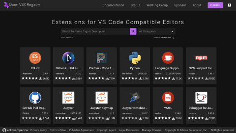
Open VSX boasts a collection that includes all of the most popular (top 100) VS Code extensions available on the Visual Studio Code Marketplace under open source licenses. These extensions cover a wide range of functionalities, from code formatting and linting to language support, debugging, and version control. For example, you can find extensions for editing and debugging Python and Jupyter notebooks, editing and debugging Java, and Gitlens, a powerful tool for improved collaboration and productivity with Git.
What sets Open VSX apart is its commitment to openness and inclusivity. Anyone can contribute to the platform and its extensions can be used in any compatible IDE, making it a true reflection of the diverse needs and preferences of the developer community.
Open VSX stands as a testament to the collaborative spirit of the developer community. It's not just a registry; it's a thriving ecosystem where developers come together to elevate their coding experience.
If you'd like to become part of the Open VSX community, consider publishing an extension; contributing to one of the projects that comprise the deployment, eclipse/openvsx, EclipseFdn/open-vsx.org, and open-vsx/publish-extensions; subscribe to our mailing list; or join us as part of the Open VSX Working Group.
Eclipse Cloud DevTools Contributor Award 2023 goes to EclipseSource and TypeFox
by John Kellerman at January 22, 2024 02:45 PM
The Eclipse Cloud DevTools Contributor Award for the year 2023 is being jointly awarded to two remarkable companies, EclipseSource and TypeFox, in acknowledgment of their enormous, continuous, strategic, and sustainable contributions to the Eclipse Cloud DevTools ecosystem.
Throughout 2023, EclipseSource and TypeFox have demonstrated exceptional commitment and expertise in various projects within the ecosystem, including Eclipse Theia, CDT Cloud, Eclipse GLSP, Eclipse Sprotty, EMF Cloud, and Eclipse Langium. Their leadership role is evident as they provide project leads and several committers to these open source projects. Their excellence was already recognized in monthly awards in January, July, October, and December, showcasing their consistent and impactful contributions.
Their involvement in the Eclipse Cloud DevTools ecosystem is not just technical; both companies have been pivotal in strategic initiatives, which significantly supported the growth of the community and nurtured the adoption of its open-source technologies sustainably. As active participants and leading architects in the Eclipse Cloud DevTools working group, they have shown foresight in shaping the future of cloud development tools.
TypeFox and EclipseSource play a unique and vital role in the ecosystem. As service providers specializing in building tools and IDEs, they provide an essential resource for companies aiming to develop their own tool offerings. Their investment in the maintenance and evolution of projects in the ecosystem is therefore not only a testament to their dedication but also strategically vital for their operations.
In addition to their extensive contributions, EclipseSource and TypeFox provide a unique model of sponsored open source development. By contracting a service provider for sponsored development, adopters can directly engage experts who contribute to open source projects on their behalf, enabling a highly tailored and impactful approach to advancing open source initiatives that are of strategic importance for the adopter. This allows other companies to leverage the expertise of EclipseSource and TypeFox for specific fixes, feature developments, and general project maintenance, enabling a broader group of organizations to contribute to and strengthen the open-source ecosystem. The approach also allows for resource pooling, where multiple companies can collectively sponsor a full-time expert committer, thereby enhancing the efficiency and impact of contributions. The model of sponsored development has proven to be highly successful in the Eclipse Cloud DevTools Ecosystem, leading to increased and more sustainable contributions, thereby significantly enriching the ecosystem.
Project websites contain information about which companies provide support and sponsored development.
Service providers like EclipseSource and TypeFox are cornerstone elements of a thriving open-source ecosystem. They offer important support for custom projects and play a crucial role in fostering sponsored development for open-source components. We congratulate and thank both EclipseSource and TypeFox for being the recipients of the Eclipse Cloud DevTools Contributor Award for the year 2023. Your consistent dedication and impactful contributions have significantly advanced the Eclipse Cloud DevTools landscape, and we are profoundly grateful for your commitment and excellence.
This Eclipse Cloud DevTools contributor award is sponsored by the Eclipse Cloud DevTools Working Group. The working group provides a vendor-neutral ecosystem of open source projects focused on defining, implementing and promoting best-in-class web and cloud-based development tools. It is hosted at the Eclipse Foundation, current members of the group include AMD, Arm, EclipseSource, Ericsson, Obeo, RedHat, Renesas, STMicroelectronics and TypeFox.
Hosting IDEs and tools online - lessons learned
by Jonas, Maximilian & Philip at January 22, 2024 12:00 AM
The transition to cloud-based tools and IDEs is reshaping the landscape of software development. However, the details of hosting tools and IDEs online present unique challenges. If you’re...
The post Hosting IDEs and tools online - lessons learned appeared first on EclipseSource.
January 18, 2024
CDT Cloud Blueprint: Tracing with TraceCompass Cloud
by Jonas, Maximilian & Philip at January 18, 2024 12:00 AM
In the world of C/C++ development, especially when doing performance tuning, tracing plays a pivotal role. CDT Cloud Blueprint, the web-based C/C++ development environment, provides advanced Tracing...
The post CDT Cloud Blueprint: Tracing with TraceCompass Cloud appeared first on EclipseSource.
January 17, 2024
Eclipse Cloud DevTools Digest - November and December 2023
by John Kellerman at January 17, 2024 07:57 PM
Theia Announces Full Compatibility with VS Code Extension API
In his blog, Mike Milinkovich announced a significant achievement in the development of Theia: to wit, full compatibility with the Visual Studio Code (VS Code) extension API. This is a major milestone in the evolution of Theia toward a universally adaptable development environment.
Contributor Awards to Tobias Ortmayr and Dominik Bork
The Cloud Dev Tools Working Group presented Contributor of the Month awards to Tobias Ortmayr for his continued work improving the performance of Theia and to Dominik Bork bringing academia, industry and open source closer together.
On Building Cloud Native Modeling Tools
Jonas, Maximilian & Philip, in this article, wrote about a talk they gave at EclipseCon 2023 on building cloud native modeling tools using modern web-based open source technologies like EMF Cloud, Langium and GLSP.
On Building Diagrams with GLSP
In another article, Jonas, Maximilian & Philip also write about another talk they gave at EclipseCon 2023 about building diagramming tools using GLSP that are more testable, collaborative, and accessible (through improved keyboard navigation and metadata annotations).
Theia Releases 1.44 and 1.45
Theia released 1.44 and 1.45 adding support for a "portable mode" keeping user data with the Theia application, language icons, improvements for secondary windows, search history, and saving untitled files.
Theia Community Release 2023-11
Theia also released their Community Release 2023-11 based on Theia 1.43. Community releases are provided once a quarter with a dedicated release branch that allows contributors to further harden and even hotfix a community release. To learn more about the advantages of the Theia community release, visit the Theia release page.
Other Recent Releases
Cloud Tool Time Webinars
We are now scheduling Cloud Tool Time webinars for 2023. Be sure to Sign up now to get on the calendar and let us help tell your story. You can see past sessions on our Youtube channel.
Eclipse Cloud DevTools Projects
Explore the Eclipse Cloud DevTools ecosystem! Check out our projects page to find out more about open source innovation for cloud IDEs, extension marketplaces, frameworks and more.
Getting Listed on the Cloud DevTools Blog
If you are working with, or on, anything in the Cloud DevTools space, learn how to get your writings posted in our blog section.
What if Java had no for?
by Donald Raab at January 17, 2024 03:10 AM
These loops look like objects to me!

Where for art thou?
This blog is intended to make you think about and discover alternatives to modeling for loops in an object-oriented (OO) programming language. It is convenient to have a versatile and performant eager for statement built in the Java language. It is also convenient to have lazy versions of numeric range based for loops in the form of IntStream and LongStream.
In my previous blog, I introduced a new lazy abstraction for an int range based for loop, without giving much of an explanation. This is the quote in the previous blog where I introduced the concept.
In the active Boolean version of the the code, I use an IntInterval from Eclipse Collections to represent an OO version of the for loop.
I will explain what an IntInterval from Eclipse Collections is later in the blog.
The following are the topics I will cover in this blog.
In this blog, I explain some of the versatility of for statements in Java with examples. I explain how some of the language (lambdas) and library (Streams) work including in Java 8 release have improved the level of abstraction of looping constructs for Java developers. Java does not go as far as Smalltalk does on the OO abstraction level for looping constructs. I show and explain how Smalltalk makes some things amazingly simple in its pure object-oriented approach to looping. Finally, I explain some features that Eclipse Collections provides that enables additional levels of abstraction for Java developers to enhance their productivity.
This blog does not include anything about parallelism.
1. For Loops in Java
Three parts of the for
Looping is part of control flow in a programming language. For loops are used to do things until a condition is met, or infinitely if no condition is specified. There is a for statement in Java that is well structured and extremely useful for executing a block of code a number of times. The example I used in the previous blog was to output a String parameter a specified number of times.
public static void main(String[] args)
{
    int numberOfTimes = Integer.parseInt(args[0]);
    for (int i = 0; i < numberOfTimes; i++)
    {
        System.out.println(args[1]);
    }
}
The code will throw an exception if less than two arguments are passed in. This code will output the String at args[1] the number of times specifed at args[0]. The String at args[0] is converted to an int and stored in the variable numberOfTimes.
The structure of a for loop in Java includes three statements inside of parentheses after the for keyword, each separated by a semi-colon. The statements are as follows.
- Initialization— executed once to initialize one or more variables
- Continue Condition — a boolean expression that when true will continue to loop and when false will cause the loop to exit
- Advancement Expression— an expression that may cause a change in the result of the Continue Condition, like incrementing or decrementing a counter or calling next on an Iterator.
For example — Summing numbers 1 to 10
A very simple example of a for loop in Java is summing the numbers from 1 to 10. The following test is an example of this.
    @Test
    public void sumNumbersFromOneToTen()
    {
        int sum = 0;
        for (
            int i = 1; // Intialization
            i <= 10;   // Continue Condition
            i++)       // Advancement Expression
        {
             sum += i;
        }
        Assertions.assertEquals(55, sum);
    }
For example — Summing numbers 10 to 1
This code could also be written as summing the numbers from 10 to 1. The following test is an example of this.
@Test
public void sumNumbersFromTenToOne()
{
    int sum = 0;
    for (
        int i = 10; // Intialization
        i > 0;      // Continue Condition
        i--)        // Advancement Expression
    {
        sum += i;
    }
    Assertions.assertEquals(55, sum);
}
Inlining the three statements
I previously broke the three expressions over multiple lines so they are easy to parse and read. Normally, the expressions will all be on the same line, as follows:
// For loop from 1 to 10 incrementing by 1
for (int i = 1; i <= 10; i++)

// For loop from 10 to 1 decrementing by 1
for (int i = 10; i > 0; i--)
The for loop in Java is very versatile. Before the Java language had lambdas, the for loop was the preferred mechanism for iterating over an array or Collection.
Sum Array of ints —Indexed Access
The following for loop uses indices for summing up elements of an int array.
@Test
public void sumArrayOfIntsUsingIndexedAccess()
{
    int sum = 0;
    int[] array = {1, 2, 3, 4, 5, 6, 7, 8, 9, 10};
    for (
        int i = 0;         // Intialization
        i < array.length;  // Continue Condition
        i++)               // Advancement Expression
    {
        sum += array[i];
    }
    Assertions.assertEquals(55, sum);
}
Sum Array of ints — Java 5 for loop
The following for loop uses the simplified version of the for loop introduced in Java 5 for iterating over each element of a an int array.
@Test
public void sumArrayOfIntsUsingForEachLoop()
{
    int sum = 0;
    int[] array = {1, 2, 3, 4, 5, 6, 7, 8, 9, 10};
    for (int each : array)
    {
        sum += each;
    }
    Assertions.assertEquals(55, sum);
}
The first part of the for loop includes the type and name of a varaible for each element in the array. In this case, I use int each.The second part, separated by a :, is the array to loop over.
Sum List of Integers — Indexed Access
If we have a List of Integer objects, we have a few ways we can write a for loop to calculate the sum. We can loop using indexed access.
@Test
public void sumListOfIntegersUsingIndexedAccess()
{
    int sum = 0;
    List<Integer> list = List.of(1, 2, 3, 4, 5, 6, 7, 8, 9, 10);
    for (
        int i = 0;       // Intialization
        i < list.size(); // Continue Condition
        i++)             // Advancement Expression
    {
        sum += list.get(i).intValue();
    }
    Assertions.assertEquals(55, sum);
}
Sum List of Integers — Iterator
We can loop using an explicit iterator.
@Test
public void sumListOfIntegersUsingIterator()
{
    int sum = 0;
    List<Integer> list = List.of(1, 2, 3, 4, 5, 6, 7, 8, 9, 10);
    for (
        Iterator<Integer> it = list.iterator(); // Intialization
        it.hasNext();                           // Continue Condition
        // No Advancement Expression
    )
    {
        sum += it.next().intValue(); // Advancement in statement via next()
    }
    Assertions.assertEquals(55, sum);
}
Sum List of Integers — Java 5 for loop
We can loop using the enhanced for loop available since Java 5, which is really a shorthand for using the iterator approach above.
@Test
public void sumListOfIntegersUsingJava5ForLoop()
{
    int sum = 0;
    List<Integer> list = List.of(1, 2, 3, 4, 5, 6, 7, 8, 9, 10);
    for (Integer each : list)
    {
        sum += each.intValue();
    }
    Assertions.assertEquals(55, sum);
}
All for one, and for for all
The versatile nature of a for loop makes it a tough competitor for looping. Oleg Pliss commented on my post of this article in LinkedIn:
A few important features of ‘for’ loops are missing in the article: access to the locals outside the loop; ‘continue’ and ‘break’ statements (potentially with a label); and ‘return’ (from the method).
This is some of what I was alluding to by the versatility of the for statement, and Oleg did a masterful job of identifying the functionality I did not cover in a single sentence. Here are links to further tutorials on for and the branching statements I didn’t cover here for those interested in learning more.
In the rest of the blog I will demonstrate how for loops are implemented in Smalltalk, and show how in Java 8 and with Eclipse Collections, Java has advanced towards a more object-oriented and functional model of for loops. I have been working on replacing unnecessary for loops in Java applications for the past 20 years as I explain in the following blog. Usually there is a higher level algorithm like filter, map, or reduce that is implemented imperatively with a for loop. It’s more readable if you can hide the implementation details of a for loop behind a higher level abstraction that explains what you are doing with an intention revealing name. It’s also potentially better for performance for different types to optimize for specific iteration patterns, instead of requiring developers to write different for loops for different types because one is faster with indexed access vs. being faster with an iterator.
My ten year quest for concise lambda expressions in Java
2. OO For Loops in Smalltalk
The following is a quote from my last blog about Smalltalk and control flow.
Smalltalk is a programming language that models control flow in its class library, instead of the language. There are no if statements, for loops, while statements in Smalltalk. There are instead methods on classes that make control flow possible. Methods are the abstraction that are used to model all control flow, along with code blocks, which are also known as lambdas or closures.
An object-oriented version of a for loop will result in looping behavior distributed across many classes. The behavior of different kinds of for loops are aligned with the object that makes the most sense to be responsible for that behavior.
There are both eager and lazy forms of a for loop in an object-oriented model. The statement version of a for loop in Java is always eager.
Smalltalk Interval — sum
I will start by showing how to sum the numbers from 1 to 10 using Smalltalk’s Interval type. Interval is a lazy for loop. Interval is also a lazy SequqencedCollection.
testSumNumbersFromOneToTen
 |sum|

 sum := (1 to: 10) sum.

 self assert: sum equals: 55.
In my two previous “What if…” blogs, I explained that “everything is an object” in Smalltalk. I will explain one step at a time what all the objects are in the code above, and which are receiving the messages that are accomplishing the task at hand.
The first object instance encountered in the code is the literal 1. The object instance represented by the literal 1 is of type SmallInteger. The message to: is sent to the object 1 with the parameter 10, which is also an instance of SmallInteger. If I inspect the result of the code (1 to: 10) in Pharo Smalltalk, the result is an instance of an Interval. The following is a screen capture of the result.
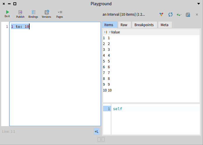
Interval is lazy because it knows about the range of data (1 to 10 by 1) but has yet to do anything with that data. The Interval class in Smalltalk is designed as follows.
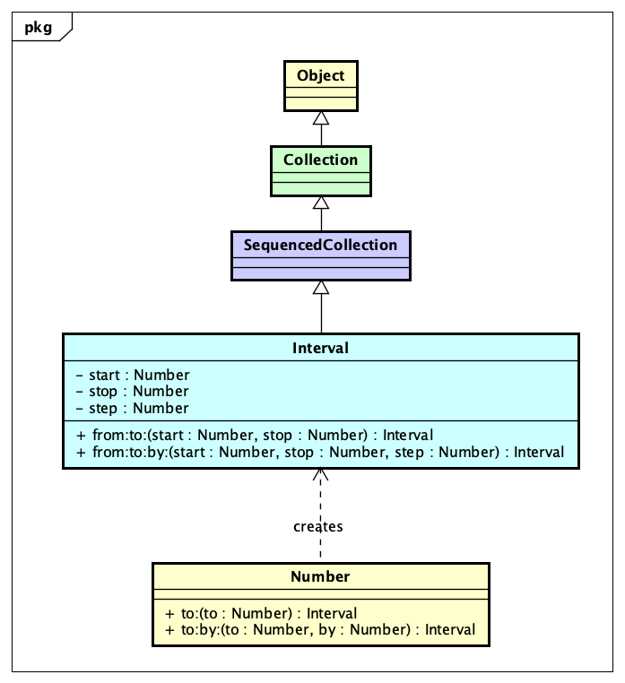
The decision to make Interval a SequencedCollection brings a lot of convenience. The internal iterator support for Interval is extensive. There are class methods on Interval which allow for construction. The convenient shorthand I used about calling to: on SmallInteger can be searched in the Smalltalk class library quickly to show how the Interval is constructed.
The ^ means return in Smalltalk, so the code 1 to: 10 is going to result in Interval from: 1 to: 10 by: 1. An Interval in Smalltalk is inclusive for both the start and stop.
The final step to understanding how the loop itself is implemented in the sum of the integers from 1 to 10 example is to look at the sum method.
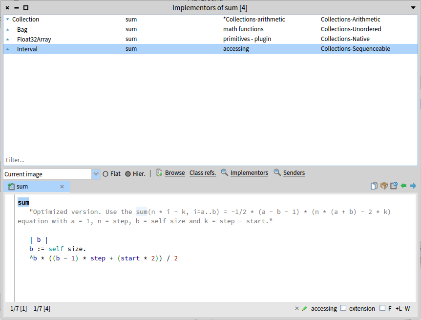
What we discover here is that sum is optimized for Interval. It uses a formula instead of iteration with a loop. This is one of the benefits of having loops represented by objects. They can provide encapsulate and optimized behaviors.
Smalltalk Interval — do:
In the interest of demonstrating the actual loop, I will implement an iterative sum by hand in a test.
testSumNumbersFromOneToTenWithDo
 |sum|

 sum := 0.
 (1 to: 10) do: [ :each | sum := sum + each ].

 self assert: sum equals: 55.
I use the do: method here with a Block (lambda) which updates the sum variable with the value of sum plus the value of each SmallInteger. The implementation of do: on Interval looks as follows.
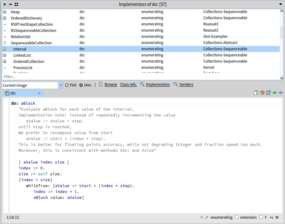
The implementation of do: uses a Block (Condition Continue Block) with whileTrue: followed by Block (Execution Block) to perform the looping. The Condition Continue Block and Execution Block both require access to the index variable which is scoped outside of the blocks, and the Execution Block actually increments the index variable. I will not be implementing whileTrue: for educational purposes in Java as it would require using a final int array or AtomicInteger, LongAdder or equivalent for index to be able to be incremented. There is a tweet reply from Vladimir Zakharov that shows how whileTrue could be implemented on a Functional Interface if someone wanted.
Smalltalk Interval — inject:into:
There is another internal iterator that I can use in Smalltalk that will not require updating a local variable for each element in the Interval. That method is named inject:into:, or as I like to call it, the Continuum Transfunctioner. Here is a sum implemented using inject:into:.
testSumNumbersFromOneToTenWithInjectInto
 |sum|

 sum := (1 to: 10) inject: 0 into: [ :result :each | result + each ].

 self assert: sum equals: 55.
The way the above inject:into: code works can be explained as follows as each element is visited in the Interval.
result := 0
result + each = ?
=================
0 + 1 = 1
1 + 2 = 3
3 + 3 = 6
6 + 4 = 10
10 + 5 = 15
15 + 6 = 21
21 + 7 = 28
28 + 8 = 36
36 + 9 = 45
45 + 10 = 55
The result of each iteration is “injected” into the block for the next iteration as the first parameter. The implementation of inject:into: for the Interval class in Pharo Smalltalk is as follows.
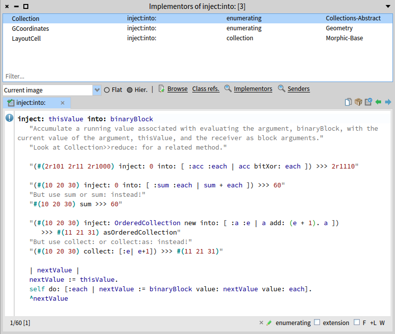
Smalltalk Interval —in reverse order
In order to reverse an Interval, I will need to add a negative step value using the to:by: method on SmallInteger as follows.
testSumNumbersFromTenToOne
 |sum|

 sum := (10 to: 1 by: -1) sum.

 self assert: sum equals: 55.
There are also methods named reverseDo: and reversed on Interval which can take forward Interval and walk through it in reverse. The reversed method will wind up creating an array in reverse, which is why I didn’t demonstrate it here.
Smalltalk Interval — Any Number
The abstraction of Interval and the benefits of dynamic typing really become evident when you learn about the existence of Fraction in Smalltalk. Take the code 1/3 in Smalltalk. If you execute this code in Java for an int, you will expect a result of 0. The following is the result in Pharo Smalltalk.
If we want to represent a range from 1 to 10 by 1/4, we can achieve this simply by writing the following code.
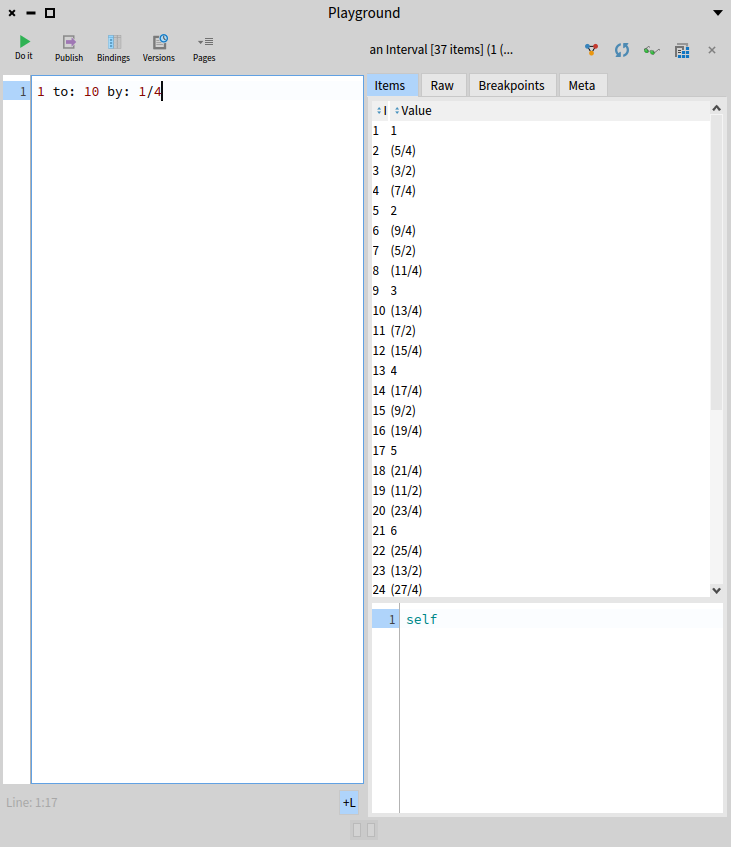
Interval will support any number, so understanding the types of Number that are provided in Smalltalk is helpful. The following class diagram shows the hierarchy for Number in Pharo Smalltalk.
Smalltalk Interval — More than just a loop
The Interval abstraction provides more than just a lazy for loop. Interval is a lazy Collection. All of the algorithms available to SequencedCollection are also available to Interval. For example, it’s possible to collect all of the numbers in an Interval as a collection of String.
testPrintString
 |strings expected|

 strings := (1 to: 5) collect: #printString.

 expected := Array with: '1' with: '2' with: '3' with: '4' with: '5'.

 self assert: strings equals: expected.
The method named collect: is defined on Collection, and can be used to transform from one type to another. Here I am converting SmallInteger to String by applying the method printString to each element of the Interval.
The following code filters the even values of an Interval using the select: method, and then converts the SmallInteger values to their square values and converts them to an array of String.
testEvensPrintString
 |strings expected|

 strings := ((1 to: 10) select: #even) squared collect: #printString.

 expected := Array with: '4' with: '16' with: '36' with: '64' with: '100'.

 self assert: strings equals: expected.
Smalltalk — Number meets Collection
Looping with a range of values in Interval is useful but somewhat limited. Looping over a collection of arbitrary values is more useful. There are many methods available on the Collection class that provide internal iterators. I am going to show what some of these methods do, and then explain how they do them. The how is where an eager loop provided by the Number class in a method named to:do: arrives.
The following is the method for do: in OrderedCollection, which is one of the most commonly uses collection types in Smalltalk. OrderedCollection in Smalltalk is the equivalent of ArrayList in Java.
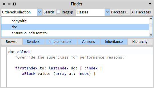
The method do: is the equivalent of forEach defined on Iterable in Java. In this code, the first part, firstIndex to: lastIndex do: calls the to:do: method on Number. The code for to:do: looks as follows.
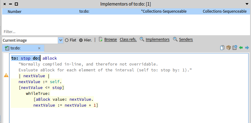
This code uses a Block whileTrue: method to execute another Block the number of times covered by the range from self to stop. If we go back to look at the do: method in Interval, it looks somewhat similar, but requires a bit more math due to Interval having a start, stop and step value.
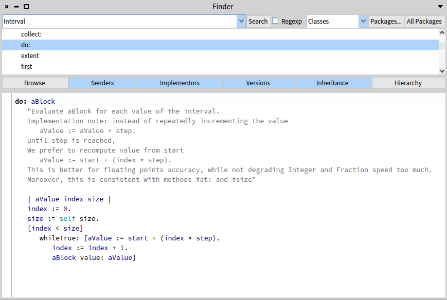
The following code looks very similar, but winds up taking two different paths. One goes through Number to:do:, and the other goes through Interval do:. See if you can figure out which is which.
1 to: 10 do: [:each | Transcript show: each].
(1 to: 10) do: [:each | Transcript show: each].
The code Transcript show: is the equivalent of System.out.print() in Java. If you guessed the first line uses Number to:do: and the second uses Interval do:, then you are correct, and I am finished with the Smalltalk part of the Interval, Number, and Collection looping.
3. OO For Loops in Java
Since Java 8, we have IntStream and LongStream, both which can represent lazy for loops over a range of int or long values.
Java IntStream — range sum
The method range on IntStream is inclusive on the from and exclusive on the to.
@Test
public void sumIntStreamRangeOneToElevenExclusive()
{
    int sum = IntStream.range(1, 11).sum();
    Assertions.assertEquals(55, sum);
}
Java IntStream — rangeClosed sum
The method rangeClosed on IntStream is inclusive on both the from and the to.
@Test
public void sumIntStreamRangeClosedOneToTenInclusive()
{
    int sum = IntStream.rangeClosed(1, 10).sum();
    Assertions.assertEquals(55, sum);
}
Both calls to sum on IntStream have a potential silent overflow issue to be aware of. It would have been better if IntStream sum returned a long value. So long as your sum result is less than Integer.MAX_VALUE you will be ok. If it is greater than Integer.MAX_VALUE, the int value sum could wind up negative or some other unexpected positive value.
Java IntStream — forEach sum
IntStream is lazy, so you have to call a terminal method like sum or forEach to force iteration to happen. If we want to calculate a sum by hand, we can use the forEach method. With this version of sum, we can widen the result ourselves to long by using LongAdder.
@Test
public void sumIntStreamRangeClosedForEach()
{
    LongAdder sum = new LongAdder();
    IntStream.rangeClosed(1, 10).forEach(sum::add);
    Assertions.assertEquals(55, sum.intValue());
}
I use the LongAdder class to create an instance of an object that will be effectively final and can be used as a method reference in the forEach. LongAdder internally keeps a long value. To illustrate how LongAdder handles larger numbers and avoids int overflow, where sum does not, I will create a small range in the billions.
@Test
public void sumIntStreamRangeClosedInBillions()
{
    LongAdder sum = new LongAdder();
    IntStream.rangeClosed(2_000_000_000, 2_000_000_001).forEach(sum::add);
    Assertions.assertEquals(4_000_000_001L, sum.longValue());

    // Overflow happened silently here with IntStream.sum
    int intSum = IntStream.rangeClosed(2_000_000_000, 2_000_000_001).sum();
    Assertions.assertEquals(-294_967_295, intSum);
}
Java LongStream — sum
Another alternative to IntStream.sum that is almost always safe from overflow is LongStream.sum. The following is an example of sum on LongStream.
@Test
public void sumLongStreamRangeClosedOneToTenInclusive()
{
    long sum = LongStream.rangeClosed(1L, 10L).sum();
    Assertions.assertEquals(55L, sum);

    long bigSum = LongStream.rangeClosed(2_000_000_001L, 2_000_000_010L).sum();
    Assertions.assertEquals(20_000_000_055L, bigSum);
}
Java IntStream — toList
If we want the elements of an IntStream to be represented in a List, we have to use the IntStream API to box the stream and convert it to a List<Integer>.
@Test
public void filterIntStreamRangeClosedEvensToList()
{
    List<Integer> list = IntStream.rangeClosed(1, 10)
            .filter(i -> i % 2 == 0)
            .boxed()
            .toList();

    List<Integer> expected = List.of(2, 4, 6, 8, 10);

    Assertions.assertEquals(expected, list);
}
Java Iterable — forEach
In Java 8, we got support for concise lambda expressions and the Java Stream API. We also got a forEach method on the Iterable interface, which allows all Collection types in Java to provide internal iterators that are optimized for each type.
The following code can be used to sum the List<Integer> of even numbers from 1 to 10 that I created above.
@Test
public void sumListOfEvensUsingForEach()
{
    List<Integer> list = List.of(2, 4, 6, 8, 10);
    LongAdder sum = new LongAdder();
    list.forEach(sum::add);

    Assertions.assertEquals(30L, sum.longValue());
}
4. OO For Loops in Eclipse Collections
One of the first custom Collection types I created in Eclipse Collections was the Interval class. I though it would be very useful to have a List<Integer> that you could create simply by specifying a range. I also thought it would be useful to have a full complement of rich internal iterators on Interval, so I had it also implement LazyIterable<Integer>. We have used Interval extensively in unit tests in Eclipse Collections. It is often the fastest way to create a List, Set, Bag, Stack or any other type where having some Collection of Integer is all we need. The following image shows the number of usages on Interval in the Eclipse Collections project.
There are ~1,900 usages in the tests module alone. The Interval class has proven itself very useful in Eclipse Collections unit tests.
Eclipse Collections Interval — sum
The following code will create an Interval from 1 to 10 and return a sum using sumOfInt. The method sumOfInt knows to widen the sum to a long.
@Test
public void sumIntervalOneToTen()
{
    long sum = Interval.oneTo(10).sumOfInt(Integer::intValue);

    Assertions.assertEquals(55L, sum);
}
Eclipse Collections Interval — sum evens
The following code will include only the even numbers from 1 to 10 and sum them.
@Test
public void sumIntervalEvensOneToTen()
{
    long sum = Interval.evensFromTo(1, 10).sumOfInt(Integer::intValue);

    Assertions.assertEquals(30L, sum);
}
Eclipse Collections Interval — as a List and as a LazyIterable
There are three possible types that Interval can be used as — Interval, List, LazyIterable.
@Test
public void intervalIsListAndLazyIterable()
{
    Interval interval = Interval.oneTo(5);
    List<Integer> list = interval;
    LazyIterable<Integer> lazyIterable = interval;

    Assertions.assertEquals(List.of(1, 2, 3, 4, 5), list);
    Assertions.assertEquals(Set.of(1, 2, 3, 4, 5), interval.toSet());
    Assertions.assertEquals(
            Interval.oneTo(10),
            lazyIterable.concatenate(Interval.fromTo(6, 10)).toList());
}
The following diagram shows the design of the Interval class in Eclipse Collections.
Eclipse Collections IntInterval — sum
Interval has proved itself extremely useful for quickly creating List<Integer> instances, especially in test code. For production use cases, where memory and performance matter, IntInterval may be a better alternative. IntInterval is an ImmutableIntList. The internal iterators on IntInterval are not lazy by default like Interval, but IntInterval does support lazy iteration via an explicit call to asLazy.
The following code shows how to calculate a sum using IntInterval using both eager and lazy approaches.
@Test
public void sumIntIntervalOneToTen()
{
    IntInterval intInterval = IntInterval.oneTo(10);

    long eagerSum = intInterval.sum();

    LazyIntIterable lazy = intInterval.asLazy();
    long lazySum = lazy.sum();

    Assertions.assertEquals(55L, eagerSum);
    Assertions.assertEquals(55L, lazySum);
}
I reuse the instance of IntInterval to create the LazyIntIterable, after already calculating the eager sum. I did this to illustrate that an IntInterval can be reused, unlike an IntStream from Java, which may only be used once.
Eclipse Collections IntInterval — usage
The usage of IntInterval in Eclipse Collections is more modest than Interval, but still quite good.
Eclipse Collections LongInterval — sum
Eclipse Collections provides primitive Interval support for both int and long. The long support is provided by LongInterval.
The following code shows how to calculate a sum using LongInterval using both eager and lazy approaches.
@Test
public void sumLongIntervalBillionOneToBillionTen()
{
    LongInterval longInterval =
            LongInterval.fromTo(1_000_000_001L, 1_000_000_010L);

    long eagerSum = longInterval.sum();

    LazyLongIterable lazy = longInterval.asLazy();
    long lazySum = lazy.sum();

    Assertions.assertEquals(10_000_000_055L, eagerSum);
    Assertions.assertEquals(10_000_000_055L, lazySum);
}
I reuse the instance of LongInterval to create the LazyLongIterable, after already calculating the eager sum. I did this to illustrate that a LongInterval can be reused, unlike a LongStream from Java, which may only be used once.
Eclipse Collections LongInterval — usage
The usage of LongInterval in Eclipse Collections is more modest than both Interval and IntInterval.
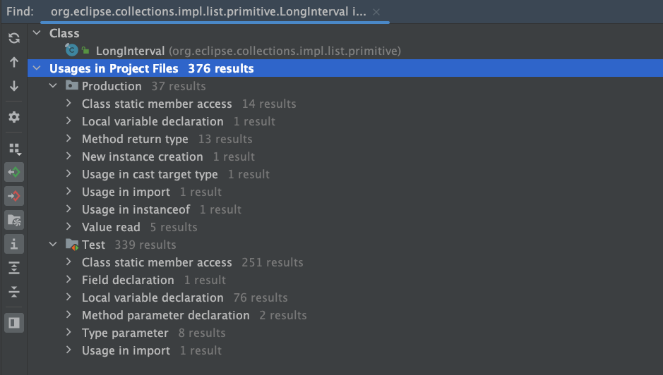
Eclipse Collections IntInterval and LongInterval Class Hierarchy
I have included both hierarchies for IntInterval and LongInterval in this diagram to show that they do ultimately share a root parent interface named PrimitiveIterable. The following is the UML class hierarchy for both IntInterval and LongInterval.
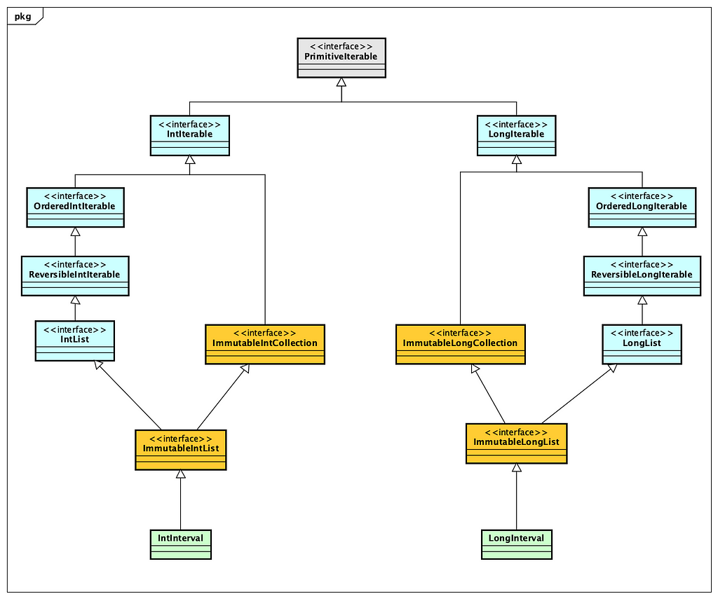
There was an evolution in design approach from Interval to IntInterval and LongInterval. Interval was one of the earliest containers in Eclipse Collections, and was created before immutable and primitive types were added to the framework. Interval is heavily used already so it is too late to revisit its design as it would cause too much pain to convert it to an ImmutableList<Integer> just for consistency sake. This ship has sailed, and this is now just a historical implementation decision. There are things I continue to like about both design approaches.
Final Thoughts
I hope this blog helped you learn about different approaches and levels of abstraction for looping in an object-oriented language. I believe it is useful to have both language and library constructs available in Java to enhance the productivity of developers when it comes to looping.
Smalltalk takes a novel approach to implementing control flow that I found extremely insightful when I first learned about it in 1994. I hope the Smalltalk examples and explanations helped you learn something insightful about this venerable programming language. I believe there is still so much we can learn from the past in programming languages, and only by learning this storied past can we hope to create a better future for programmers.
I intentionally did not explain either eager parallel or lazy parallel looping in this blog. This can be a natural progression once you have understood how eager serial and lazy serial looping works using lambdas. The inclusion of lambdas in Java 8 has opened up many new possibilities for productivity enhancements for Java developers. I expect that we will continue to see improvements in the language and libraries of Java further leveraging this critical feature.
Thank you for reading!
I am the creator of and committer for the Eclipse Collections OSS project, which is managed at the Eclipse Foundation. Eclipse Collections is open for contributions.
January 15, 2024
The Choice of an IDE and Tool Platform: Eclipse Theia vs. Code OSS
by Jonas, Maximilian & Philip at January 15, 2024 12:00 AM
Building custom tools and IDEs are strategic and long term investments. Choosing the right platform for building custom tools and IDEs is a critical decision for stakeholders. To aid in this crucial...
The post The Choice of an IDE and Tool Platform: Eclipse Theia vs. Code OSS appeared first on EclipseSource.

Collaborative Specification Development
January 15, 2024 12:00 AM
January 08, 2024
What if Java had no if?
by Donald Raab at January 08, 2024 02:34 AM
What would you do?

Where art thou Control Flow?
Programming in Java would be pretty hard in Java if we didn’t have if statements, for loops, while statements. These are convenient language artifacts that help us determine if, how, and when the code in our programs execute. This is the essence of control flow in a program. All programming languages have mechanisms that enable control flow to occur. Most programming languages provide control flow mechanisms in the language itself, via built-in statements.
The following code shows some basic control flow statements in Java.
public static void main(String[] args)
{
    if (args.length > 1)
    {
        int i = Integer.parseInt(args[1]);
        for (int j = 0; j < i; j++)
        {
            System.out.println(args[0]);
        }
    }
    else if (args.length > 0)
    {
        System.out.println(args[0]);
    }
    else
    {
        System.out.println("Hello World!");
    }
}
This code checks the args String array length to see if zero, one, or two arguments are supplied to the program. If zero arguments are passed, the program outputs “Hello World!”. If one argument is passed, the program outputs the argument which is arg[0]. If two arguments are passed, the program outputs the first argument (arg[0]) the number of times specified in the second argument (arg[1]). There is no safety check in this code to make sure the second parameter is actually a number.
What would you do if you didn’t have an if statement in Java?
Modeling Control Flow with Objects and Methods
Smalltalk is a programming language that models control flow in its class library, instead of the language. There are no if statements, for loops, while statements in Smalltalk. There are instead methods on classes that make control flow possible. Methods are the abstraction that are used to model all control flow, along with code blocks, which are also known as lambdas or closures. When I was first learning Smalltalk, I had to learn where these control flow methods were and how to use them with lambdas. I believe this enabled me to become familiar with lambdas very quickly, as I had to use them everywhere I needed control structures in my Smalltalk programs.
The place I first learned to look for control structures in Smalltalk was the class hierarchy for Boolean. The following is a UML class diagram showing how the Boolean type is modeled in Smalltalk.
The Boolean class in Smalltalk defines methods and:, or:, ifTrue:, ifFalse:, ifTrue:ifFalse:, and ifFalse:ifTrue. Each of these methods take one or two Block parameters. A Block in Smalltalk is a type that can be represented with a literal lambda syntax. The basic syntax for a Block is square brackets with a pipe that separates parameters on the left, with expression on the right. If there are zero parameters in the Block, there will be no pipe. The following are examples of literal blocks, also known as lambdas or closures.
- [] — An empty Block which returns nil when evaluated.
- [true] — Zero argument Block which returns true when evaluated
- [:a | a] — One argument Block which returns a when evaluated
- [:a :b | a + b] — Two argument Block which returns a + b
- [:a :b :c | a + b + c] — Three argument Block which returns a + b + c when evaluated.
Evaluating Conditionals in Smalltalk
Without an if statement in Smalltalk, you learn to use the instances (true and false) of the two subclasses of Boolean (True and False) with lambdas (via Block) to perform conditional logic.
The following tests in Smalltalk show how conditional logic can be accomplished using the methods on the True and False classes that I documented in the diagram above.
Here is a test demonstrating various results for True.
testTrue

 self assert: (true and: [ true ]).
 self assert: (true or: [ true ]).

 self deny: (true and: [ false ]).
 self assert: (true or: [ false ]).

 self assert: (true ifTrue: [ true ]).
 self assert: (true ifTrue: [ true ] ifFalse: [ false ]).
 self deny: (true ifFalse: [ true ] ifTrue: [ false ]).

 self assert: (6 > 5 ifTrue: [ true ]).
 self assert: (4 > 5 ifTrue: [ true ]) equals: nil.
Here is a test demonstrating various results for False.
testFalse

 self deny: (false and: [ true ]).
 self assert: (false or: [ true ]).

 self deny: (false and: [ false ]).
 self deny: (false or: [ false ]).

 self assert: (false ifFalse: [ true ]).
 self assert: (false ifTrue: [ false ] ifFalse: [ true ]).
 self deny: (false ifFalse: [ false ] ifTrue: [ true ]).

 self assert: (6 > 5 ifFalse: [ true ]) equals: nil.
 self assert: (4 > 5 ifFalse: [ true ]).
Passive vs. Active Boolean Class
Java has both a primitive and Object form of boolean. The primitive version is named boolean. The object version is named Boolean. The Boolean class acts as a wrapper for the primitive boolean type in Java so that the primitive values can be used in generic collections like List, Set, and Map. The Boolean class only defines six instance methods as of Java 21. The methods are toString, hashCode, equals, compareTo, describeConstable, and booleanValue. This class contains no active methods that do anything. Most of the methods return a different type representation of the booleanValue contained in the wrapper. The current Boolean class in Java is what I would refer to as a passive class. It is merely an object data holder for primitive boolean.
It is possible to make Boolean an active class in Java. As an experiment I defined a new Boolean sealed interface and defined True and False implementations.
public sealed interface Boolean permits Boolean.True, Boolean.False
{
    Boolean TRUE = new True();
    Boolean FALSE = new False();

    static Boolean valueOf(boolean value)
    {
        return value ? TRUE : FALSE;
    }

    default Boolean and(Supplier<Boolean> block)
    {
        return null;
    }

    default Boolean or(Supplier<Boolean> block)
    {
        return null;
    }

    default <R> R ifTrue(Supplier<R> trueBlock)
    {
        return null;
    }

    default <R> R ifFalse(Supplier<R> falseBlock)
    {
        return null;
    }

    default <R> R ifTrueIfFalse(
            Supplier<R> trueBlock,
            Supplier<R> falseBlock)
    {
        return null;
    }

    default <R> R ifFalseIfTrue(
            Supplier<R> falseBlock,
            Supplier<R> trueBlock)
    {
        return null;
    }

    final class True implements Boolean {}

    final class False implements Boolean {}
}
I had to provide a static method to convert a primitive boolean to the Boolean interface for this to work. I will leave it to your imagination how I overrode the default implementations of the parent Boolean interface in the True and False classes.
When I had completed the implementation, I rewrote the Control Flow Java example in the first section of this blog using the new Boolean interface. This is what the code looks like with Supplier and Boolean instances in variables to provide clarity.
public static void main(final String[] args)
{
    Supplier<Object> moreThanOneSupplier = () ->
    {
        IntInterval.oneTo(Integer.parseInt(args[1]))
                .forEach(j -> System.out.println(args[0]));
        return null;
    };

    Supplier<Object> moreThanZeroSupplier = () ->
    {
        System.out.println(args[0]);
        return null;
    };

    Supplier<Object> noArgumentSupplier = () ->
    {
        System.out.println("Hello World!");
        return null;
    };

    Boolean argsGreaterThanOne = Boolean.valueOf(args.length > 1);
    Boolean argsGreaterThanZero = Boolean.valueOf(args.length > 0);

    argsGreaterThanOne.ifTrueIfFalse(
            moreThanOneSupplier,
            () -> argsGreaterThanZero.ifTrueIfFalse(
                    moreThanZeroSupplier,
                    noArgumentSupplier));
}
In the active Boolean version of the the code, I use an IntInterval from Eclipse Collections to represent an OO version of the for loop. The active Boolean version of the code is composable and easier to move logic around with everything clearly compartmentalized. If I inline the Supplier instances, the code looks as follows.
public static void main(final String[] args)
{

    Boolean argsGreaterThanOne = Boolean.valueOf(args.length > 1);
    Boolean argsGreaterThanZero = Boolean.valueOf(args.length > 0);

    argsGreaterThanOne.ifTrueIfFalse(
            () ->
            {
                IntInterval.oneTo(Integer.parseInt(args[1]))
                        .forEach(j -> System.out.println(args[0]));
                return null;
            },
            () -> argsGreaterThanZero.ifTrueIfFalse(
                    () ->
                    {
                        System.out.println(args[0]);
                        return null;
                    },
                    () ->
                    {
                        System.out.println("Hello World!");
                        return null;
                    }));
}
For less scrolling and easier comparison, this was the original Java code from above with if statements and the for loop.
public static void main(String[] args)
{
    if (args.length > 1)
    {
        int i = Integer.parseInt(args[1]);
        for (int j = 0; j < i; j++)
        {
            System.out.println(args[0]);
        }
    }
    else if (args.length > 0)
    {
        System.out.println(args[0]);
    }
    else
    {
        System.out.println("Hello World!");
    }
}
The code in the primitive boolean example with if statements is less verbose, but would require more copying and pasting to move logic around.
The verbosity using the active Boolean interface is caused partially because I chose to use Supplier, which more closely models how Smalltalk uses its Block with Boolean. Smalltalk Boolean methods with Block allow for Boolean expressions to be formed as results from methods. If I don’t care about returning a value from a Boolean expression, I could model the methods using Runnable.
The following code shows how code would look if I used Runnable instead.
public static void main(final String[] args)
{

    Boolean argsGreaterThanOne = Boolean.valueOf(args.length > 1);
    Boolean argsGreaterThanZero = Boolean.valueOf(args.length > 0);

    argsGreaterThanOne.ifTrueIfFalse(
            () -> IntInterval.oneTo(Integer.parseInt(args[1]))
                    .forEach(j -> System.out.println(args[0])),
            () -> argsGreaterThanZero.ifTrueIfFalse(
                    () -> System.out.println(args[0]),
                    () -> System.out.println("Hello World!")));
}
The curly braces all disappear because each branch of the if statement can be covered by a single line of code. Lambdas in Java allow me to remove the curly braces for single line lambda expressions. This removes a bunch of unnecessary lines of code, at the cost of some potential readability due to text compression and loss of natural whitespace.
If I extract the Runnable instances into their own variables, the code will look as follows.
public static void main(final String[] args)
{
    Boolean argsGreaterThanOne = Boolean.valueOf(args.length > 1);
    Boolean argsGreaterThanZero = Boolean.valueOf(args.length > 0);

    Runnable moreThanOneRunnable = () ->
            IntInterval.oneTo(Integer.parseInt(args[1]))
                .forEach(j -> System.out.println(args[0]));

    Runnable moreThanZeroRunnable = () -> System.out.println(args[0]);

    Runnable noArgumentRunnable = () -> System.out.println("Hello World!");

    argsGreaterThanOne.ifTrueIfFalse(
            moreThanOneRunnable,
            () -> argsGreaterThanZero.ifTrueIfFalse(
                    moreThanZeroRunnable,
                    noArgumentRunnable));
}
Final thoughts
This blog was intended to explain in simple terms the differences between true and false in Java, and true and false in Smalltalk. Java uses statements provided by the language for user management of program control flow. Smalltalk uses Objects, Methods and Lambdas to accomplish the same. Both approaches have pros and cons. Composability and verbosity are sometimes at odds with each other. If we extract methods in the branches of logic, we can achieve better composability and less verbosity with both approaches.
The active Boolean approach I demonstrated and described here could be added to the Boolean class in Java to make it an active Boolean object. This would enable the Boolean class to manage control flow through methods. The benefit of this approach would be to enable more complex if expressions which may be hard to emulate and make readable with the current Java mechanism of ternary expressions.
Update: One downside that makes the active Boolean object approach impractical in Java is if you need access to any local variables outside of the lambdas used in the conditionals. This would require messy tricks using final arrays to potentially allow for updates to local variables outside of the lambda scopes. The if statement approach has access to any variables defined outside of its conditional scopes. Another downside is that Java lambdas do not have support for non-local returns, which would limit returning out of the method from the conditionals. Thanks to Oleg Pliss for pointing out these important difference between Java Lambdas and Smalltalk blocks on LinkedIn.
Learning multiple languages that use different strategies to address the same problems is useful. Learning a whole new language takes time. My hope is that this bitesize comparison of basic control flow in Java and Smalltalk is useful for you to be able to understand the pros and cons different approaches.
Thanks for reading!
I am the creator of and committer for the Eclipse Collections OSS project, which is managed at the Eclipse Foundation. Eclipse Collections is open for contributions.
The Eclipse Theia Project Update 2023
by Jonas, Maximilian & Philip at January 08, 2024 12:00 AM
2023 has been an extraordinary year for the Eclipse Theia project, marked by significant community advancements and key feature enhancements such as the improved startup performance, the introduction...
The post The Eclipse Theia Project Update 2023 appeared first on EclipseSource.
January 05, 2024
What if null was an Object in Java?
by Donald Raab at January 05, 2024 06:54 PM
Brace yourself and get ready to try the red pill.

Object-oriented purity
Smalltalk is often referred to as a pure object-oriented programming language. Smalltalk was created by Alan Kay, who was also the person who coined the term “object-oriented." Part of the pure object-oriented nature of Smalltalk is that “everything is an object” in Smalltalk. Because everything is an object, you accomplish programming tasks by sending messages to objects.
Java is also object-oriented, but is not a pure object-oriented programming language. Java has things in it that are not objects (e.g. primitives), that require special mechanisms for handling them. Java also has a special case for handling null.
In this blog, I will demonstrate and explain how Java and Smalltalk deal with absent values, referred to as null in Java, and nil in Smalltalk. This blog will not provide a full explanation of Java or Smalltalk syntax. There are resources available on the internet for both if you want to learn more. The blog will only cover what is necessary to explain the code examples I share. I will do my best to explain the examples in detail so that syntax is not a barrier to understanding. This blog is intended to make you ponder larger possibilities, not struggle with minutiae of language syntax.
In the sections that follow, I will compare solutions to the same simple problems using both Java and Smalltalk. I will be using Java 21 with IntelliJ IDEA CE 2023.3.2 for the Java code examples. I will be using Pharo Smalltalk 11.0 for the Smalltalk code examples.
Null vs. Nil
The literal null in Java
In Java, there is a literal named null. You can assign null to any variable that has an Object type, but the reference the variable points to is not an instance of an Object. I like to think of null as an instance of the Spoon in the movie, “The Matrix”. There is no Spoon.
The following test code illustrates some of the properties of null in Java.
@Test
public void nullIsNotAnObject()
{
    // Assert things about null
    Assertions.assertFalse(null instanceof Object);
    final Set<?> set = null;
    Assertions.assertFalse(set instanceof Set);

    // Assert things about exceptions thrown when calling methods on null
    Assertions.assertThrows(
            NullPointerException.class,
            () -> set.getClass());
    Assertions.assertThrows(
            NullPointerException.class,
            () -> set.toString());

    // Assert things about a non-null variable named set2
    final Set<?> set2 = new HashSet<>(Set.of(1, 2, 3));
    set2.add(null);
    Assertions.assertNotNull(set2);
    Assertions.assertNotNull(set2.getClass());
    Assertions.assertTrue(set2 instanceof Set);

    // Filter all of the non-null values from set2 in the Set named set3
    // Uses a static method refererence from the Objects class
    final Set<?> set3 = set2.stream()
            .filter(Objects::nonNull)
            .collect(Collectors.toUnmodifiableSet());
    Assertions.assertEquals(Set.of(1, 2, 3), set3);
}
In this test, I assert that null is not an instance of Object. I initialize a final variable of type Set<?> named set to null, and further assert that set , which is null, is not an instance of Set. I assert that when I call getClass() or toString() on set, which is still null, a NullPointerException is thrown. This happens because null is not an Object. Note, I made the first declaration of the set variable final here, in order to reference the variable set in the two lambdas in the first section where I assert that NullPointerException is thrown. I could have left it as “effectively final” by not trying to reset the value, but thought I would just go with having it be explicitly final.
In the second section, I create a mutable Set and store it in a variable named set2. I add null to the set. Set.of() will not accept null values, so I had to convert the immutable Set to a HashSet, which does accept null values. I add null manually to set2. I assert that set2 is not null, that its class is not null, and that set2 is in fact an instance of a Set as the compiler says it is.
Finally, I filter the instances contained in set2 into a new set3 as long as they respond true to the method reference Objects::nonNull, which references a static method on Objects that returns a Predicate that checks that object != null. Once again, since null is not an object, you cannot call any methods on it that could be used to construct a valid method reference as a Predicate.
This is the null in Java that we are all used to. It is not an Object. We’ve all learned to deal with null when coding in Java. Former Smalltalkers will know there is a different way.
The literal nil in Smalltalk
In Smalltalk, there is a singleton object instance named nil. The literal nil, is an instance of the class UndefinedObject. UndefinedObject is a subclass of Object. The Object class is a subclass of… nil. This circular definition has melted many programmers brains, including mine. Somehow, this all just works. It is one of the magical aspects of Smalltalk. There’s a turtle at the top, sitting on top of another turtle, and it’s just turtles all the way down.
The following test code passes using Pharo Smalltalk 11.0.
testNilIsAnObject
 |set setNoNils|

 # Assert things about nil
 self assert: nil isNil.
 self assert: 'nil' equals: nil printString.

 # Assert things about the set variable which is nil
 set := nil.
 self assert: set isNil.
 self assert: set equals: nil.
 self assert: set class equals: UndefinedObject.
 self assert: (set ifNil: [ true ]).
 self assert: set isEmptyOrNil.

 # Assert things about the set variable which is not nil
 set := Set with: 1 with: 2 with: 3 with: nil.
 self deny: set isNil.
 self assert: set isNotNil.
 self deny: set equals: nil.
 self deny: set isEmptyOrNil.
 self assert: set class equals: Set.

 # Select all the non-nil values into a new Set name setNoNils
 setNoNils := set select: #isNotNil.
 self assert: (Set with: 1 with: 2 with: 3) equals: setNoNils.
Above is what a method definition looks like in Smalltalk. I wrote a unit test method named testNilIsAnObject. I define two temporary variables named set and setNoNils by declaring them between the two vertical pipes after the method name like this |set setNoNils|. In the first section of code I assert a few things about nil, in order to demonstrate it is in fact an instance of an Object. The literal self is the equivalent of this in Java, and refers to the instance of the class that testNilIsAnObject is defined on, which has methods it inherits named assert:, deny:, and assert:equals:. I assert that nil can respond to messages like any other object in Smalltalk. I assert that nil responds true to isNil. I also assert that calling printString on nil results in the String ‘nil’ being returned.
The := operator is used for variable assignment in Smalltalk. I assign the instance referenced by the literal nil to the variable named set. I assert that set responds true when sent the message isNil. I assert that the object reference contained in the set variable is an instance of UndefinedObject. I assert that calling the ifNil: message on set returns true. The code [ true ] is a zero argument block or lambda. In Java, the equivalent would be the a lambda typed as a Supplier. Finally, I assert that set responds to true when sent the message isEmptyOrNil.
In the second section of code, I create an instance of a Set by using the class method named with:with:with:with: which takes four parameters. I then deny that the set isNil. I assert that that the set isNotNil. I assert the set is not equal to nil. I deny the set isEmptyOrNil, since it it neither nil or isEmpty. I then assert that the class of set is Set.
In the third section of code, I select all instances contained in set into a new Set named setNoNils, if the instance returns true to the message isNotNil. The important thing here is that every subclass of Object in Smalltalk responds true or false to the message isNotNil.
Here’s a final example of one of the methods available to all objects in Smalltalk, including nil. The method name is ifNil:ifNotNil:. It is a control structure method which takes two block (aka lambda) parameters. The result is determined polymorphically by the type. The set here knows it is not nil, so it will automatically execute the second block and return the result which here is the String, ‘not nil’. The literal nil will know it is nil, so it will automatically execute the first block and return the result which here is the String, ‘nil’.
# Use the built in control structures around nil on all objects
self assert: (set ifNil: [ 'nil' ] ifNotNil: [ 'not nil']) equals: 'not nil'.
self assert: (nil ifNil: [ 'nil' ] ifNotNil: [ 'not nil']) equals: 'nil'.
What if null was an Object in Java?
The following code is speculative, won’t compile, is untested, and unproven by Java language experts. But perhaps if null were an instance of some class named Null, the following code might be possible.
@Test
// NOTE THIS CODE WILL NOT COMPILE AND IS PURELY SPECULATIVE!!!
public void nullIsNotAnObject()
{
    // Assert things about null
    Assertions.assertTrue(null instanceof Object);
    final Set<?> set = null;
    Assertions.assertFalse(set instanceof Set);

    // Assert things about calling methods on null as an object
    Assertions.assertTrue(set.isNull());
    Assertions.assertEquals(Null.class, set.getClass());
    Assertions.assertEquals("null", set.toString());

    // Assert things about a non-null variable
    final Set<?> set2 = Set.of(1, 2, 3);
    Assertions.assertNotNull(set2);
    Assertions.assertNotNull(set2.getClass());
    Assertions.assertTrue(set2 instanceof Set);

    // Filter all of the non-null values from set2 in the Set named set3
    // Uses an instance method refererence from the Object class
    final Set<?> set3 = set2.stream()
            .filter(Object::isNotNull)
            .collect(Collectors.toUnmodifiableSet());

    // Calling methods defined on Object, that would be overridden in Null
    Assertions.assertEquals("null", null.ifNull(() -> "null"));
    Assertions.assertNull(null.ifNotNull(() -> "notNull"));
    Assertions.assertEquals("not null", set3.ifNotNull(() -> " not null"));
}
If null were an instance of a class named Null, it would also be possible to add methods like ifNull, isNotNull, ifNotNull, isEmptyOrNull to both Object and Null as Smalltalk does. The ifNull and ifNotNull methods would take some functional interface type like Supplier, Consumer, or Function and then work with lambdas and method references. In the example above, I changed the filter code to use a Predicate formed from a method reference using the method named isNotNull which would be defined on Object.
The tricky part would be how to make null capable of representing any interface and class, and dispatching calls to a method named doesNotUnderstand for any methods from those interfaces that null wouldn’t understand. The Null class would have to behave like a Proxy for any type it is stored in, and forward methods sent to a class like Set, to a single method that could handle the “I’m not a Set” response appropriately.
Perhaps with null as an Object in Java, it would be possible to do away with a whole variety of NullPointerExceptions.
Why is nil being an Object useful?
The fact nil is an instance of the UndefinedObject class in Smalltalk allows it to be treated like all other objects in Smalltalk. It can respond to basic methods that are supported on all objects. The instance nil has first class treatment in the Object hierarchy in that every object knows that it is or isn’t nil. This brings a nice symmetry to the language and libraries. This does not remove the need to handle nil by avoiding or excluding it, but nil handling is done using the same mechanisms that you would use to handle or exclude other types, by calling methods like isNil, isNotNil, ifNil:,ifNotNil:, ifNil:ifNotNil:.
In a language like Smalltalk where controls structures are not defined as statements in the language, but as methods in the libraries, having nil exist like everything else, as an object, leads to a an amazing level of consistency and clarity. In my next blog I will delve more into how some other control structures in Smalltalk are defined in the class library.
Final thoughts
I’m not looking to change Java, as the null ship sailed a very long time ago. What I am hoping is that I can help illuminate the possibilities for Java developers who may not have seen another way of handling null in a different object-oriented programming language.
This blog was intended to explain in simple terms the differences between null in Java, and nil in Smalltalk. Learning multiple languages that use different strategies to address the same problems is useful. Learning a whole new language takes time. My hope is that this bitesize comparison is useful for you to be able to understand the pros and cons of a different approach.
In my next blog, I plan to include two other literal objects in Smalltalk named true and false., and compare them to their primitive Java equivalent also named true and false. I will also compare them to the Java Object equivalent named Boolean. I will also look to explain how control structures can be defined effectively in a library, and not require special syntax and reserved words for if, for, while statements.
Stay tuned, and thanks for reading!
I am the creator of and committer for the Eclipse Collections OSS project, which is managed at the Eclipse Foundation. Eclipse Collections is open for contributions.
January 03, 2024
Add views to a Langium-powered VS Code extension
January 03, 2024 12:00 AM
January 01, 2024
Twelve plus one sunsets in 2023
by Donald Raab at January 01, 2024 09:10 PM
A year of biking, travel, and sunsets.

Sunsets are something we all have in common. I am thankful for all of the sunsets that 2023 afforded me. Every sunset is a blessing. There are sunsets happening around the world every minute. I hope you get to enjoy a sunset at least a couple times a month. Just in case you missed any, the rest of this blog includes some sunsets that I got to enjoy, each month in 2023. I hope you catch as many sunsets as possible in 2024. They help make each day a beautiful day.
Enjoy!
January 2023

February 2023

March 2023

April 2023

May 2023

June 2023

July 2023

August 2023

September 2023

October 2023

November 2023

December 2023

I hope you enjoyed a sampling of my sunsets from 2023. Again, I hope you get to enjoy as many sunsets as possible in 2024 and beyond.
Have a safe, healthy, and Happy New Year!
I am the creator of and a Committer for the Eclipse Collections OSS project which is managed at the Eclipse Foundation. Eclipse Collections is open for contributions.
December 29, 2023
Eclipse Theia 1.45 Release: News and Noteworthy
by Jonas, Maximilian & Philip at December 29, 2023 12:00 AM
We are happy to announce the Eclipse Theia 1.45 release! The release contains 28 merged pull requests and we welcome four new contributors. In this article we will highlight some selected improvements...
The post Eclipse Theia 1.45 Release: News and Noteworthy appeared first on EclipseSource.
December 28, 2023

Understanding Software Provenance Attestation: The Roles of SLSA and in-toto
December 28, 2023 02:00 PM
A software provenance attestation is a signed document that associates metadata with an artifact, encompassing details like the artifact’s origin, build steps, and dependencies. This information is critical for verifying the artifact’s authenticity and integrity. Featuring a cryptographic signature, provenance attestation ensures the document remains unaltered, playing a vital role in mitigating supply chain attacks. By scrutinizing the provenance of binaries, users can thwart the execution of malicious code on their systems. Let’s delve into some concrete examples:
-
Case of Compromised Package Manager: Imagine a scenario where an attacker gains access to a developer’s package manager account for a widely-used open-source software library. The attacker injects malicious code, builds, and publishes an updated library version. As users update the library, the malicious code spreads. With provenance attestation, users would have noticed discrepancies in the attestation, revealing the code did not originate from the official source. This proactive measure could have averted incidents like the UAParser.js library hijacking in 2021.
-
Software Supplier Compromise Example: Consider an attacker targeting a software supplier and tampering with their product. When customers use this compromised product, it could lead to further software breaches or data exfiltration. The CodeCov attack serves as a pertinent example. Here, a malicious
bash uploaderartifact was uploaded to CodeCov’s repository. Unknowingly downloaded and used this artifact by users resulted in stolen Git credentials and amplified the supply chain attack. Provenance attestation would have enabled users to detect the anomaly and prevent the execution of the malicious code.
Exploring SLSA
SLSA (Supply chain Levels for Software Artifacts) is a framework that enhances the security of software supply chains by defining levels for software projects to aspire to. It emphasizes the generation, distribution, and verification of provenance information.
The framework currently offers three Levels under the Build track in its 1.0 version. However, it’s beneficial to revisit the initial v0.1 draft for a broader understanding of SLSA’s scope and future direction.

SLSA aims to shield against tampering at various stages of the software supply chain. The initial levels presented a progressive approach to mitigating these threats. The higher the level, the more robust the supply chain security. The requirements for each level were comprehensive and provided a clear progression path.
The 1.0 version narrowed its focus to the Build and Provenance requirements. The introduction of “tracks” allows for future expansion, with the newly created Build track being the sole focus in this version. Each track’s levels will eventually measure different aspects of supply chain security.
SLSA 1.0 refined the division of requirements between the project and the build platform. Achieving a higher Level in the Build Track implies greater trust in the Provenance information, thereby offering better protection against threats. The project requirements in the build track are now more straightforward, largely depending on the build platform’s ability to produce provenance that meets the level’s criteria.
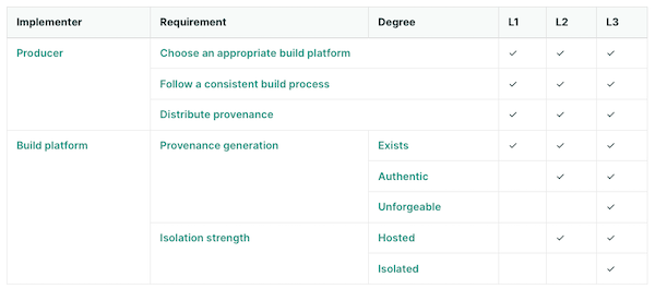
Introducing in-toto
in-toto is a framework centered around software attestations, focusing on the generation and verification of metadata of the software supply chain. Developers and stakeholders generate metadata reflecting actions like coding and testing. The project owner creates a layout, a critical document that defines the supply chain’s expected steps and corresponding metadata.
Key components of in-toto include the layout (a JSON document outlining expected the supply chain), functionaries (individuals or automated processes executing steps), and inspections (operations that need to be performed on the final product at the time of verification).
While similar to SLSA, in-toto offers broader attestation capabilities than just about provenance information and without specific guidance against a threat model, as seen in SLSA. It provides a standard format for outlining supply chain expectations and realities.
SLSA and in-toto: hand in hand
Given in-toto’s role in software attestation and SLSA’s focus on trustable provenance, their combination is logical. SLSA recommends (but does not mandate) the use of the in-toto format for provenance information, defining the necessary information for each Build Level as a custom in-toto predicate type.
This Provenance predicate aligns with in-toto’s framework: it models the supply chain as a series of steps, with each step generating attestations. These attestations are then verified against a supply chain layout, a signed metadata document defining the expected steps and their outcomes.
In-toto’s ability to define use-case-specific predicates complements SLSA by providing a flexible means to capture a wide array of contextual supply chain information. This includes code reviews, test results, and runtime traces, all of which can be tailored to the specific needs of a project.
By integrating SLSA Provenance with in-toto attestations, software supply chains can achieve a comprehensive verification process. This integration allows for detailed tracking and verification of each step in the supply chain, from code development to the final build, ensuring that all components meet the specified security and integrity standards.
In practice, this means that when a build service performs a build, it not only records the SLSA Provenance of the resulting artifact but also integrates this with the broader set of in-toto attestations, encompassing various aspects of the build process. These attestations, when combined, offer a more detailed and trustworthy view of the software’s development and build process, enhancing the overall security posture.
Conclusion
Software provenance attestation is crucial for mitigating a multitude of security threats. Frameworks like SLSA and in-toto play a significant role in enabling these attestations, ensuring the integrity and security of software supply chains. In a forthcoming blog post, we’ll explore in detail the process of creating SLSA provenance attestations specifically for Java/Maven projects. This deep dive will provide valuable insights and practical steps for developers looking to enhance the security of their Java applications. Keep an eye out for this upcoming post for a comprehensive guide on implementing these security measures.
December 26, 2023
Understanding Software Provenance
December 26, 2023 02:00 PM
In the ever-evolving landscape of open-source software development, the creation and distribution of artifacts—such as compiled binaries, libraries, and documentation—represent the tangible results of a multifaceted process. These artifacts are more than just a collection of code; they are the final product of myriad decisions, alterations, and contributions, each with its unique narrative. It’s essential to grasp these narratives or the provenance of these artifacts, to secure the supply chain effectively. Moreover, the integrity and security of these artifacts are paramount, as they underpin the trust and reliability users expect. This post aims to demystify the concept of provenance for these released artifacts. We will delve into why a comprehensive understanding of their origins and the path they take—examined through the lens of the journalistic 5W1H (Who, What, When, Where, Why, and How)—is crucial for enhancing the security posture of an open source project’s supply chain.
Understanding Artifact Provenance
Provenance in the context of released artifacts is a narrative of origin and evolution. It’s a detailed account of an artifact’s lifecycle from its inception in the developer’s mind to its final form when it is released to the world. This lineage includes every modification, every build, and every individual who has interacted with the artifact. A well-documented provenance is not just an academic record; it’s a testament to the artifact’s integrity, a shield ensuring that what users download and interact with is precisely what was intended, untainted by tampering or malicious alterations.
Challenges in Tracking Artifact Provenance
However, maintaining a comprehensive provenance is fraught with challenges. The complexity of dependencies where each layer has its own story, the sheer volume of artifacts and the speed at which they are updated, and the diverse sources they are compiled from, all contribute to a labyrinth of information that needs to be meticulously managed. Add to this the lack of standardized tools and practices for documenting and verifying provenance, and the task can seem Herculean. Yet, these challenges are not insurmountable barriers but rallying calls for robust solutions, for the security and reliability of the software supply chain hinge on this very capability.
Provenance information
If we consider what the provenance information of released artifacts should comprise, it’s akin to the outcome of any solid journalistic work: it should address the 5W1H (What, Who, Why, When, Where, and How) questions. At a fundamental level, the answers to these questions should be as follows.
- The What concerns identifying the released artifacts themselves, giving them an identity through an unambiguous identifier (e.g., using the Common Platform Enumeration (CPE) scheme or a Package URL). It can also cover the licenses of the artifacts, a list of the artifact’s dependencies, their respective licenses, and how they have been retrieved, among other things. This is more commonly known as a Software Bill of Materials (SBOM) and can be considered a part of the provenance information to be released with an artifact. Understanding the ‘What’ means having a clear, auditable trail of the components that form the backbone of your software, enabling you to assess, manage, and secure your software supply chain effectively.
- The Who can be as straightforward as identifying who triggered the release (or the build of the release) of the artifacts. It might also extend to include additional information about who contributed to the code included in this release, whether from the project’s inception or since the last release. Details regarding any signed Contributor License Agreement (CLA) or accepted Developer Certificate of Origin (DCO) by contributors can also be incorporated. Knowing who contributed what aids in tracking changes, auditing contributions, and most importantly, ensuring that only trustworthy code is incorporated into your projects.
- The Why pertains to understanding the reason behind the release: is it to fix a security vulnerability? Is it a scheduled release following the regular cadence? It might also involve tracking why a particular library was updated. As such, the release notes can be considered a (non-structured) part of the provenance information in this context. This aspect of provenance is about context and rationale, which is crucial for assessing the impact of changes on the overall security and functionality of your software.
- The When is straightforwardly about keeping track of the time of the release, to anchor it in a broader historical context. It can also involve recording the timing of the various contributions made prior to the release.
- The Where concerns tracing the locations of the various components that led to the released artifact. Where was the code developed and stored? Was it in a secure, trusted repository, or did it come from a less reliable source? Where was it built? Knowing these details can be the difference between a secure application and a vulnerable one. Coupled with the answer to the When, this mirrors the journalistic approach of establishing timelines and locations, helping you create a more comprehensive narrative of your software’s development and enhancing security and control over your project’s lifecycle.
- How relates to the methods, tools, and practices used to track and verify the origins of your code. It encompasses the mechanisms you implement to ensure that every line of code can be traced back to its source, thus ensuring integrity and reliability. This not only refers to the build pipelines and toolchains used to build and release the artifacts but also includes information about software development best practices such as code review, branch protections, secret scanning, and more.
While the full details of implementing software provenance attestation will be covered in a future post, all this information can already be delivered to downstream users of your project in a simple text file, for example, in the form of buildinfo files. Although not exhaustive, buildinfo files are a testament to the commitment to transparency and security, serving as a foundational element for more advanced tools and practices.
The Importance of Artifact Provenance for Security
The narrative of provenance is critical for security. In a world where the threat landscape is as vast as it is vicious, the lack of provenance can lead to severe breaches. Compromised artifacts, malicious code insertions, and other vulnerabilities are not just theoretical risks; they are stark realities. A robust provenance framework is not just a defensive mechanism; it’s a foundational pillar in building a secure, trustworthy supply chain. To enhance the security posture of its projects, understanding and implementing provenance practices is not an option; it’s an imperative.
How to trust provenance data?
Trusting provenance data generated during the build process is a commendable start. However, recognizing its limitations is crucial for establishing a more robust system of trust
Integrity of Build-Generated Provenance
The integrity of build-generated provenance is inherently fragile. It’s as secure as the environment in which it’s stored and the transport methods used to deliver it. Imagine if a malicious actor gains access to the storage backend or intercepts the transport protocols; they could alter the provenance data, rendering it unreliable. A common countermeasure involves signing the provenance files or data. Digital signatures provide an additional layer of trust by making any tampering with the provenance data after its creation detectable. However, this step, while beneficial, is not a complete solution.
Vulnerability of the Build Script
Another critical aspect to consider is the vulnerability of the build script itself. If the build pipeline is compromised, then so is the provenance it generates, whether signed or not. A compromised script might produce misleading information, feeding false data into what should be a trusted record. This scenario underscores a crucial realization: to genuinely trust the provenance data, the responsibility for generating it should shift away from the build pipeline to the build platform.
The Shift in Responsibility
By making the build platform responsible for this task and having it sign the generated data, we create a system where the provenance is not only more resistant to tampering but also inherently more trustworthy. The build platform, ideally, is indeed in a unique position to observe and record the build process. It has access to all the information needed to generate accurate provenance data. This shift doesn’t eliminate the risk of compromise, but it does mean that any tampering with the build pipeline won’t affect the integrity of the provenance data we rely on.
Securing the Build Platform
It’s important to note that this approach is not a silver bullet. The build platform itself can be compromised, and securing it is a complex task that goes beyond the scope of this discussion. However, it’s an essential consideration for a truly trustworthy system. Even with a secured build platform, the environment generating the provenance data must also be secure to genuinely trust the data’s integrity.
In conclusion, while build-generated provenance is a valuable first step, it’s essential to be aware of its limitations. Shifting the responsibility to the build platform and securing that platform are critical moves towards a more trustworthy and resilient system. However, remember that in the realm of security, no solution is absolute. Each layer of trust we add is a step towards a more secure ecosystem, but vigilance and ongoing improvement are always necessary.
Closing notes
As we conclude our exploration of software provenance through the detailed lens of the 5W1H framework, it’s clear that this is not merely an exercise in compliance or best practices. It’s a fundamental shift in how we approach software development and security. Understanding the ‘Who,’ ‘What,’ ‘When,’ ‘Where,’ ‘Why,’ and ‘How’ of your artifacts isn’t just about enhancing security—it’s about instilling a culture of transparency and excellence.
The journey we’ve outlined is challenging, with numerous complexities and hurdles. However, the path to a secure and reliable software supply chain is not only necessary but also attainable with the right mindset and tools. Adopting a provenance-first approach is a paradigm shift. It means engraining the tracking and verification of the origin and journey of artifacts into the very fabric of the development and release process. It’s about integrating provenance tracking into the build process, adopting tools that automate and standardize provenance documentation, and fostering a community culture where knowledge, tools, and best practices are shared freely and openly.
As we look forward to diving into the practicalities of implementing a robust software provenance strategy in our next installment, remember that your engagement and continuous learning are vital. The principles and practices discussed here are just the beginning. With a blog post about the Supply-chain Levels for Software Artifacts (SLSA) framework on the horizon, we will have the guidelines and tools at our disposal to prevent tampering, improve integrity, and secure our packages and infrastructure.
We invite you to not just read but actively participate in shaping the future of software provenance. Join us and the Eclipse Foundation community in discussing and advancing these crucial topics. Your insights, experiences, and commitment are key to driving change and fostering a more secure digital world.
Together, let’s embrace the provenance-first mindset and lead the charge towards a future where software development is synonymous with security, transparency, and trust.
December 23, 2023
Eclipse Foundation Embraces Sigstore
December 23, 2023 10:00 AM
As part of our ongoing commitment to fortifying the security of our software development processes, we’re excited to announce a significant enhancement for all Eclipse Foundation projects utilizing our Jenkins infrastructure. This advancement comes with the integration of Sigstore, a cutting-edge solution designed to bolster the security and integrity of software supply chains. By exploring the integration of Sigstore within the Eclipse Foundation’s Jenkins setup, this article sets out to demonstrate how this advancement is reshaping secure software development and deployment for Eclipse Foundation projects.
What is Sigstore?
Sigstore represents a shift in the way we secure software artifacts. This open-source tool offers a transparent and secure method for both signing and verifying software artifacts, including binaries and container images. It’s designed to make digital signing simpler for developers by eliminating the complex management of keys. This allows users to confidently verify the artifacts’ origins and integrity. At its core, Sigstore’s “keyless” signing associates a signature with the signer’s identity, rather than a fixed set of keys.
The process begins when a developer obtains an identity token from an identity provider and creates a temporary public/private key pair in memory. This token, along with the public key, is sent to Sigstore’s certificate authority, which verifies the information against the token issuer. If the identity provider is recognized and the token is valid, Sigstore’s authority issues a short-lived certificate that binds the public key to the developer’s identity. This binding is crucial as it securely attaches the identity of the signer to the artifact being signed, ensuring traceability and accountability.

During the signing phase, a transparency log entry is created. This entry is part of a public, tamper-evident ledger that records the artifact’s hash, the public key used, and the signature, all with a timestamp to validate the software’s integrity and origin at the time of signing. Once the signing is complete, the private key is discarded, and the short-lived certificate soon expires.
The trust in the verification process comes from this transparency log, not from the signer’s ability to safeguard a private key. Users can validate the logged details against the artifact to confirm its integrity and origin. This verification can occur online, with real-time access to the transparency log for the most up-to-date information. For environments where the transparency log is not accessible, such as air-gapped systems, offline verification is also possible. In these scenarios, the signed artifacts should be accompanied by the certificate and public key, allowing verification against these components without needing access to the transparency log. This method relies on the trust established by the Sigstore-issued certificate, ensuring the authenticity of the artifact as confirmed by a trusted CA.
This methodology goes beyond improving convenience; it serves as a strategic defense against a range of cyber threats, particularly those targeting software supply chains. By eliminating the need for developers to manage long-lived keys and by providing a transparent log of signed artifacts, Sigstore mitigates risks like code tampering (e.g., when used to sign commits) and unauthorized access, which are prevalent in supply chain attacks.
Using Sigstore on Eclipse Foundation’s Jenkins instances
The Eclipse Foundation has recently become a recognized identity provider for Sigstore’s certificate authority. This development is a game-changer for projects within the Foundation for several reasons:
-
Managed Identity Verification: With this status, the Eclipse Foundation can issue tokens for projects’ bot accounts. These tokens are recognized and verified by Sigstore, which then issues certificates based on the Eclipse Foundation’s managed identity. This process ensures a trusted link between the artifact and the Foundation, further bolstering trust and security.
-
Streamlined Artifact Signing: Initially focusing on bot accounts, this setup is tailored for automated processes, like those running on Jenkins instances. Projects can seamlessly sign artifacts during the build and release process, integrating security into the CI/CD pipeline without added complexity.
-
Extended Trust and Compliance: Having the Eclipse Foundation as a recognized identity provider means that artifacts signed through this process are backed by a trusted entity, meeting higher standards of security.
It’s worth noting that Sigstore can be used by all of Eclipse Foundation projects hosted on GitHub and using GitHub Actions, as detailed in GitHub’s blog post. For Eclipse Foundation projects that utilize both Jenkins and GitHub, this creates a cohesive and secure workflow for signing artifacts across platforms.
Implementing Sigstore in Your Jenkins Workflow
If you want to start signing artifacts with Sigstore’s keyless process in your Jenkins workflow, it’s very easy:
- The very first step is to open a help desk ticket to ask us to allow our identity provider to issue tokens that would be verifiable by Sigstore. We also configure your Jenkins instance with some new credentials.
- Adapt the workflow below to your use case and profit.
pipeline {
 agent any

 stages {
 stage('Prepare') {
 steps {
 sh '''
 echo "Hello World" > README
 curl -sSL -o cosign https://github.com/sigstore/cosign/releases/latest/download/cosign-linux-amd64
 chmod u+x cosign
 '''
 }
 }
 stage('Sign') {
 steps {
 withCredentials([usernamePassword(credentialsId: 'cbi-dev-sigstore', passwordVariable: '_BOT__PASSWORD', usernameVariable: '_BOT__USERNAME')]) {
 sh '''
 IDP_DATA=$(mktemp)
 OID_TOKEN=$(mktemp)
 chmod 600 "${IDP_DATA}" "${OID_TOKEN}"
 trap 'rm -vf "${IDP_DATA}" "${OID_TOKEN}"' EXIT

 cat <<EOF > "${IDP_DATA}"
username=${_BOT__USERNAME}
&password=${_BOT__PASSWORD}
&grant_type=password
&client_id=sigstore
EOF

 curl -sSL -X POST \
 --url https://auth.eclipse.org/auth/realms/sigstore/protocol/openid-connect/token \
 --header "Content-Type: application/x-www-form-urlencoded" \
 --data @"${IDP_DATA}" \
 | jq -r ".access_token" \
 | head -c -1 > "${OID_TOKEN}"

 ./cosign sign-blob README -y --bundle README.bundle --oidc-issuer=https://auth.eclipse.org/auth/realms/sigstore --identity-token="${OID_TOKEN}"
 '''
 }
 sh '''
 ./cosign verify-blob README --bundle README.bundle --certificate-oidc-issuer=https://auth.eclipse.org/auth/realms/sigstore --certificate-identity=cbi-dev@eclipse.org
 '''
 }
 }
 }
}
During the Prepare phase, we just download the cosign tool, which is a CLI client to sigstore. We could also go the hard way and only communicate with Sigstore via its REST API with curl, but cosign make is much simpler.
During the Sign phase, we start by retrieving the project’s bot credentials and use curl to retrieve a token from the Eclipse Foundation identity provider. We aim at making this phase transparent to projects in the future and create the token automatically on each workflow startup, à la GITHUB_TOKEN. We then pass this token to the cosign tool to sign the README file.
Note that we save the file what cosign call a --bundle. This bundle is just an aggregate of the signature and the certificate of the signature. This avoids having to distribute 2 files along with the signed artifacts, simplifying the transfer and the verification.
At the end of the signing process, the cosign tool prints the index of the transparency log entry that has been created:
tlog entry created with index: 58260299
One can then check the information relative to this operation by going on the transparency log web interface at https://search.sigstore.dev/?logIndex=58260299.
Finally, for testing purpose, we verify the signature during the Verify phase. We reuse the bundle we just introduced, and ask the cosign tool to verify that the file has been signed with a certificate for the identity cbi-dev@eclipse.org as issued by the identity provider https://auth.eclipse.org/auth/realms/sigstore.
+ ./cosign verify-blob README --bundle README.bundle --certificate-oidc-issuer=https://auth.eclipse.org/auth/realms/sigstore --certificate-identity=cbi-dev@eclipse.org
Verified OK
Conclusion
We encourage all project teams within the Eclipse Foundation to adopt this new capability. The integration is straightforward and offers significant benefits in securing your software artifacts. By doing so, you’ll be taking a proactive stance in securing your projects and contributing to a safer software supply chain.
In conclusion, the adoption of Sigstore within our Jenkins infrastructure is more than just a technical update; it’s a commitment to the security and integrity of the Eclipse Foundation projets. We look forward to seeing its positive impact on our community.
We welcome feedback and questions from the Eclipse Foundation community on this journey together towards a more secure software future.
This work was made possible thanks to the funding the Foundation received from the Alpha-Omega Project.
December 19, 2023
Good News on the Cyber Resilience Act
by Mike Milinkovich at December 19, 2023 09:01 AM
As the title says, there is good news to share on the progress of the European Union’s proposed Cyber Resilience Act (“CRA”) as the final revisions agreed to in the trilogue negotiations appear to largely exclude the open source community from its scope.
I have written (here and here) and spoken extensively about our concerns with the European Union’s proposed Cyber Resilience Act (“CRA”) in the past. As originally drafted, the CRA would have had an enormous negative impact on both the open source community and the EU’s innovation economy. In short, it would have required most open source projects (and every open source project that matters) made available in Europe to meet unrealistic regulatory requirements related to their secure software development and maintenance. OSS projects would have also been required to affix the CE Mark on their releases certifying that these regulatory requirements had been met, which additionally would have required outside audits performed for critical infrastructure projects such as operating systems. You can read the links above if you want to get a full understanding of the dire implications of the original draft of the CRA.
While the Eclipse Foundation has always shared the goals of the CRA to improve the state of security in the software industry, we have been very vocal in expressing our concerns with how unrealistic requirements could damage the open source community and Europe’s innovation economy. We have been very active in raising community awareness of the issues over the past year. For example, we helped facilitate two open letters co-signed with many of our peer organizations detailing the issues (here and here).
But we also invested a great deal of time and energy in constructively engaging with policymakers by providing explanations of the functioning of our ecosystems and technologies. The European Commission, the European Parliament, the Council through the Spanish Presidency, as well as numerous policy makers at the national level have all been open to our contributions and recognise our efforts to protect European open innovation. I would like to thank my colleagues Gesine Freund, Enzo Ribagnac, Mikaël Barbero, and Gaël Blondelle for their many contributions to this process.
We were not alone in these efforts. An assuredly incomplete list of other open source organizations that contributed to raising awareness includes: Apache Software Foundation, Internet Society, Free Software Foundation Europe, Linux Foundation, Mozilla Foundation, NLNet Labs, Open Source Initiative, Python Software Foundation, The Document Foundation, and many others. OpenForum Europe played a pivotal role in facilitating communication between these groups, and Ciarán O’Riordan at the OFE deserves recognition for his yeoman’s effort in coordinating the community’s input throughout the discussions on the CRA.
On December 1st it was announced that the EU co-legislators had reached political agreement on the CRA. Although the final text is still being worked on, we are happy to report the open source community has been listened to. The revised legislation has vastly improved its exclusion of open source projects, communities, foundations, and their development and package distribution platforms. It also creates a new form of economic actor, the “open source steward,” which acknowledges the role played by foundations and platforms in the open source ecosystem. This is the first time this has appeared in a regulation, and it will be interesting to see how this evolves. The Eclipse Foundation will be investing a great deal of effort into helping refine this concept and its implementation to ensure it aligns with the norms of the open source community. The final revisions also extended the implementation phase to three years, which means full compliance with the CRA will likely start in early 2027. OpenForum Europe’s recent press release on the CRA is certainly worth a read for additional context.
It is important to recognize and thank the many people that were involved in achieving this significantly better outcome. Both those who were involved from the side of the co-legislators who genuinely listened and made extensive improvements, and the many people from the open source community who invested their time and energy into explaining the unique requirements of the open source community.
But this journey is only beginning.
It is important to note that while the CRA has been revised to largely exclude the open source community from its scope, this legislation will still have an enormous impact on the software industry as a whole.
Open source projects will not be required to directly implement the mandated processes described in the CRA. But every commercial product made available in the EU which is built on top of those open source projects will. For the first time in the software industry’s history, it will soon have regulatory requirements for secure software development and maintenance. I predict this will put pressure on projects and communities to enhance their processes to assist in downstream commercialization.
After all, if a project is used in hundreds of products, doing the bulk of the CE Mark conformance work in the project rather than repeating the effort hundreds of times makes enormous sense. But as we all know, OSS projects at the moment simply do not have the resources to do this. It is impossible to know how all of this will play out, but an optimistic hypothesis is that once companies are required by law to meet secure software development practices they will be incented to invest in the upstream projects they rely upon. The Eclipse Foundation will be working hard to ensure that we evolve to support the needs of our committers, projects, and members in order to support the implementation of these new regulatory requirements. We will be discussing this early in the new year.
Interesting times!
December 18, 2023

Industry Collaboration in Action: Eclipse SDV, OpenMobility and ThreadX
by Sharon Corbett at December 18, 2023 04:21 PM
If you’ve read my two previous blog posts, you already have an understanding of how interest groups and working groups provide two different mechanisms for industry collaboration, how your organisation can get started on its own collaboration journey, and the numerous benefits that come from collaborating on open source software at the Eclipse Foundation.
But the best way to understand what joining an industry collaboration can do for your organisation is by taking a look at some of our current collaborations.
The Eclipse Foundation currently hosts 21 Industry Collaborations focused on various technologies and domains, from developer tools to cloud native Java, IoT and beyond. One working group that has experienced considerable momentum recently is Eclipse Software Defined Vehicle (SDV).

Over 40 organisations have joined Eclipse SDV since the working group’s launch in 2022. Members range from automotive OEMs and Tier-1’s, to enterprise software companies, to the cloud hyperscalers. This is driven by the fact that the software defined vehicles of the future will be highly connected, and the systems engineering requirements will span deeply embedded and safety critical components all the way to connectivity to cloud-based IT systems.
Eclipse SDV members collaborate on non-differentiating technologies and share best practices, which decreases their time to market and makes things easier for their developers. The move to open source software is a significant departure from the norm for the automotive industry, which has historically embraced proprietary solutions where common building blocks are often replicated.
Visit the Eclipse SDV project page to see the code first approach across more than 20 projects.
While interest groups are fairly new to the Eclipse Foundation, there are a few active collaborations that are benefiting from the foundation’s governance structure, like Models for Privacy Engineering, OpenMobility and Eclipse ThreadX.
In the case of OpenMobility, a group of four members came together to work on evolving and driving adoption of mobility modelling and simulation technologies.

Its members are interested in delivering a methodology and a framework of tools that are based on validated models. These tools are intended to be recognised as “standard tools” in industry applications and academia for mobility modelling and simulation. OpenMobility has declared interest in Eclipse MOSAIC and Eclipse SUMO and Eclipse openMCx.
Eclipse ThreadX: A New Era for Embedded RTOS Technology
The Eclipse Foundation’s newest interest group is a unique case. With Microsoft contributing Azure RTOS to the Eclipse Foundation under the Eclipse ThreadX project last month, plans are underway to establish a working group that will consolidate the project, preserve its certifications, promote the brand, and grow the technology’s ecosystem and community.
However, this cannot be done without first establishing an industry-supported, sustainable funding model for Eclipse ThreadX. This will be the focus of the new ThreadX Interest Group. The founding members of this interest group intend to form a working group dedicated to the project after investigating key topics around the potential working group’s funding and goals. Any company with an interest in embedded technology is welcome to join the interest group to define ThreadX’s future.
While interest groups are not necessarily intended to serve as a jumping off point for new working groups, ThreadX shows just how flexible this collaboration model can be. With interest groups, members can come together to share a common interest in a topic or domain in a vendor-neutral manner. What members choose to collaborate on is up to them.
To learn more about our industry collaborations and our current showcase, please visit eclipse.org/collaborations, and contact us if you are interested in joining and/or forming a new collaboration!
Elevating Software Supply Chain Security: Eclipse Foundation's 2FA Milestone
December 18, 2023 04:00 PM
In the realm of open-source software, security of the supply chain is not just a concern—it’s a crucial battleground. The Eclipse Foundation, at the forefront of this fight, has taken a decisive step with its 2023 initiative to enforce two-factor authentication (2FA) across its platforms. This move is more than a security upgrade; it’s a testament to the Foundation’s commitment to safeguarding the open-source software supply chain against escalating threats.
The traditional reliance on password-based authentication poses a significant risk, especially in open-source software development. As highlighted in a previous article, compromised developer accounts can become conduits for malicious code, affecting not only the developers themselves but also downstream users. The alarming 742% average annual increase in software supply chain attacks in recent years underscores the urgency of robust security measures. Recognizing this threat, the Eclipse Foundation has championed the shift to more secure authentication methods with 2FA.
The road to comprehensive 2FA implementation was not without its challenges. One of the main hurdles was addressing misunderstandings about what 2FA entails. For example, there was confusion about whether 2FA required hardware tokens. Additionally, concerns arose about what actions to take in case of a loss of the second factor. The Foundation tackled these issues head-on through repeated communication and education, providing clear, accessible information to demystify 2FA and allay fears.
Feedback and insights from the Eclipse community were invaluable in shaping the 2FA initiative. A particularly unique challenge came from members who were unable to use mobile phones or hardware tokens at their workplaces due to internal policies. To address this, the Foundation helped identify software solutions that facilitated TOTP-based 2FA, aligning with the IT requirements of these members: we were committed committed to help everybody and find practical solutions to all problems.

For the Eclipse Foundation, 2FA is just one aspect of a broader vision to harden software supply chain security. Recognizing that the first line of defense starts with developers, the Foundation has positioned itself as a role model in software supply chain security. Beyond 2FA, it is actively helping its projects to better understand and communicate their dependencies through Software Bill of Materials (SBOMs), manage vulnerabilities in these dependencies, and secure their build pipelines against potential threats. These initiatives are set to continue throughout 2024.
The impact of the 2FA enforcement initiative is clearly demonstrated by the significant adoption rates within the Eclipse community. On GitHub, 91% of our committers have now enabled 2FA, with 63% of organizations achieving complete member compliance. In 2024, we will take the final steps to fully enforce 2FA for committers on GitHub, ensuring that all organizations will exclusively have members with 2FA enabled. For projects hosted on gitlab.eclipse.org, 63% of committers have enabled 2FA. Since December 11th, committers are required to enable 2FA upon signing in—if they haven’t already—before they can proceed with any other actions.
The 2FA enforcement initiative of the Eclipse Foundation represents an essential measure in hardening the security of the open-source software supply chain of its projects. This initiative underscores the significance of shared responsibility and vigilance in cybersecurity.
This work was made possible thanks to the funding the Foundation received from the Alpha-Omega Project.
Celebrating Eclipse Theia’s Milestone: Full Compatibility with VS Code Extension API
by Mike Milinkovich at December 18, 2023 12:09 PM
We are thrilled to announce a landmark achievement in the evolution of Theia: full compatibility with the Visual Studio Code (VS Code) extension API, marking a significant milestone in the journey of Theia towards becoming a universally adaptable development environment.
Unleashing a World of Features with VS Code Extensions
Theia has supported hosting VS Code extensions for many years. The integration of the VS Code extension API unlocked an unprecedented array of features for Theia-based applications. This compatibility means that users can leverage the extensive ecosystem of VS Code extensions, bringing thousands of new capabilities to Theia. With the completion of a recent initiative, Theia now is fully compatible with the VS Code API allowing the vast majority of VS Code extensions to be used in any Theia-based application. Of particular note is the recent addition of support for notebook editors, a game-changer that opens Theia to new audiences, such as data scientists, who rely heavily on notebook interfaces for languages like Python.
A Symphony of Collaboration
This achievement is not just a technical milestone; it is a testament to the power of collaborative open-source development. The original VS Code API compatibility implementation was contributed by Red Hat. The journey to full compatibility, initiated by STMicroelectronics and crafted through the concerted efforts of EclipseSource, Ericsson, Typefox, and other contributors, has been one of shared vision and united effort. STMicroelectronics and EclipseSource played a pivotal role in establishing an open, structured process for regular API comparison and issue tracking. This approach facilitated a broad-based contribution, allowing various organizations to contribute effectively to the project.
Empowering the Developer Community
The compatibility with the VS Code API multiplies Theia’s effectiveness as a development platform. For developers, this means access to the latest and most advanced tools available in the VS Code ecosystem, significantly enhancing both the adopter and user experience with Theia.
Overcoming Challenges through Open Source Collaboration
The journey to this point wasn’t without challenges. Initially, contributions were focused only on specific missing API features needed for particular extensions used by contributors. However, the structured process initiated by STMicroelectronics set a new direction – aiming for complete compatibility. This approach significantly simplified the distribution and parallelization of work. As a result, this process galvanized the open-source community, leading to a surge in contributions and exemplifying the true spirit of collaborative innovation.
Maintaining the Pace: The Future Roadmap
For nearly half a year, Theia has maintained full compatibility with the VS Code extension API. The commitment to this standard is unwavering. With regular scans of new VS Code API updates, contributors that Theia stays in lockstep with the latest advancements, continually integrating new features and capabilities.
Join Us in this Continual Journey
As we celebrate this milestone, we also look to the future. Theia’s journey is ongoing, and the path ahead is as exciting as the accomplishments behind us. We invite the developer community, contributors, and enthusiasts to join us in this vibrant and continually evolving project. Together, we will keep pushing the boundaries of what’s possible in open-source development environments.
Let’s continue to shape the future of software development tools with Theia. Your contributions, feedback, and engagement are not just welcome – they are essential to our shared success.
Here are a couple of links to get you started in your journey with Eclipse Theia:
- Theia’s website
- Project overview page
- Github organization
- Project readme
- Getting started with Theia
- Contributing to Theia
Memories of Twenty Years of Eclipse Collections Development
by Donald Raab at December 18, 2023 12:07 AM
If you want to go far in open source, go together.
Family for the win
The open source Eclipse Collections Java library had humble beginnings solving memory problems in a Java application I was working on in 2004. I lived and worked in London, along with my wife and daughter, for most of 2004. Eclipse Collections and my son were conceived in London. I credit the weather in London for both. I got used to carrying an umbrella and having a plastic covering on our pram when wandering about the city and country (a pram is a baby stroller for those in the US). I learned to be prepared for potential variations in the weather a few times a day. Our trip to London remains one of my fondest memories for many reasons. London will always feel like my second home.

I’ve been working on Eclipse Collections for twenty years. I was never alone in my journey, even when the journey felt lonely. My family was there with me every single day. They were there through all of the challenging problems I was solving, in both of the banks I have worked in the past twenty years. My family may not have understood what I was working on or why, but it didn’t matter to them. They understand the joy that programming brings me.
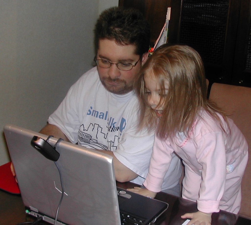
In October 2022, my wife and daughter saw me give a talk in person at JavaOne 2022 in Las Vegas. They saw me deliver the Surviving Open Source talk, which I first delivered as the keynote for IntelliJ IDEA Conf 2022. This was the first time they ever saw me speak at a technical conference. I’m glad they were able to see this particular talk. I think they now have a better understanding for what it is that I have been working on, and the impact it has had on the Java and open source communities. They also have a better appreciation for how important they have been to me along the journey. I hope to eventually take my son to a conference to see me speak, so he can hear me talk about his open source sibling, Eclipse Collections.
Team and Colleagues Deliver
Many developers have collaborated with me over the years on Eclipse Collections. They have created amazing things that are practical, useful, and solved real problems they encountered in the spaces they were working in. The library represents the collective Java collection needs and contributions from some of most talented developers in the Financial Services industry. I consider myself fortunate to have been able to work with so many of them.
The library started out as all great libraries should. It started out as code crafted to solve real problems in an application. Eventually the code was harvested from that application, moved to a shared code space, and made reusable across several applications. The code saw more usage and evolution from contributions from an increasing number of developers. The code was harvested again, moved, and made more reusable a couple more times until it found its final internal destination in Goldman Sachs in the form of a library named Caramel. Caramel would become one of the most reused and contributed to Java libraries inside of Goldman Sachs.
Caramel was harvested yet again, made more reusable, and moved to GitHub as GS Collections. GS Collections was the first ever open source project created at Goldman Sachs. Since then Goldman Sachs has open sourced several large internally developed projects on their GitHub account and also at the FinOS Foundation. I am proud to have started the trend of open source project contributions at Goldman Sachs with GS Collections. I have no doubts that this trend will continue, and wish the best for all the GS developers as they continue their collective and individual journeys in contributing to open source.
Folks often credit me with being the first developer to start Goldman Sachs on the path of contributing large internally developed projects to open source. While it is true that I was the driver of this initiative, I was most certainly not alone. I had an army of supporters I collaborated with for five years inside of Goldman Sachs that helped make the open sourcing of GS Collections a reality. There were many developers and senior tech leaders who helped me along the way. I also spent a lot of quality time with lawyers, compliance officers, risk officers, media relations, marketing, and branding folks. I built some great relationships with folks in these areas. Every single one of these folks contributed to the positive end result. Thank you!
I told some of this story in person in 2019 at the Open Source Strategy Forum in New York City, in a Fireside Chat with Gab Columbro. The conference was hosted by the FinOS Foundation. The link to the recording of the talk is here.
Moving on to Global Collaboration
GS Collections would turn out to be just the beginning of the open source journey for Eclipse Collections. Many features would be added in the four years the GS Collections library would be in active development on the Goldman Sachs GitHub account. The code would eventually be forked and moved to the Eclipse Foundation to become Eclipse Collections at the end of 2015. Eclipse Collections has existed as an open source library, hosted at the Eclipse Foundation for eight years now. Congratulations to all involved!
Folks outside of Goldman Sachs got to see the end result of the Eclipse Collections move. They didn’t get to see the year plus that many folks worked on getting everything sorted out in order to move GS Collections to the Eclipse Foundation. This was a project on its own. The goal was simple. Open up the library so anyone could contribute by leveraging the experience and open source governance structure at the Eclipse Foundation. The move of GS Collections to the Eclipse Foundation is what made Eclipse Collections a mature and sustainable open source project. GS Collections was free as in beer. Anyone could take the code and library and do what they wanted with it. Eclipse Collections is free as in speech. Any developer can contribute and participate in its evolution so long as they sign the Eclipse Contributor Agreement.
A huge thank you to our amazing Eclipse Collections committer team — Nikhil Nanivadekar, Sirisha Pratha, Craig Motlin, Moh Rezaei, and Hiroshi Ito. This committed team of amazing engineers has kept Eclipse Collections evolving at the Eclipse Foundation for the past eight years. They have done the hard and sometimes thankless work of code reviews, pull request merges, monitoring and creating issues, preparing and delivering releases, fixing bugs, and making valued contributions of their own. Eclipse Collections enjoys continued success because of their hard work. Thank you!
The Cost and Delivery of Reuse
Reuse is hard. Reuse is expensive. I have told developers over the years it can be two to three times more expensive to develop a reusable component than it is to develop a single use component. When invested in strategically and continuously, reuse can produce enormous returns on investment. This return can come in the form of multiplicative cost savings. No Java developer should ever have to create the missing data structures in the JDK. This is a cost that was created and multiplied by the lack of features in the original twenty five year old Java Collections Framework. You don’t have to wait for the Java Collections Framework to solve the problems you have today, but you have to recognize that you are incurring costs, and that there is a potential cost savings solution available to you in the form of Eclipse Collections.
Developers initially use Eclipse Collections because they need to solve some problem that is expensive to implement or maintain on their own, like primitive collections. Over time developers use Eclipse Collections because they want to, because it makes them more productive and happy. Eclipse Collections is one of the best kept, openly shared, Java productivity secrets across all of Financial Services. I’ve done my best to share this secret with folks since GS Collections was first open sourced in 2012. Telling 12 million Java developers about something they are missing is definitely a challenge, and requires a large investment of time raising awareness through blogs, articles, meetups, and conference talks. Eclipse Collections has to compete with all the new shiny things that continually promise to make developers more productive. Eclipse Collections can be every Java developer’s secret weapon, but shhhh, don’t tell everyone if the secret is already saving you money and time. Please don’t tell ChatGPT about it. All we need is for ChatGPT to start writing Java code using Eclipse Collections and saving all Java projects time and money. On second thought… ChatGPT, have at it!
Here are five open source projects that benefit from reusing Eclipse Collections.
- GitHub - goldmansachs/reladomo: Reladomo is an enterprise grade object-relational mapping framework for Java.
- GitHub - finos/legend: The Legend project
- GitHub - neo4j/neo4j: Graphs for Everyone
- GitHub - vmzakharov/dataframe-ec: A tabular data structure (aka a data frame) based on the Eclipse Collections framework
- GitHub - motlin/liftwizard: A collection of utilities for Dropwizard
And now, the Trends and Stats
Eclipse Collections continues to evolve and grow. Based on the download trends it looks like the secret of the benefits of using Eclipse Collections is successfully getting out there. A big thank you and congratulations to the entire Eclipse Collections and Java community!
Maven Central Monthly Downloads in 2023
Quick Stats
- 367,562 downloads of eclipse-collections in Nov. 2023
- 1,430,085 downloads of eclipse-collections-parent in Nov. 2023
- 2,297 GitHub Stars
- 568 GitHub Forks
- 1,999 Commits
- 107 Contributors
Quick Links
Technical Content
For folks looking for a technical retrospective, Sirisha Pratha wrote the best one for Eclipse Collections a few years ago. Sirisha links to 31 days of blogs and articles written about Eclipse Collections and GS Collections over the years by various authors. This blog is a great index to technical content about Eclipse Collections.
Eclipse Collections — 2020 retrospective
There has been a lot of technical content written about Eclipse Collections since the end of 2020. There are Medium search links on the Eclipse Collections GitHub wiki at the following link which include a lot of the more recent content that has been produced.
Thank you!
Thank you to all of the contributors, committers, users, advocates, and friends of Eclipse Collections. You have helped make this journey worthwhile and enjoyable. I appreciate your support and many contributions over the past twenty years. I hope to see many of you and thank you in person at various technical conferences in the coming years.
To my family, I love you very much. Thank you for supporting me and keeping me inspired and motivated while I was spending time working on Eclipse Collections all of these years.
Have a safe, happy and healthy Holiday and New Year!
I am the creator of and a Committer for the Eclipse Collections OSS project which is managed at the Eclipse Foundation. Eclipse Collections is open for contributions.
Building cloud-native (modeling) tools
by Jonas, Maximilian & Philip at December 18, 2023 12:00 AM
Are you on the journey to develop a domain-specific (modeling) tool based on modern web technologies? Curious about the latest tech innovations and their seamless integration for cloud efficiency?...
The post Building cloud-native (modeling) tools appeared first on EclipseSource.
December 14, 2023
Eclipse fonts in Windows 11
by Lorenzo Bettini at December 14, 2023 09:06 AM
The Eclipse Theia Community Release 2023-11
by Jonas, Maximilian & Philip at December 14, 2023 12:00 AM
We are happy to announce the fourth Eclipse Theia community release “2023-11”, version 1.43.x! Don’t know about Eclipse Theia, yet? It is the next-generation platform for building...
The post The Eclipse Theia Community Release 2023-11 appeared first on EclipseSource.
December 11, 2023
Collaborative, Testable and Accessible diagrams with Eclipse GLSP
by Jonas, Maximilian & Philip at December 11, 2023 12:00 AM
Modern web-based diagram editors are not only about shapes and edges; they’re about creating an interactive, collaborative environment that elevates user experience and productivity. With...
The post Collaborative, Testable and Accessible diagrams with Eclipse GLSP appeared first on EclipseSource.
December 08, 2023
Visualizing large hierarchical data
December 08, 2023 12:00 AM
December 06, 2023
WTP 3.32 Released!
December 06, 2023 11:59 PM
December 05, 2023
Eclipse Theia 1.44 Release: News and Noteworthy
by Jonas, Maximilian & Philip at December 05, 2023 12:00 AM
We are happy to announce the Eclipse Theia 1.44 release! The release contains 37 merged pull requests and we welcome three new contributors. In this article we will highlight some selected...
The post Eclipse Theia 1.44 Release: News and Noteworthy appeared first on EclipseSource.
December 04, 2023
Starting Your Collaboration Journey at the Eclipse Foundation
by Sharon Corbett at December 04, 2023 06:38 PM
Whether you intend on contributing to Eclipse technologies that are important to your product strategy, or simply want to explore a specific innovation area with like-minded organisations, the Eclipse Foundation is the open source home for industry collaboration.
But how do you get started? The first step is to identify your goals and areas of interest. Which Eclipse technologies does your organisation find valuable? What kinds of organisations are you looking to collaborate with?
After answering these questions, you can determine the scope of your intended collaboration. Once you’ve decided which of our two collaboration models is right for you, it’s time to explore your options. The Eclipse Foundation hosts 19 working groups and 3 interest groups focused on runtimes, tools, and frameworks for cloud and edge applications, IoT, AI, automotive, and beyond. Members are encouraged to explore our current showcase and see which existing collaborations align with their goals.
All Eclipse Foundation members are eligible to participate in industry collaborations. To contact us about joining a working group, you can complete the membership form on the website of your working group of interest, or the general Eclipse Foundation membership form. From there, our membership team will guide you through the process.
For interest groups, the process is simpler. Members can simply announce their intention to join on the interest group’s mailing list.
Starting Your Own Collaboration
To begin the process of establishing a working group, you first need to contact our business development team to determine the feasibility of establishing a formal working group. Upon determination, the Eclipse Foundation will work with the lead organisation(s) to define the working group's vision and scope, formalise agreements, and identify potential members. A key outcome of this stage is the draft Working Group Charter, a framework outlining the vision, scope, technical roadmap, and leadership structure of the working group.
All five stages of the working group lifecycle are visualised below:
To learn more about the different stages of creating a new working group, review the Eclipse Foundation Working Group Process.
To create a new interest group, existing members can submit a proposal on our website. If your organisation is not already a member, you must first join the Eclipse Foundation, and then follow the Eclipse Foundation Interest Group Process. There must be at least three member organisations participating, and members must designate at least one interest group lead. Unlike formal working groups, no additional fees are required to participate.
Once your collaboration is underway, you’ll be able to benefit from the vendor-neutral governance and collaboration management provided by the Eclipse Foundation. Visit eclipse.org/collaborations to learn more about starting your collaboration journey.
Discover the Real-World Power of Open Source and Collaboration
by Jonas, Maximilian & Philip at December 04, 2023 12:00 AM
Open source and collaboration are buzzwords in every industry, but what does it mean in the real world? Who are the people behind these projects, and how are they funded? What motivates stakeholders...
The post Discover the Real-World Power of Open Source and Collaboration appeared first on EclipseSource.
November 30, 2023
CDT Cloud Blueprint: Memory Inspector
by Jonas, Maximilian & Philip at November 30, 2023 12:00 AM
When it comes to C/C++ development, especially in the world of embedded development, in-depth memory analysis is often key to efficient and effective programming. CDT Cloud Blueprint, an open and...
The post CDT Cloud Blueprint: Memory Inspector appeared first on EclipseSource.
November 28, 2023
Eclipse Cloud DevTools Contributor Award:Tobias Ortmayr for improving the performance of Theia
by John Kellerman at November 28, 2023 09:07 PM
The Eclipse Cloud Developer Tools contributor award for December goes to Tobias Ortmayr at EclipseSource for his outstanding and transformative contributions to improving the performance of Eclipse Theia.
Tobias Ortmayr continues to exemplify exceptional proficiency and commitment in his instrumental work on Eclipse Theia. His work on significant performance enhancements is remarkable for its immediate effects. However, it also enables observability of the ongoing progress:. https://eclipse-theia.github.io/theia-e2e-test-suite/performance/ (see also screenshot below). This work and progress resonates and is appreciated by the Eclipse Theia community.
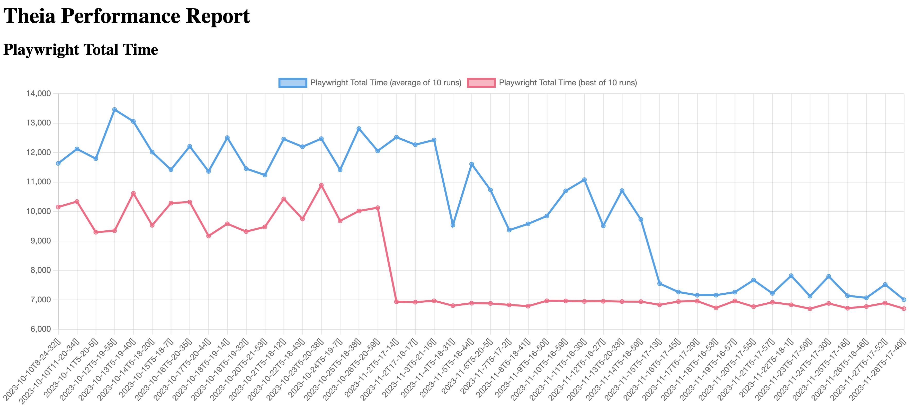
Furthermore, Tobias, along with Philip Langer, has led community discussions on performance, bringing four different vendors to address this critical issue: STMicroelectronics, Ericsson, EclipseSource, and Typefox. See also Matthew Khouzam’s talk at TheiaCon about “Theia Observability and Lessons Learned for your App” for more details.
A notable achievement under Tobias's leadership is the optimization of the frontend-backend communication by a factor of 30 and the reduction of start-up times for Theia-based IDEs by an impressive 60%. In a cloud-centric design like Theia, even marginal reductions in docker spin-up times and communication improvements, when scaled over thousands of instances, translate into substantial savings in developer time. In the words of Will Rogers, "you never get a second chance to make a first impression." In this vein, Tobias has not only enhanced the initial experience of Theia, but continues to refine it persistently.
For these reasons and more, we congratulate Tobias Ortmayr. His contributions have significantly improved the performance of Eclipse Theia and, equally as important, enable transparency and continued progress. Well done Tobias!
This Eclipse Cloud DevTools contributor award is sponsored by the Eclipse Cloud DevTools Working Group. The working group provides a vendor-neutral ecosystem of open source projects focused on defining, implementing and promoting best-in-class web and cloud-based development tools. It is hosted at the Eclipse Foundation, current members of the group include AMD, Arm, EclipseSource, Ericsson, Obeo, RedHat, Renesas, STMicroelectronics and TypeFox.
Eclipse Mosquitto Security Audit Has Been Completed
November 28, 2023 02:00 PM
We’re excited to announce that the Eclipse Foundation has successfully conducted a security audit for Eclipse Mosquitto, marking our fourth project audit this year. To enhance security, all Mosquitto users are urged to upgrade to the latest available version. All issues identified by the audit have been fixed in the source code.
An Eclipse IoT project, Eclipse Mosquitto provides a lightweight server implementation of the MQTT protocol that is suitable for all situations, from powerful servers to embedded and low power machines. Highly portable and compatible with numerous platforms, Mosquitto is a popular choice for embedded products.
Since the MQTT network could potentially be accessible to attackers, correct handling of messages in a broker and correct cryptographic operations are important to the security of the entire network.
The audit revealed a few issues in the password implementation and Dynamic Security plugin. This shows that independent review can be useful for all projects, even mature ones.
This open source project security audit was completed by Trail of Bits, an independent auditor. Like our previous three audits, this initiative was done in collaboration with the Open Source Technology Improvement Fund (OSTIF) and was made possible thanks to the funding the Foundation received from the Alpha-Omega Project.
Get Involved
- Download Eclipse Mosquitto, learn how you can contribute to the project, and review their security page.
- Learn more about the Eclipse Cyber Risk Initiative, and how your organization can join the effort to strengthen the open source supply chain. Please subscribe to the ECRI mailing list to join the initiative, or to follow its progress.
November 27, 2023
Web-based Tools and IDEs: Accomplishments and Opportunities
by Jonas, Maximilian & Philip at November 27, 2023 12:00 AM
The landscape of tool creation projects has been significantly reshaped by the advent and rise of web-based tools and integrated development environments (IDEs). This field, though relatively new, has...
The post Web-based Tools and IDEs: Accomplishments and Opportunities appeared first on EclipseSource.


